Simply effective
ACO
Brand strategy
Global brand identity
Global packaging concept
Brand portfolio strategy
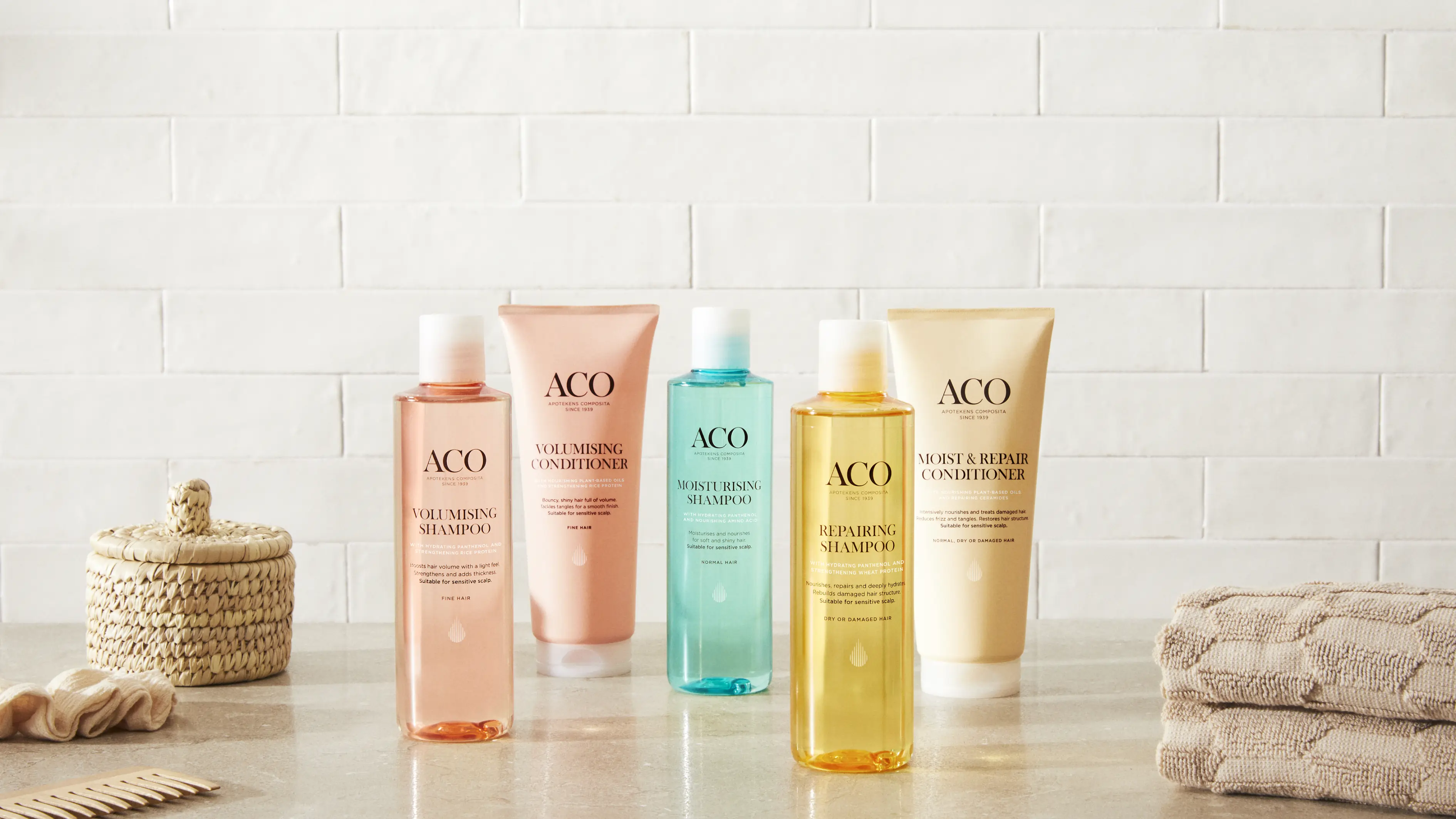
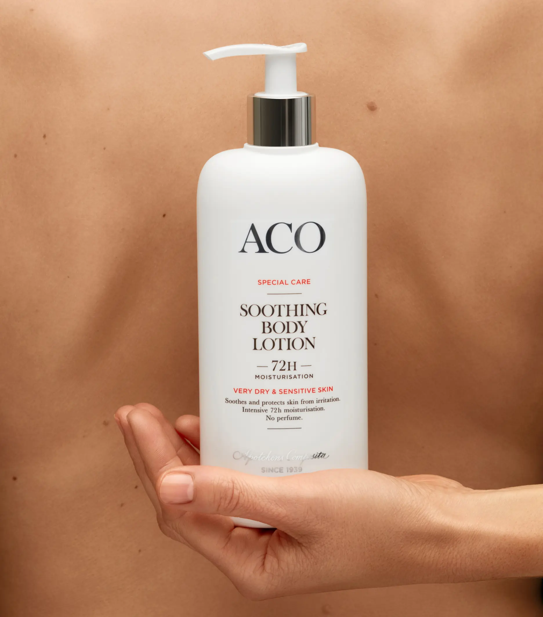
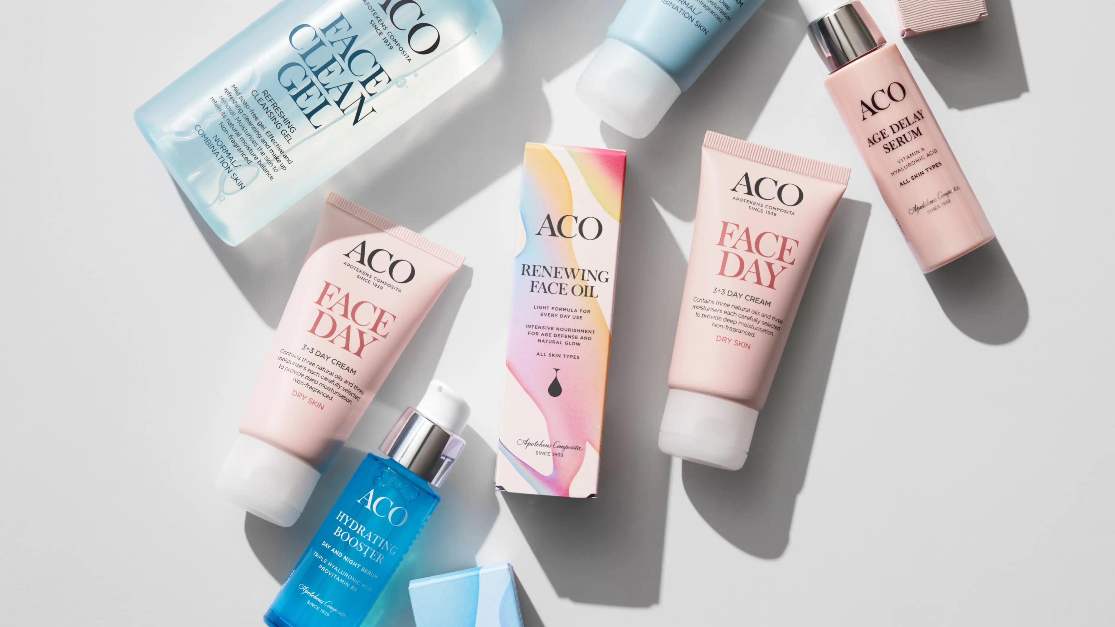
Product design
Naming strategy
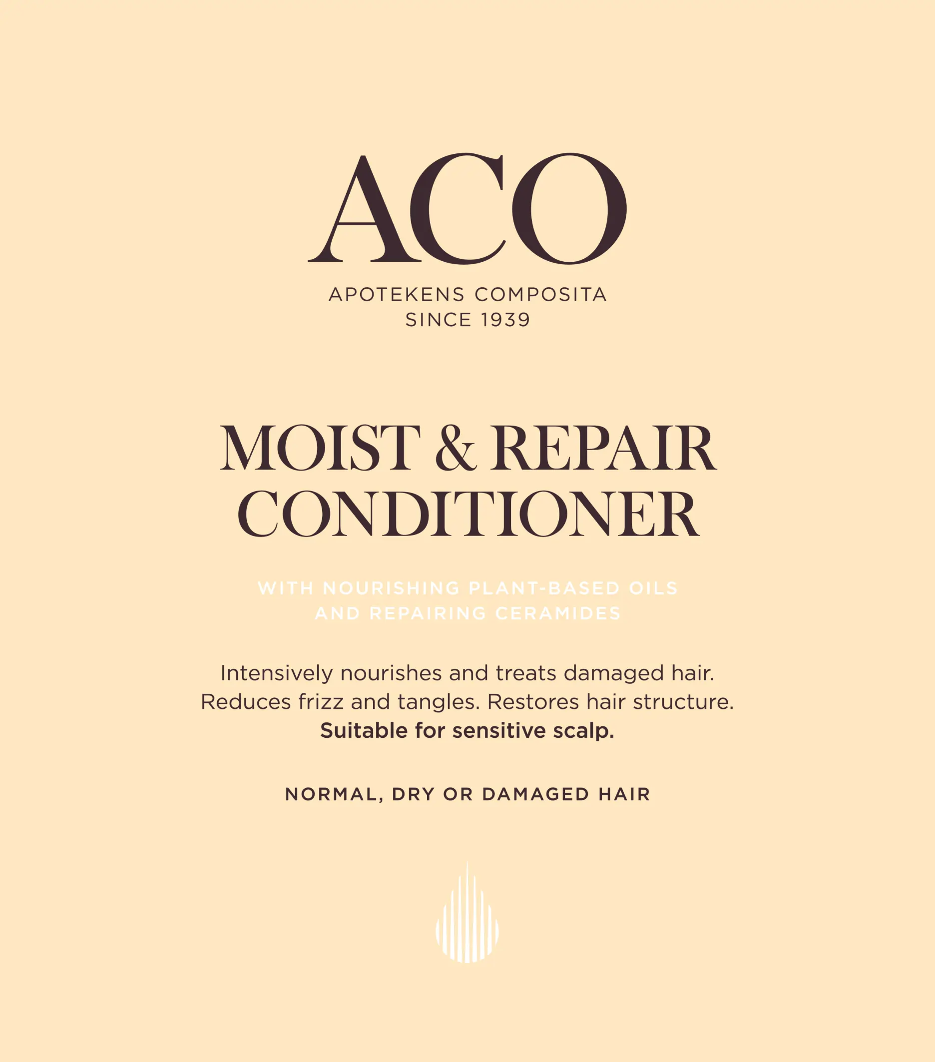
Information hierarchy
Global communication concept
Full production
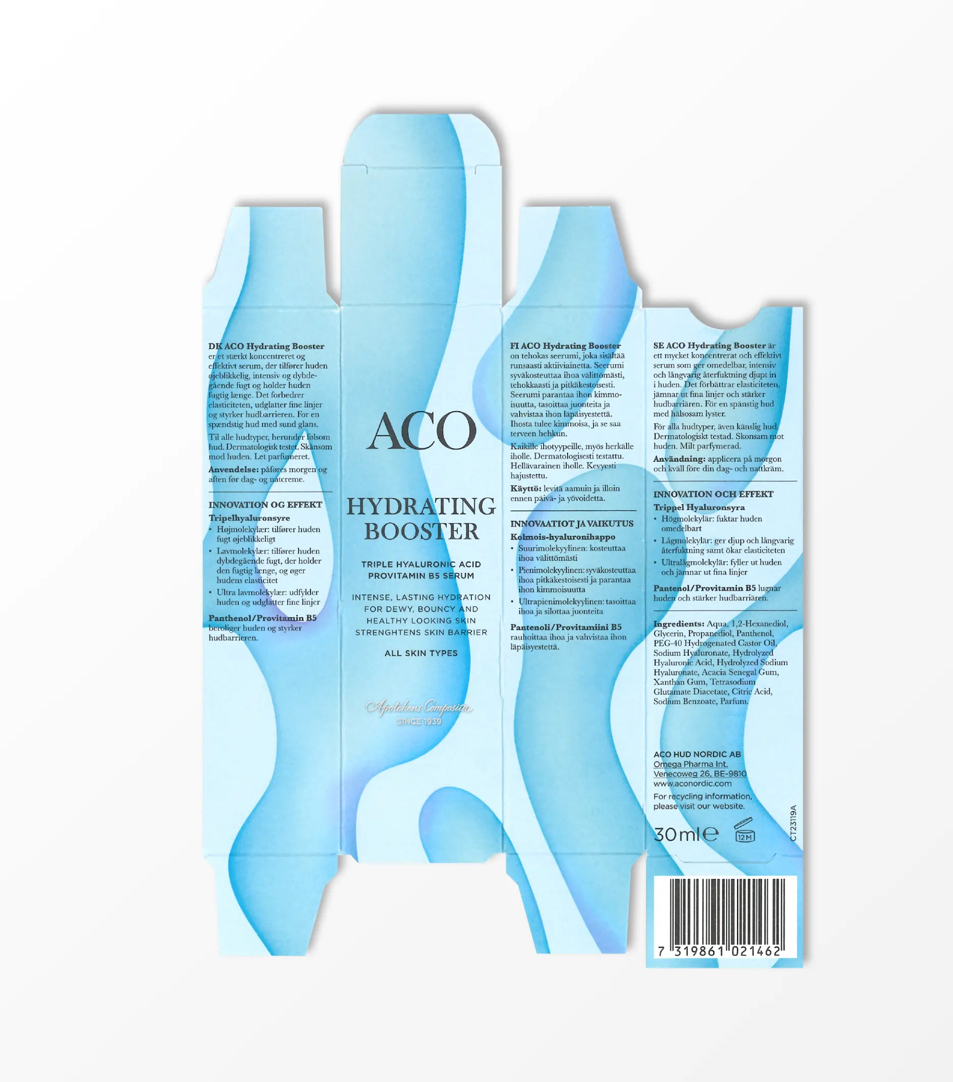
Founded in 1939, ACO is one of Scandinavia’s leading skin care brands and is today present in over seven markets globally. With an ever-growing portfolio and ever-changing consumer needs, ACO manages to stay relevant and top of mind with a brand identity and design that is – Simply effective.

Strategy informs identity.
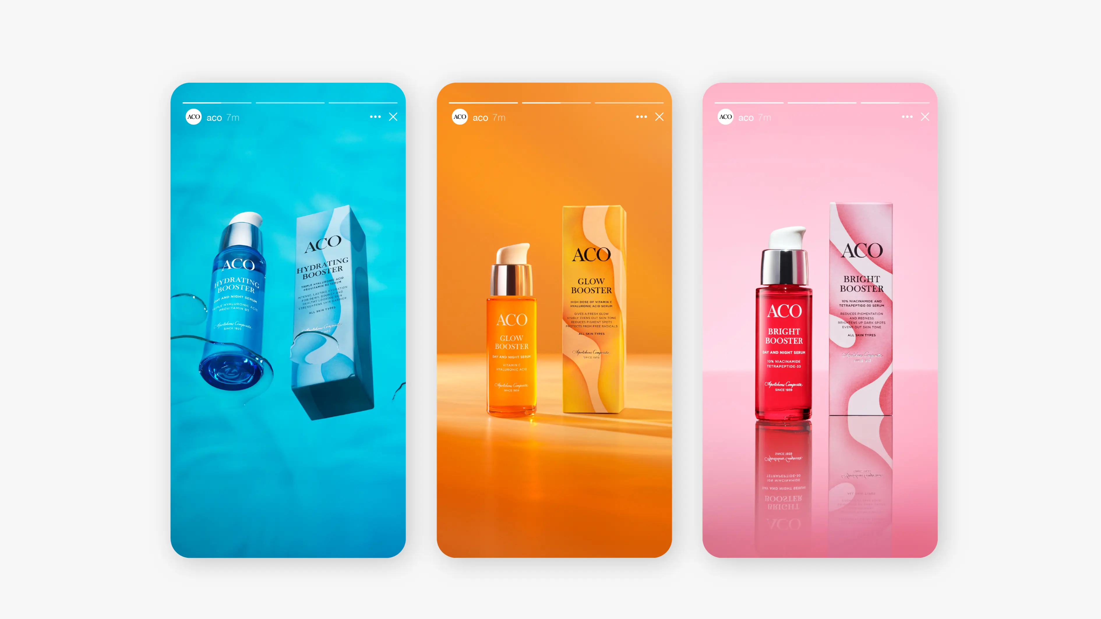
The strategic brand concept: Simply effective, reflects not only the products but lends itself to ACO’s heritage and drives the development of a modern Scandinavian design expression.

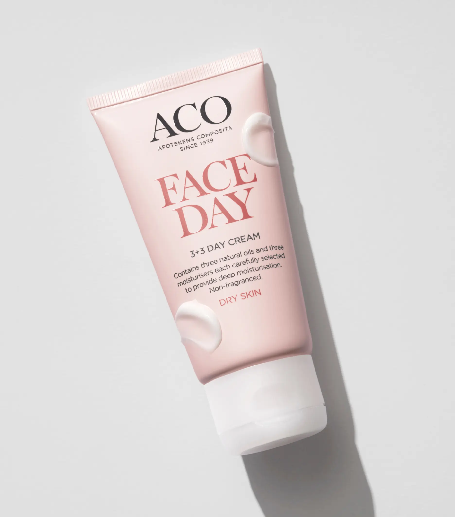
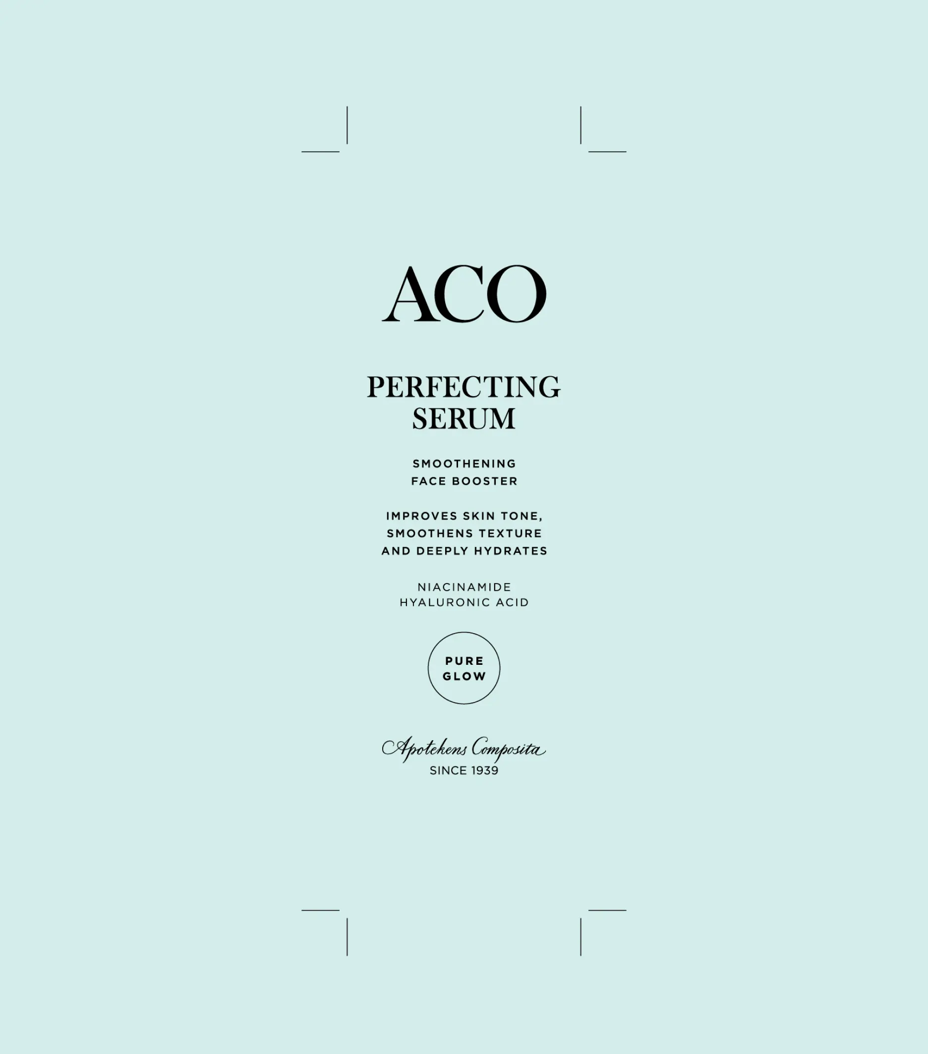
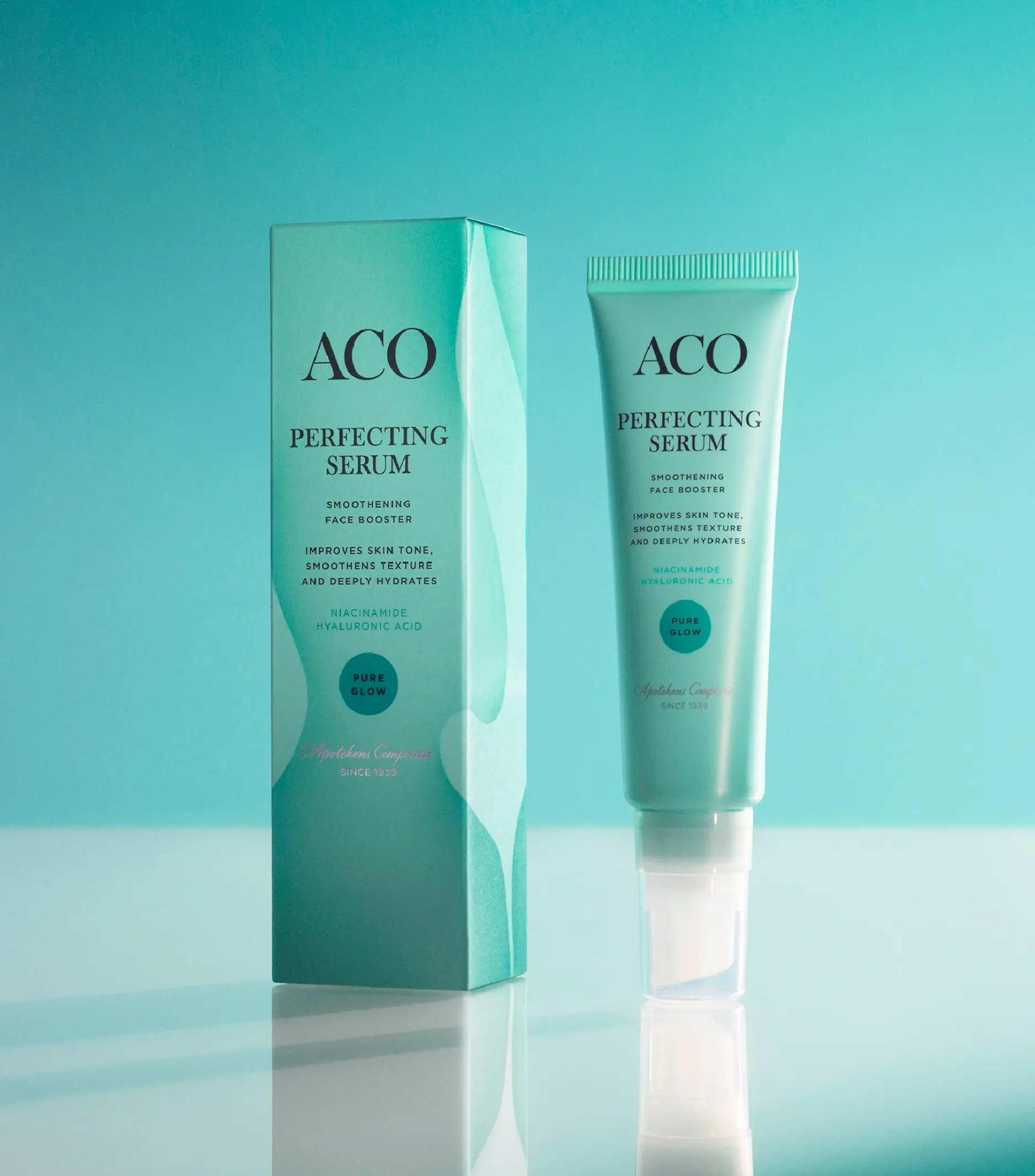
Few but hardworking elements.
We created a strong visual core, consistent throughout the portfolio, with a modern, elegant, and sophisticated wordmark standing proud and clear at the center of the identity. This was accompanied by clear typographic hierarchies and tactile colors with clear differentiation between product ranges and price levels.


The impact.
Since the initial re-positioning and re-design in 2018 not only have ACO managed to stay on top of the game but also enjoyed sales increases by +82%, awareness growth from 83% to 91% and consideration from 56% to 67%. Not bad for an 85-year-old skincare brand.