Ease into the future
Cryptonow
Design strategy
Brand identity
Brand implementation
Brand design film
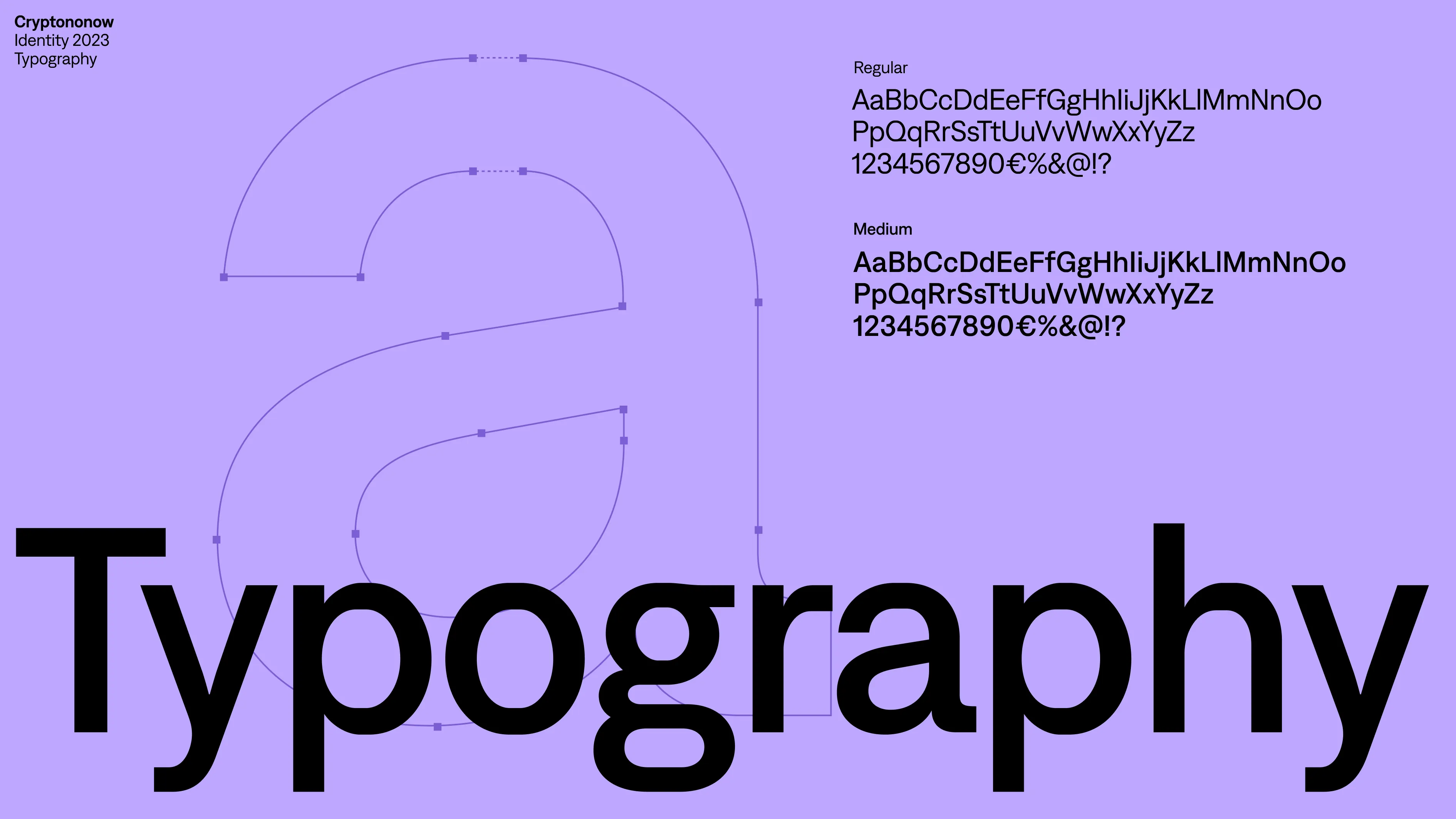
Custom headline typeface
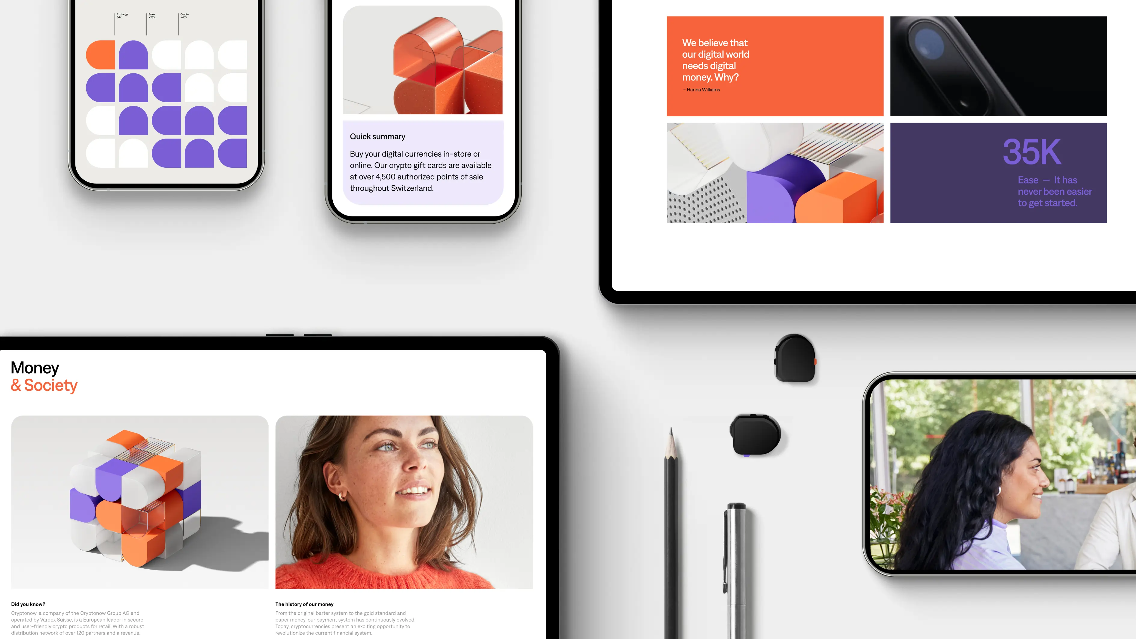
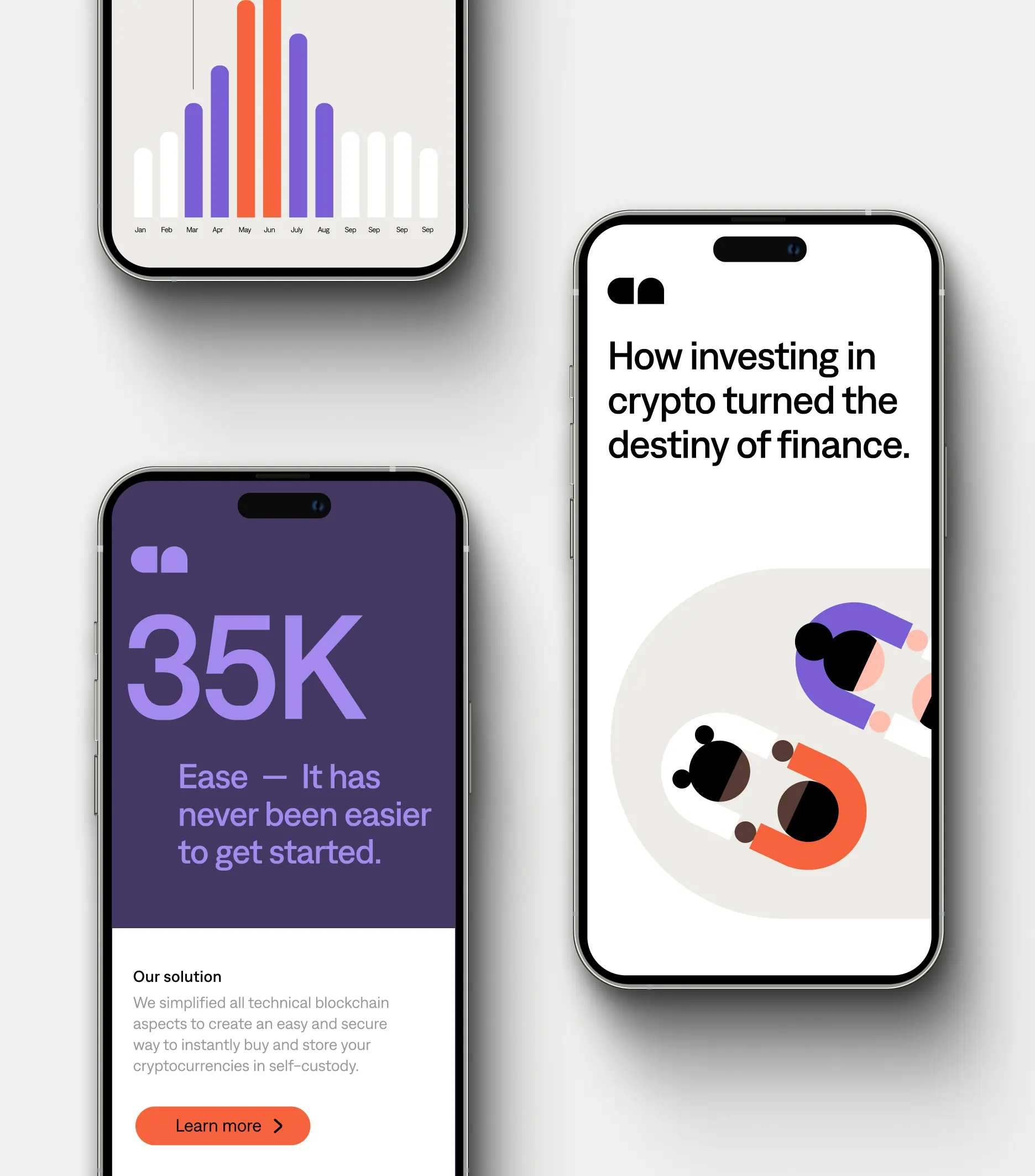
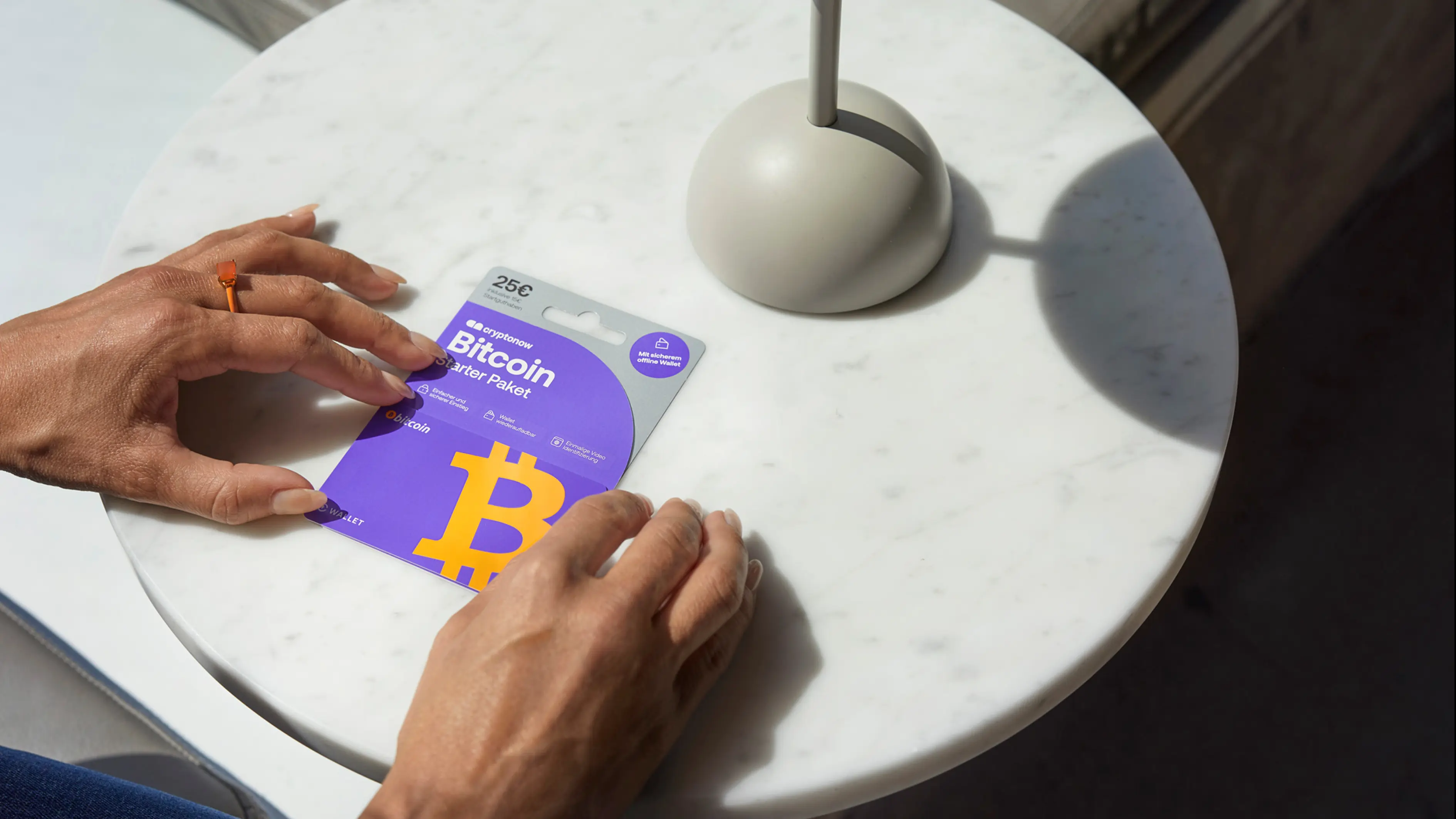
Imagery concept
Tone of voice
Sound ID
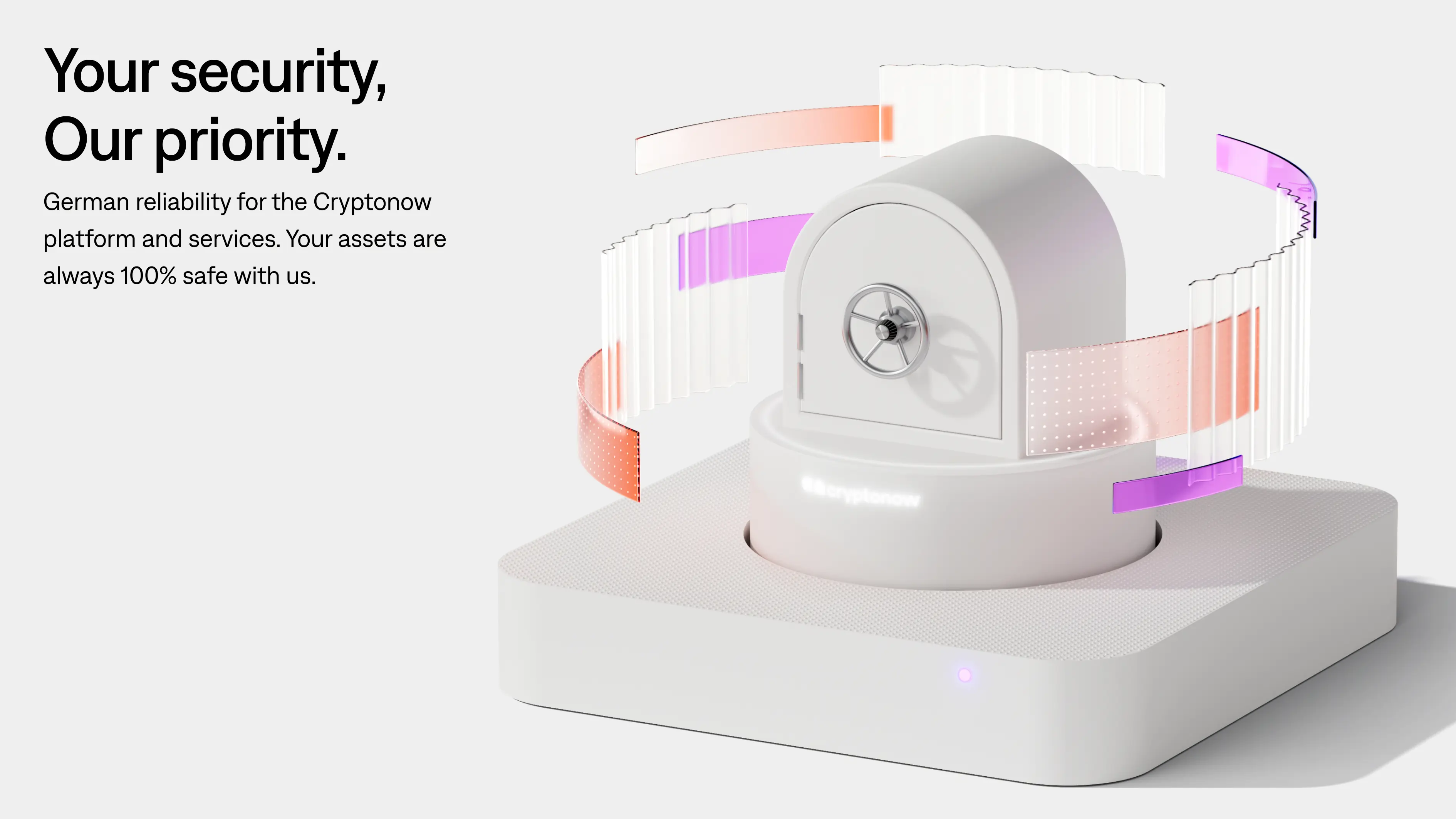
The future of money.
Cryptonow believes that digital money has the potential to create a fairer and more efficient world for everyone. Their goal is to make it accessible and understandable through services and products that allow you to learn, explore and invest in digital currencies – in a safe and simple way, right at your fingertips.
Since their launch in Switzerland in 2017, Cryptonow has grown steadily and in preparation for their international expansion they needed a clear and cohesive brand identity. An identity that would enable them to convey trust and reliability that would attract a non-digital savvy, financially conservative, target group.


Strategy informs identity.
By offering a different, less tech driven way to explore cryptocurrencies, Cryptonow allows consumers to “Ease into the future of crypto”. A promise and strategic direction that allowed the visual identity to draw inspiration from an easing dynamic curve – serving as a visual embodiment of simplicity, and a guiding path towards the future.

Few but hard-working elements.
From our strategy “Ease into the future of crypto”, also found in the brand’s soft symbol, we created a sense of ease in every detail of the identity – from brand devices and illustrations to photography style and icons. The color palette is thoughtfully based on two important aspects of Cryptonow’s identity: to communicate trust while also feeling exciting and full of energy.


The impact.
The combination of a sense of ease, effortlessness, and vibrant energy, results in a bold, welcoming brand that can explain complex ideas by transforming them into visually engaging and effortless comprehensible designs.