Rethink
Hjärnfonden
Brand strategy
Brand identity
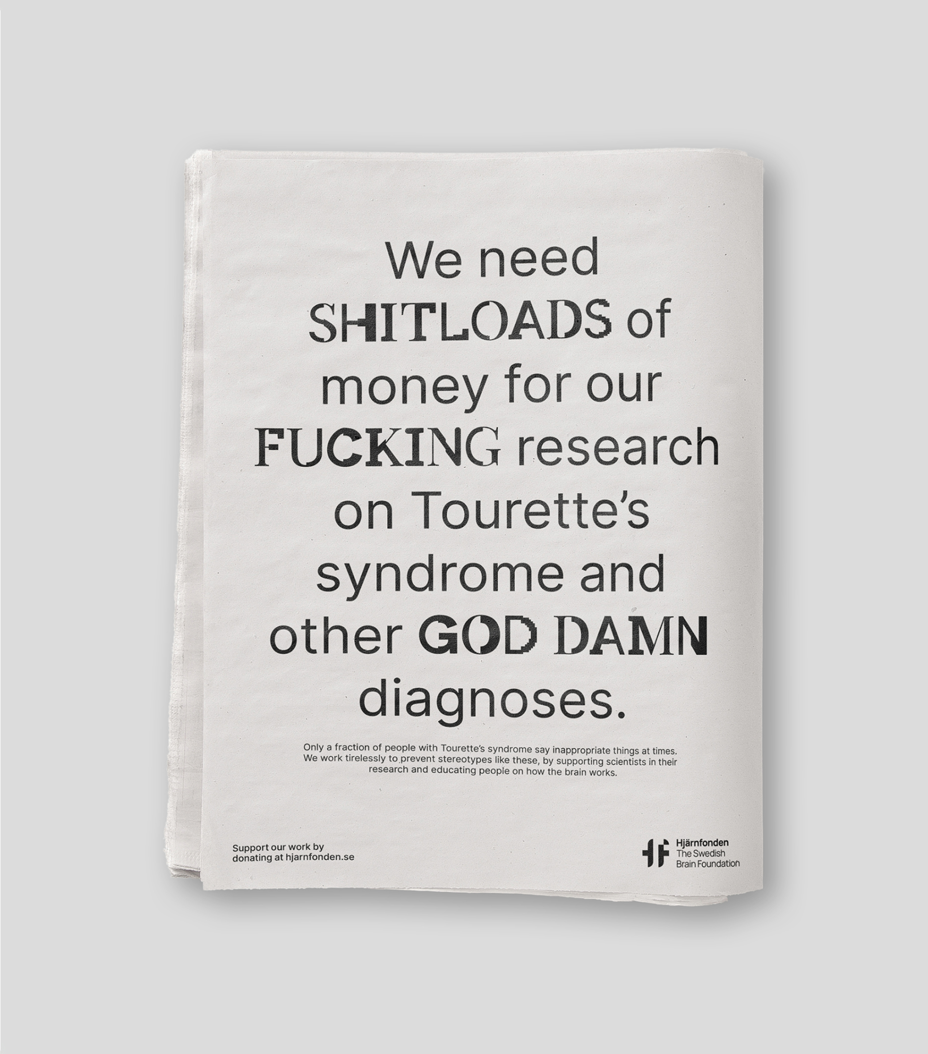
Typeface design
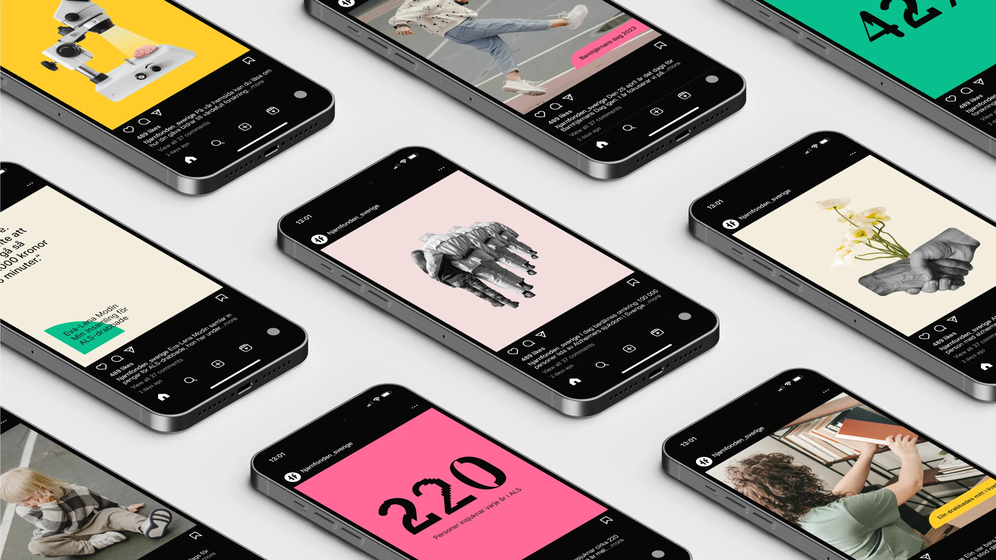
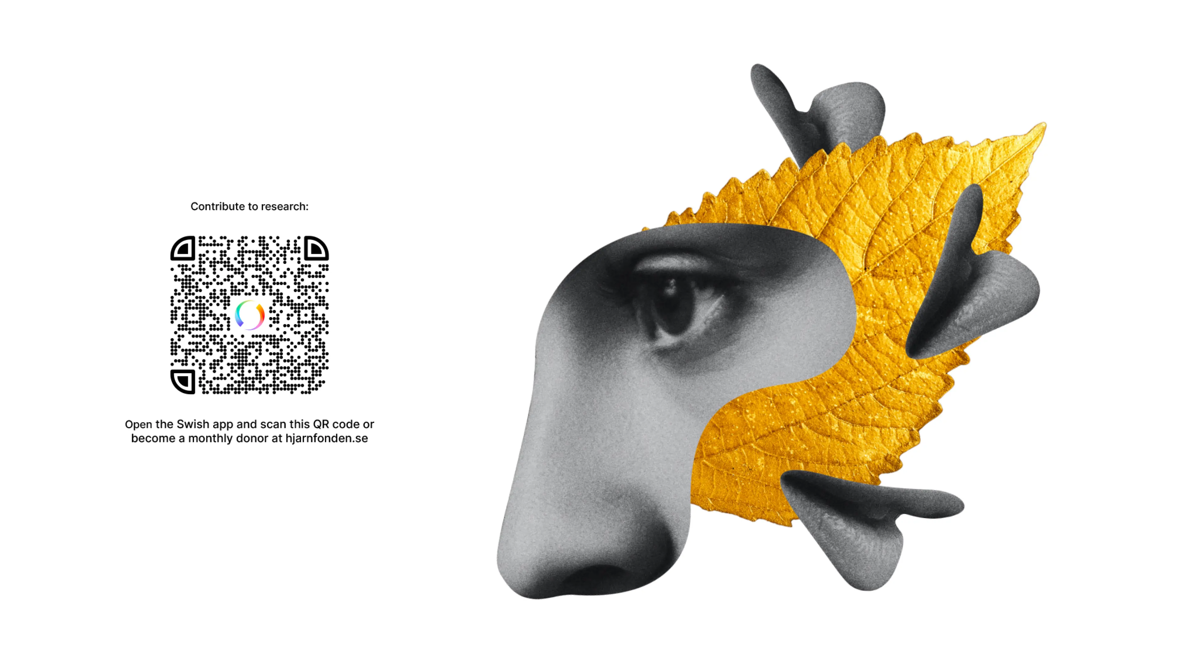
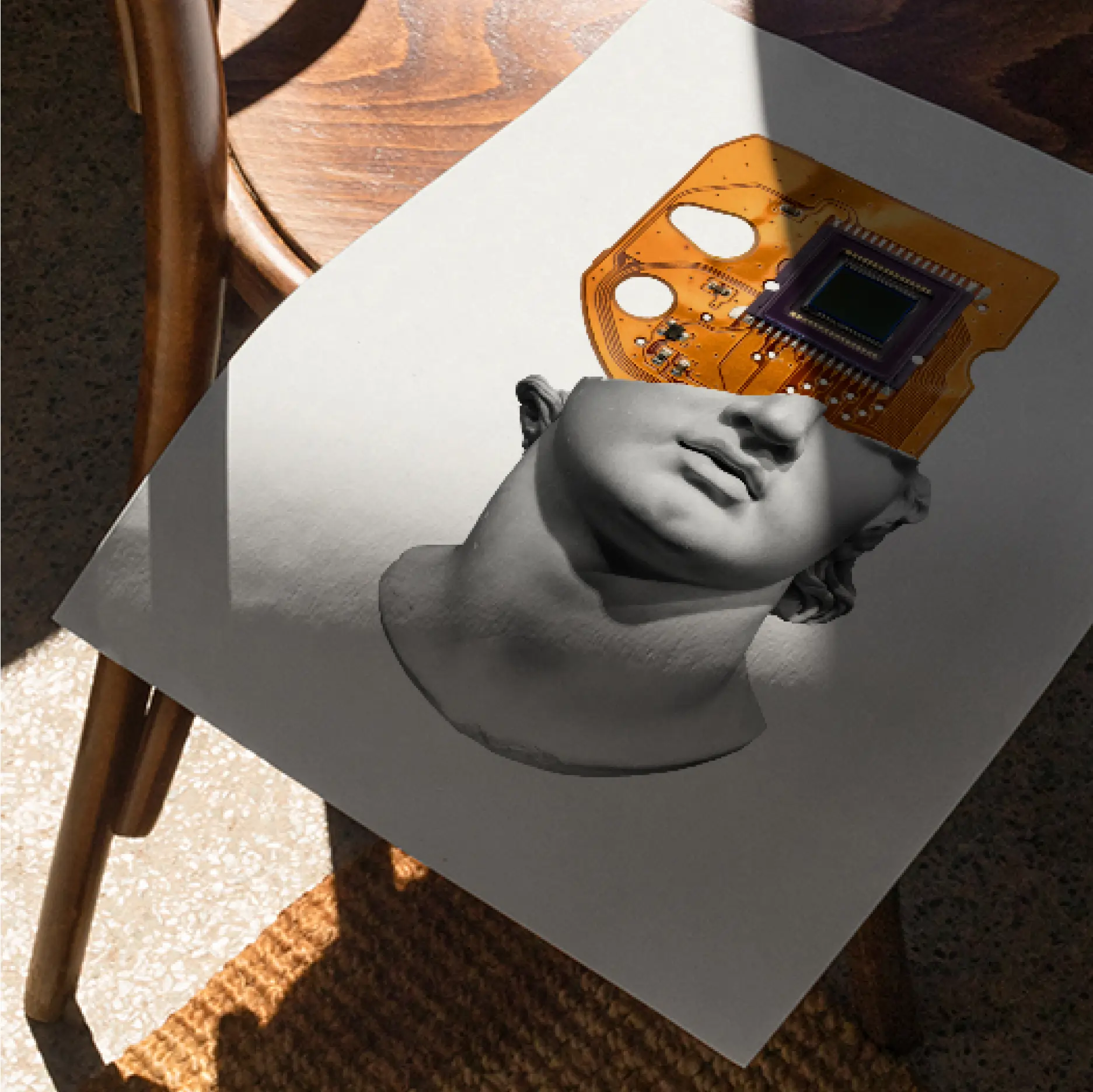
Illustrations
Motion
Hjärnfonden (The Swedish Brain Foundation) raises money for research and information about the brain and its diseases, injuries, and disabilities. For the first time in 30 years, Hjärnfonden was looking for a new brand identity. The brief simply stated that the new brand identity needed to be innovative, standout, and cost efficient to implement.

Strategy informs identity.
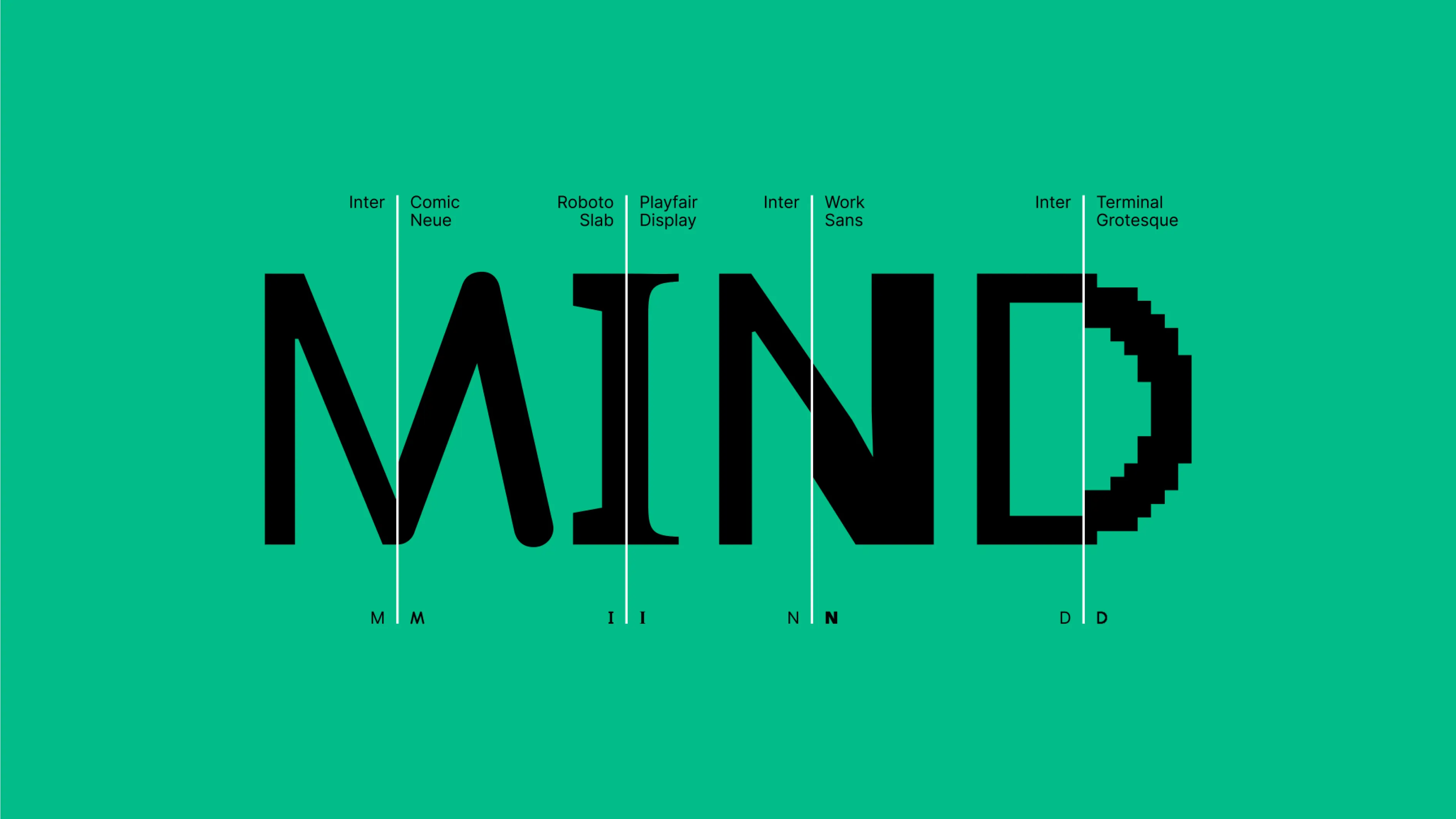
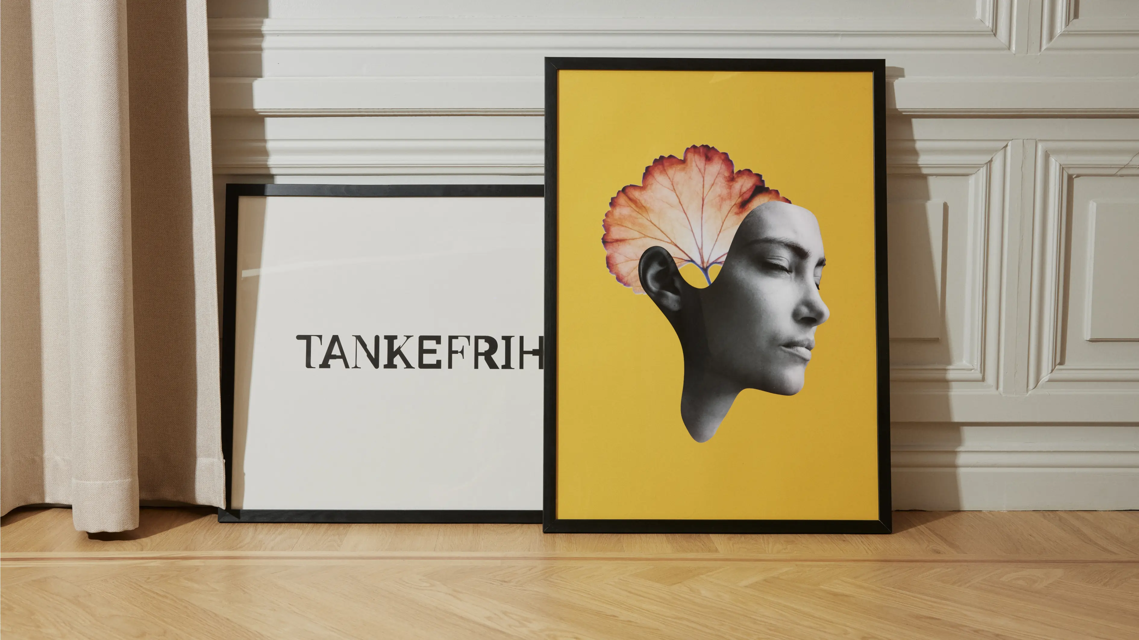
The power of the brain is infinite and unrestrained so when developing the new identity for Hjärnfonden we wanted it to reflect both the logical and the creative parts of the brain. Therefore, the identity has two sides – the rational, structured, distinct, and comprehensible, and the surprising, irrational, and unexpected. This innovative identity is intended to evoke curiosity and encourage conversations. An identity that, like our brain, is elastic, dynamic, unique, and magnificent.
Few but hardworking elements.
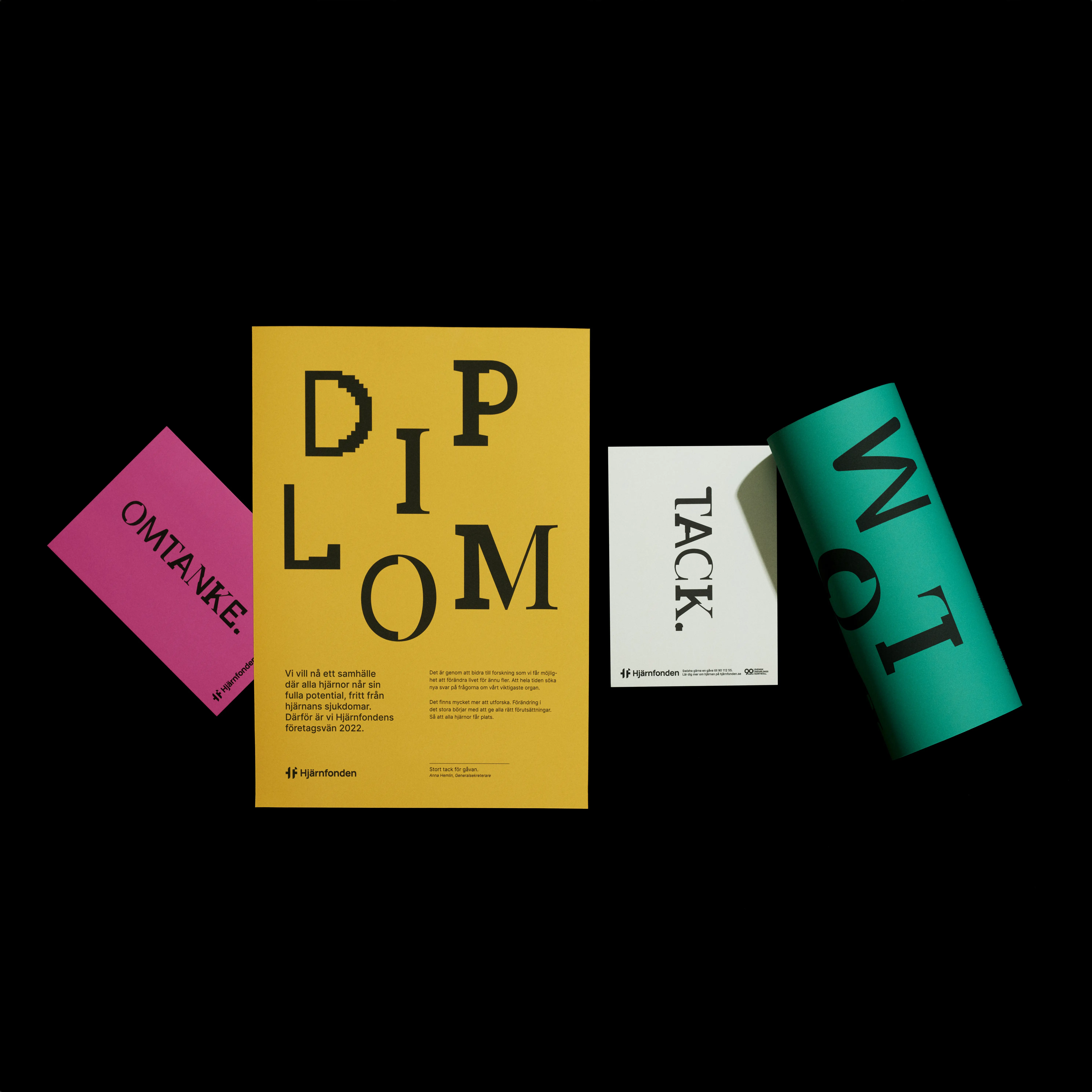
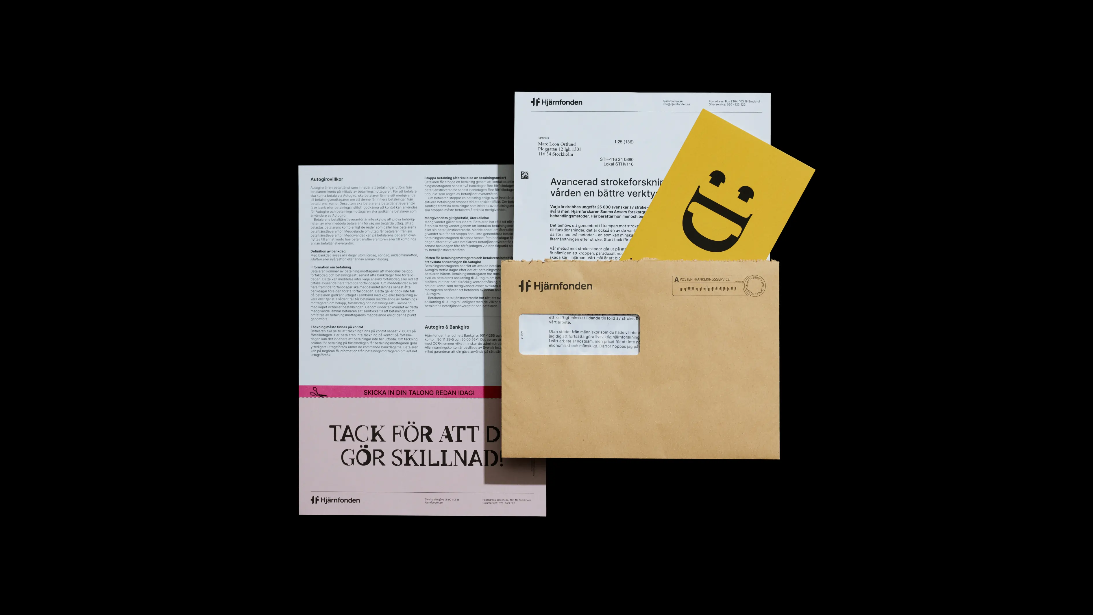
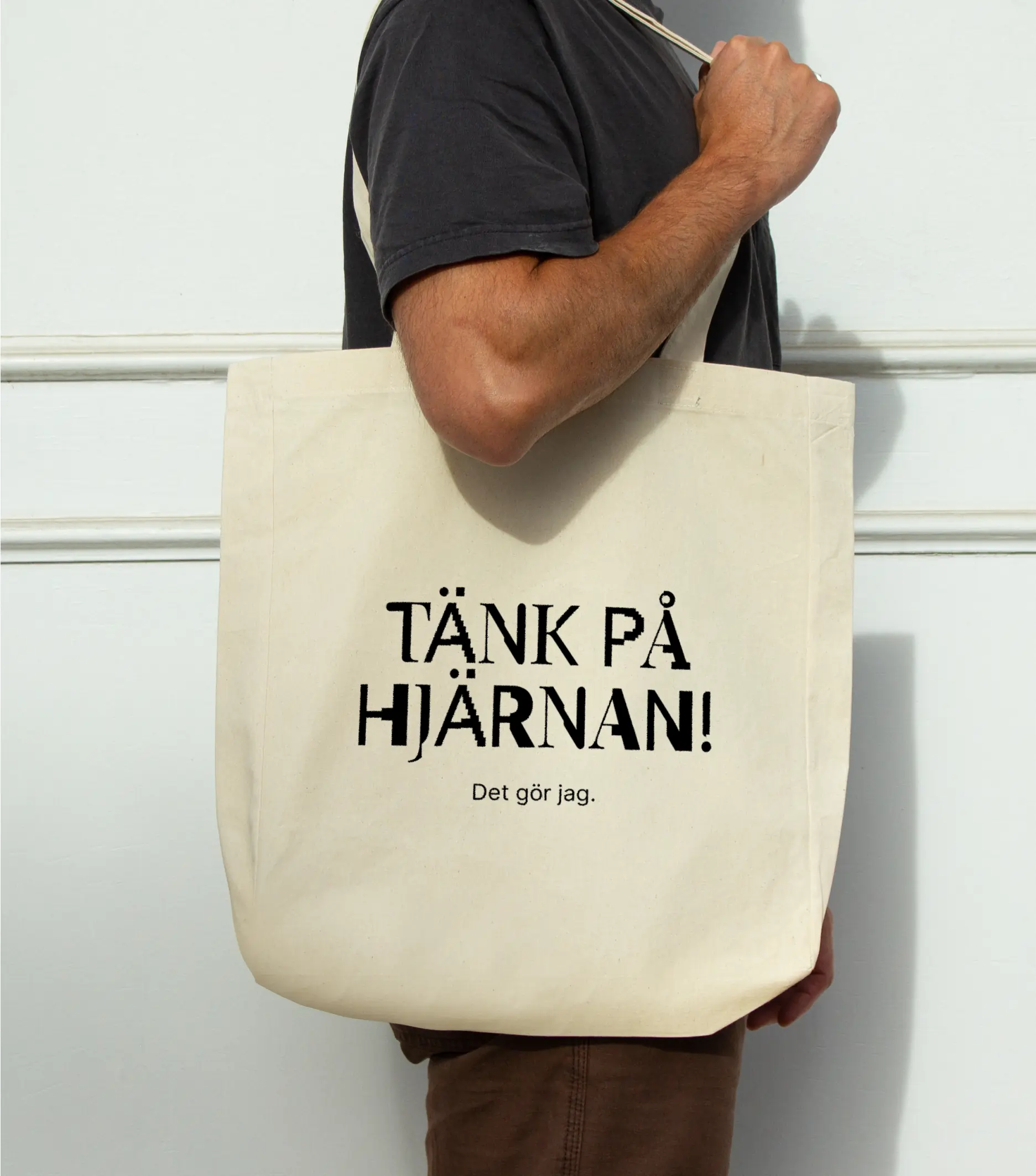
The new logotype, with an acronym symbol, evokes a strong sense of trust and responsibility, affirming the credibility of the foundation. The custom display typeface stands out, builds awareness, and enhances the duality of the identity. Combined with the playful and intelligent collage approach to visuals, an expressive, flexible, yet solid identity comes to life.
The impact.
The identity has not only received global acclaim, winning numerous international design awards, it has also raised the awareness about Hjärnfonden and its work to a new level. It has attracted new talent that refer to the identity as being a large part of why they wanted to join the foundation.