The unusually caring bank
SBAB
Brand strategy
Brand identity
Digital brand wxperience
Typeface design
Motion identity
Illustration
In a world where “the bank” is often perceived as greedy and a non-transparent necessary evil, SBAB (a state-owned bank) has always challenged this with honesty, thoughtfulness, clarity, and a high level of credibility. And down to earth interest rates.
Strategy informs identity.
The new strategy moved SBAB from being solely a price challenger brand, to offering the broadest ecosystem of products and services aimed at supporting customers full home-ownership journey. SBAB became the foundation of sustainable financial home ownership. This translated into a non-bank-like, unusually caring and likeable identity.

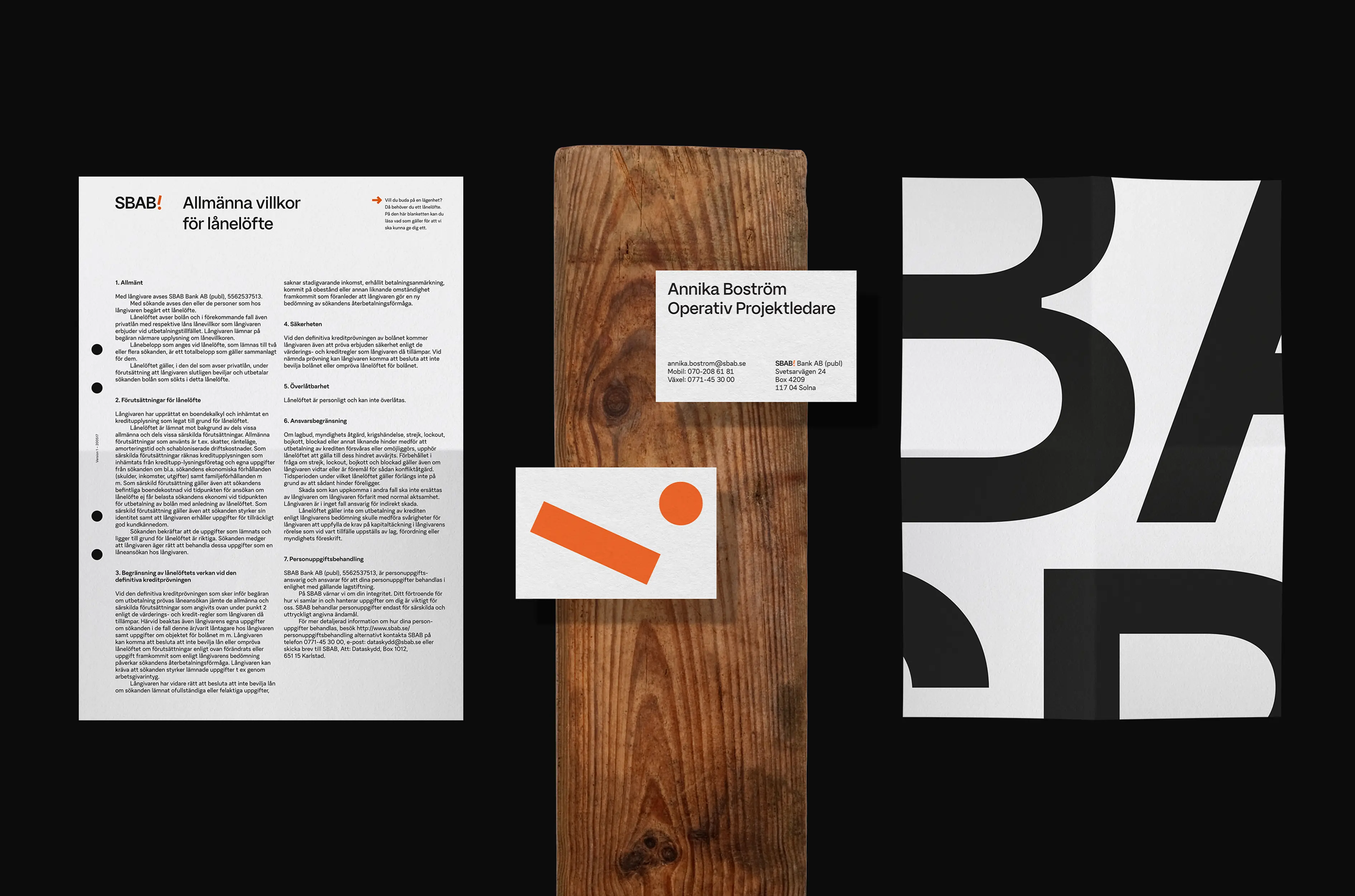
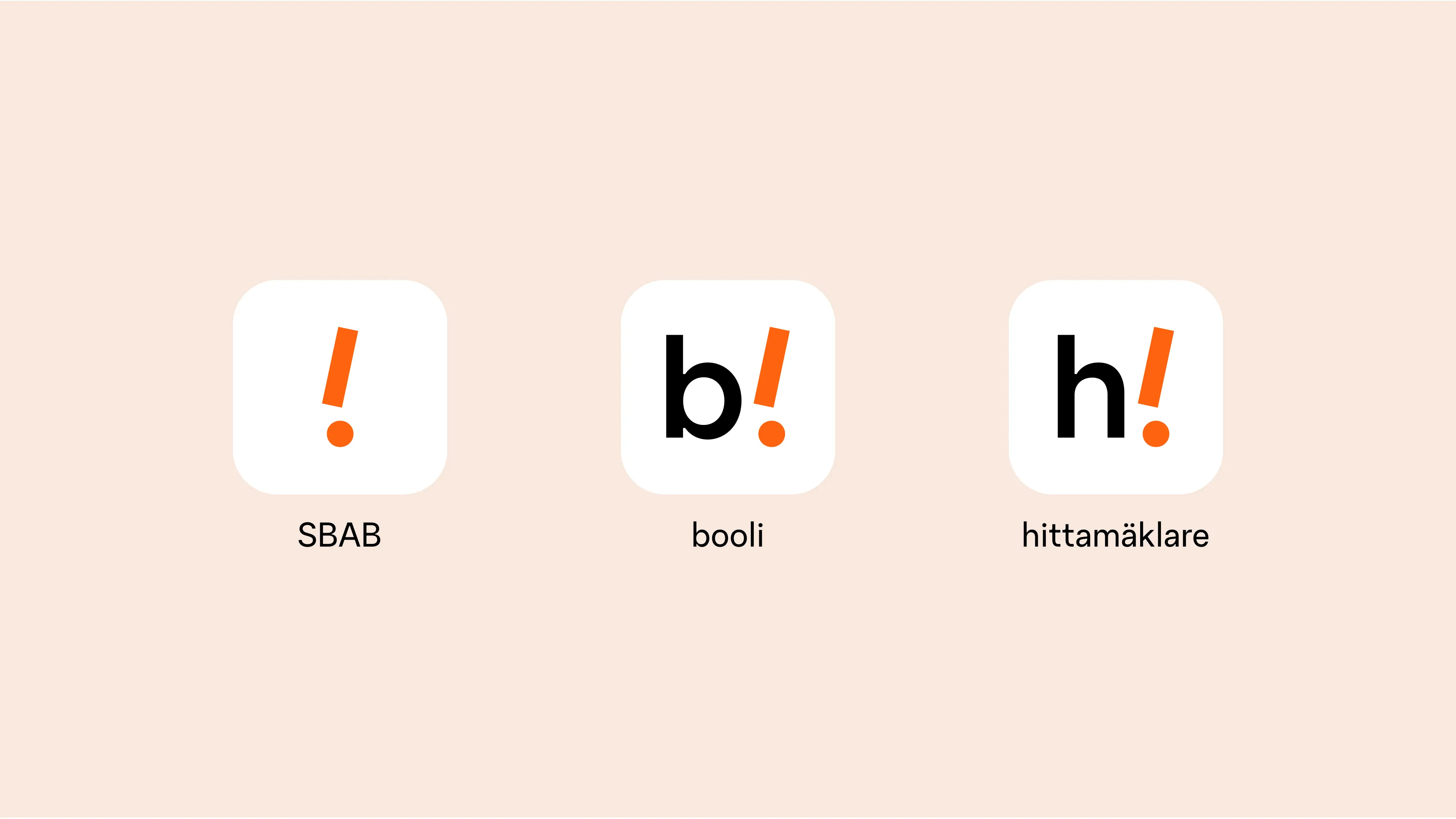
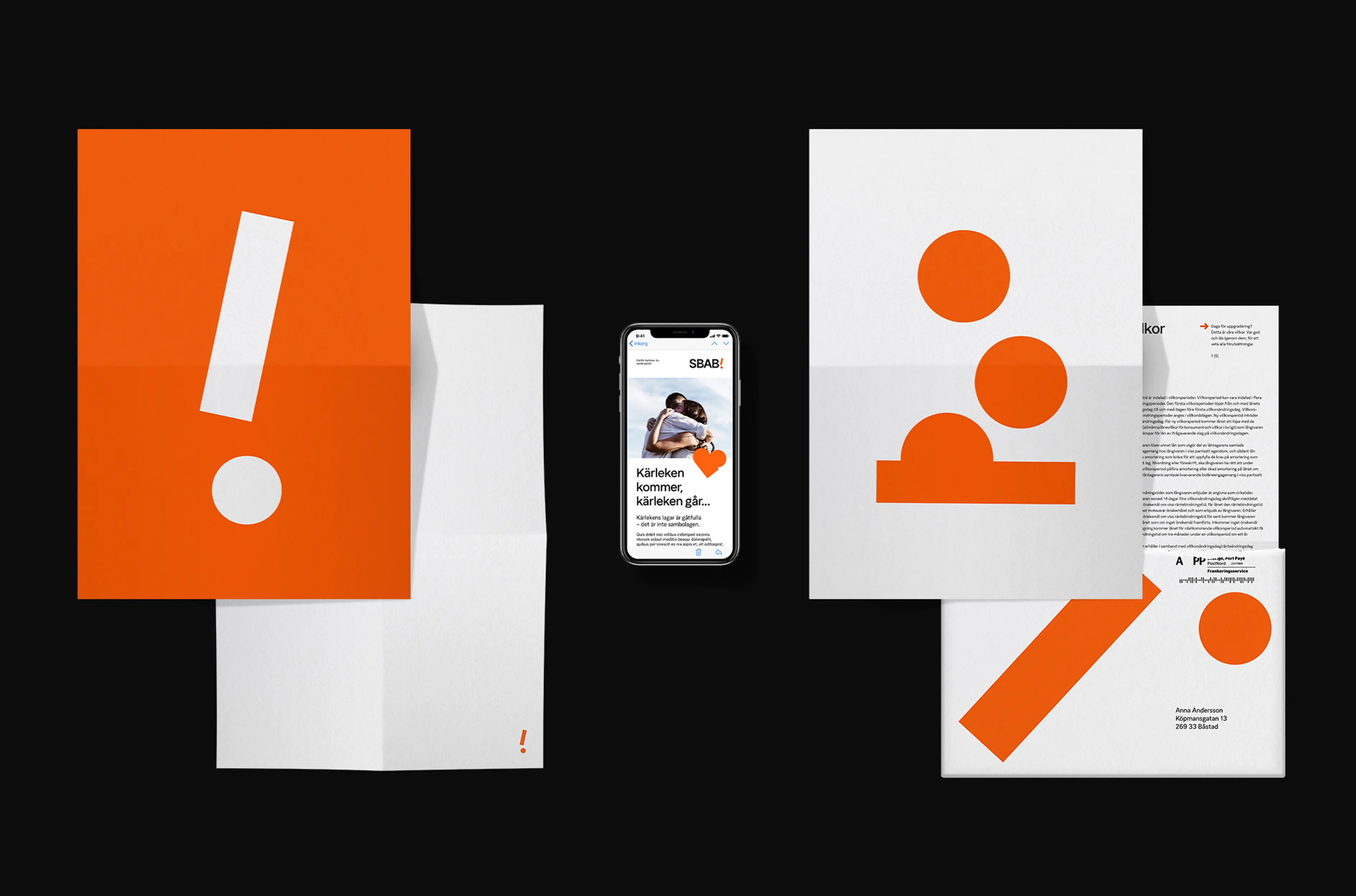
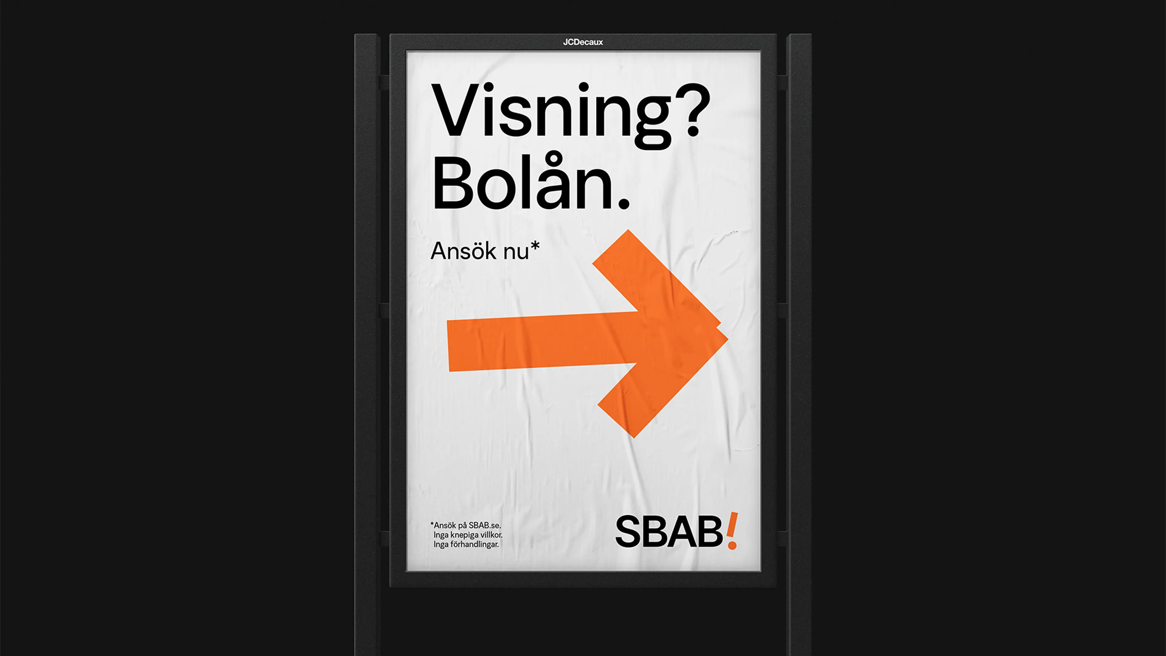
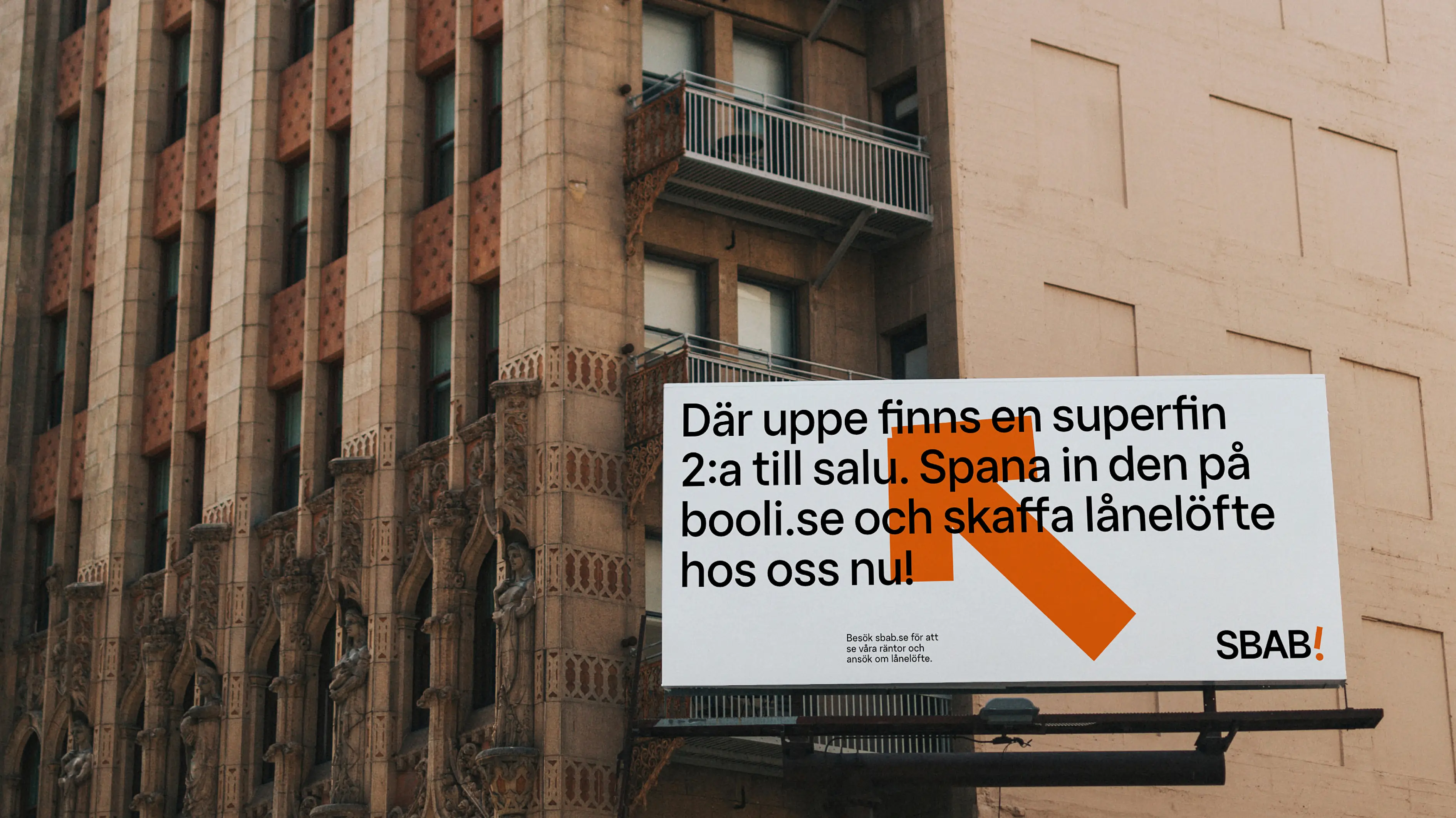
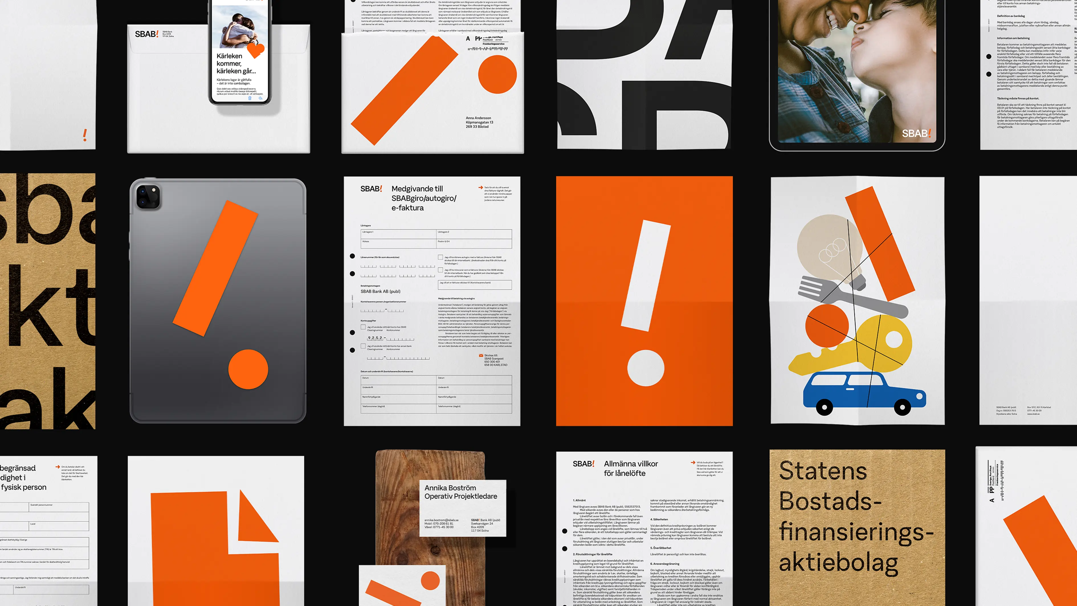
Few but hardworking elements.
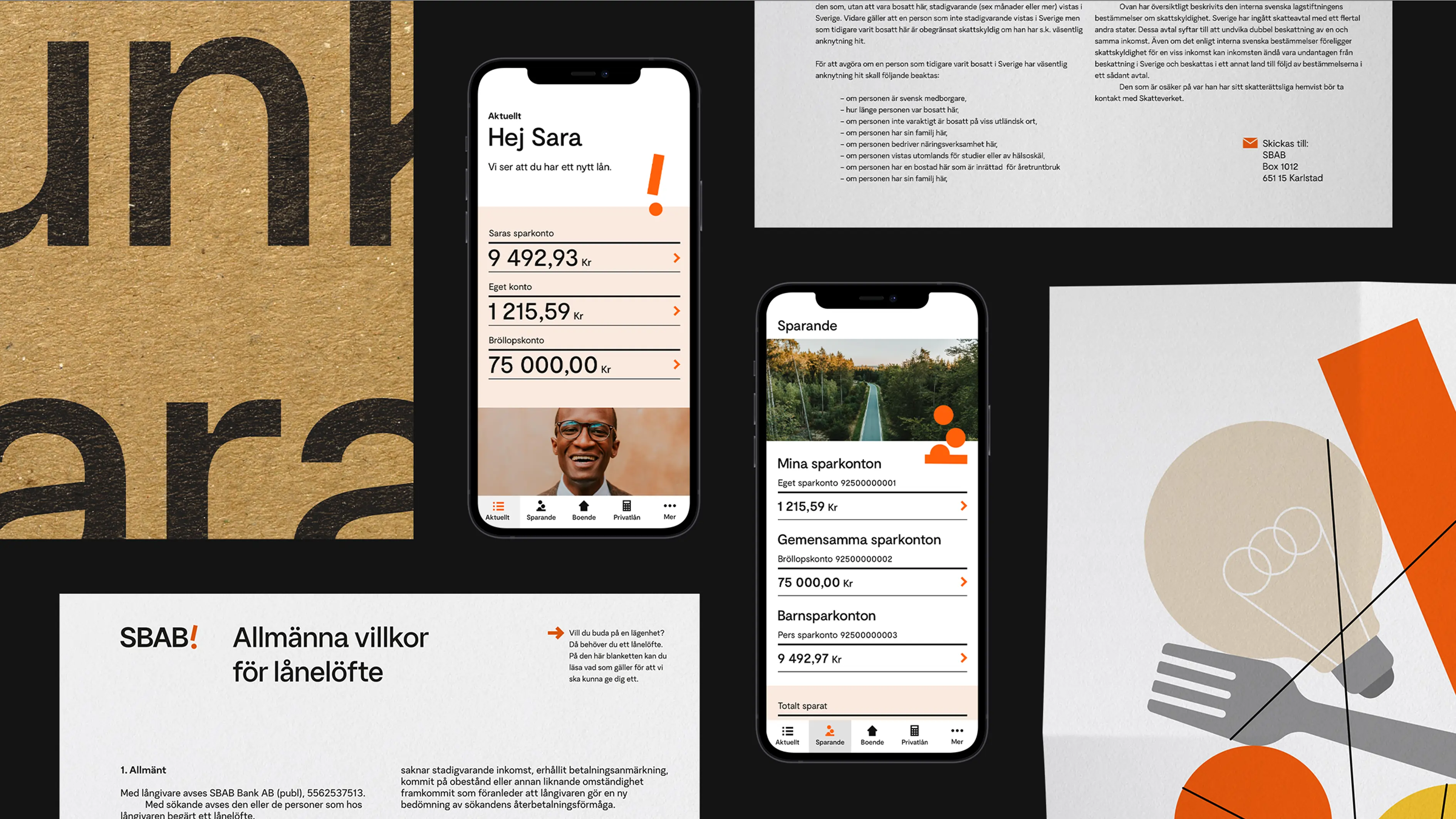
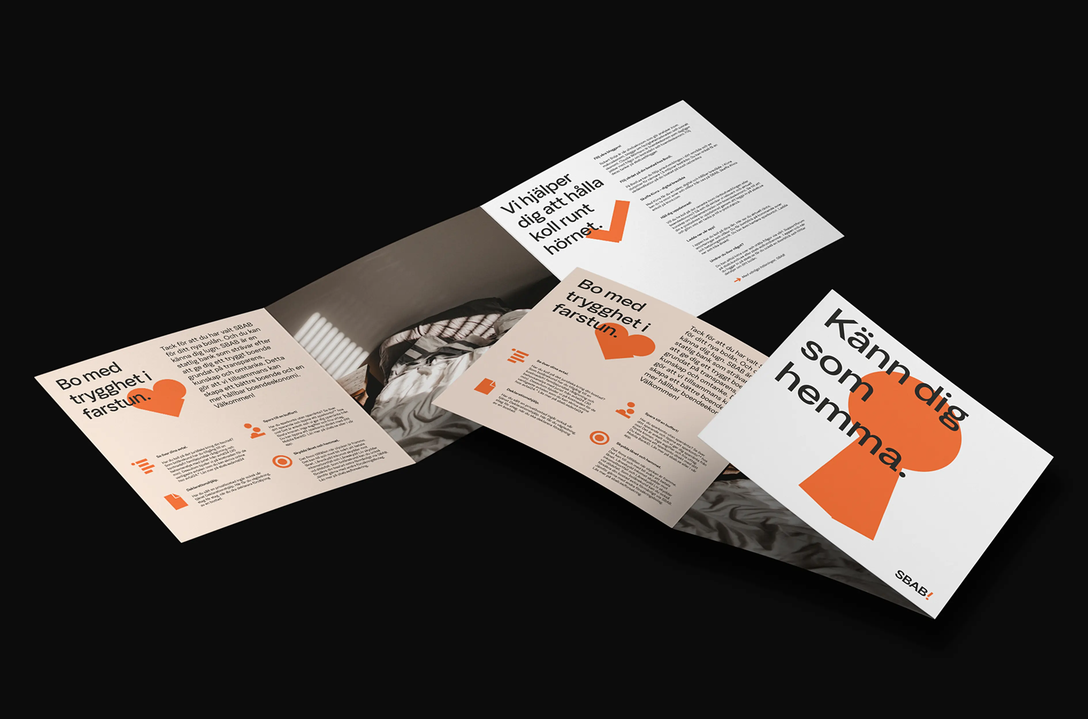
We updated not only the SBAB orange brand color, but also their exclamation mark by evolving it into a brand portfolio symbol. We created unique iconography and adding a stand-out, playful, illustration style where even the exclamation mark is present. The entire identity storytelling and the caring nature was implemented across all touchpoints including web & app, products, and services.


The impact.
Traffic increased successfully to the SBAB site by +20%, step changing cross-brand traffic, increasing awareness of the entire brand portfolio, as well as improving app rating and web lighthouse scores. The entire identity has moved SBAB to a new level of appreciation and commercial development.