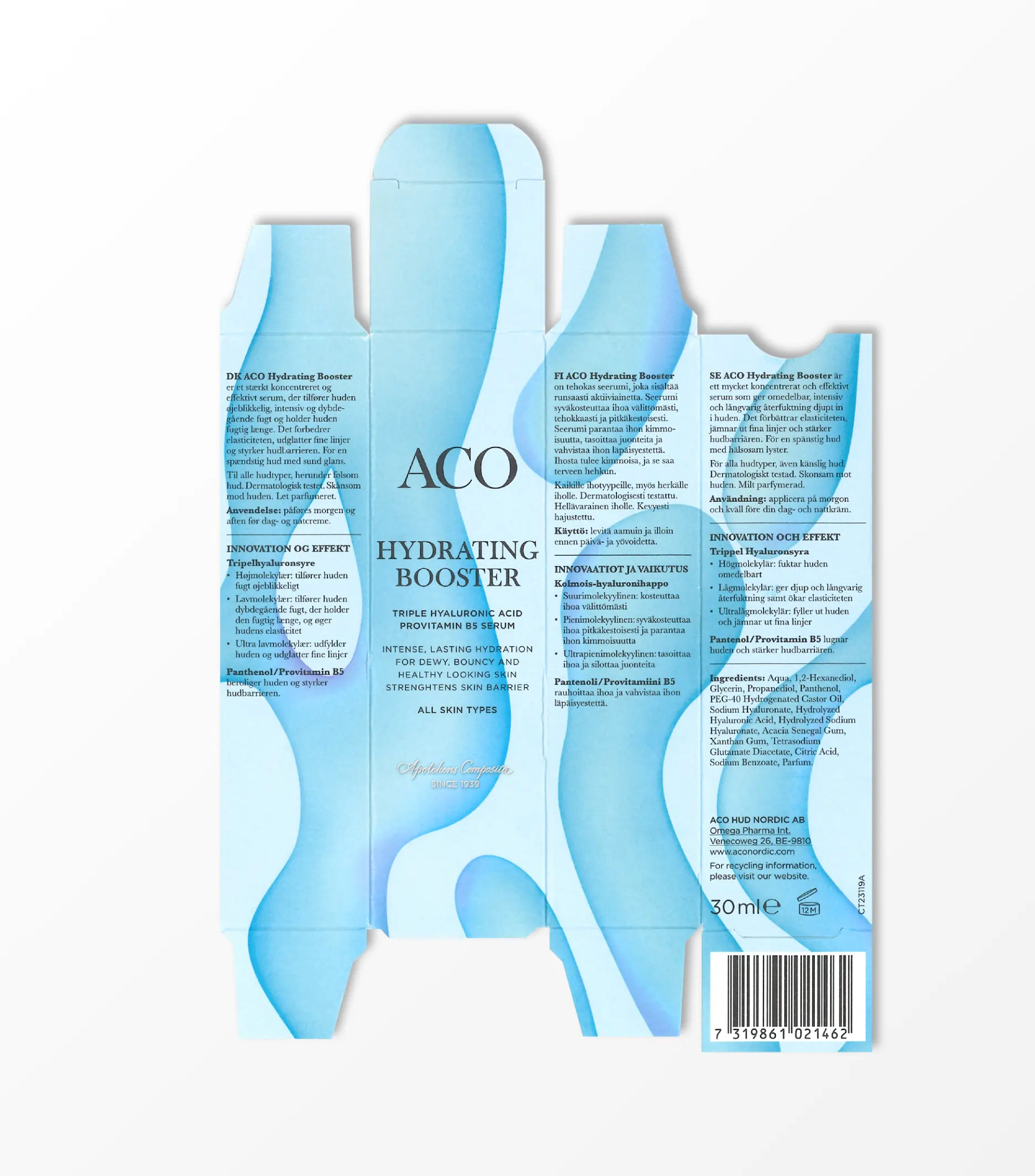
Simply effective
ACO
Brand strategy
Global brand identity
Global packaging concept
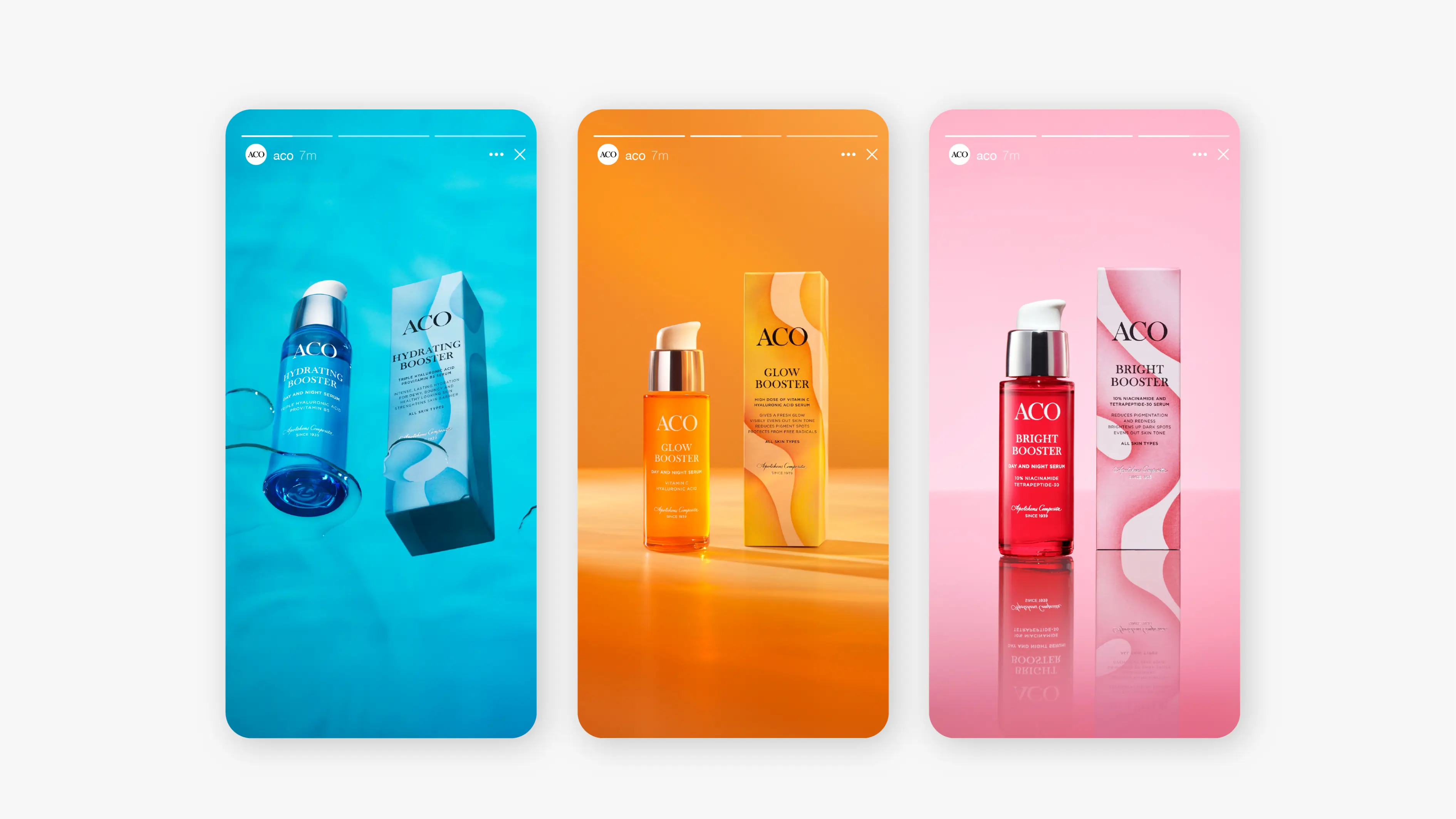
Brand portfolio strategy
Product design
Naming strategy
Information hierarchy
Global communication concept
Full production
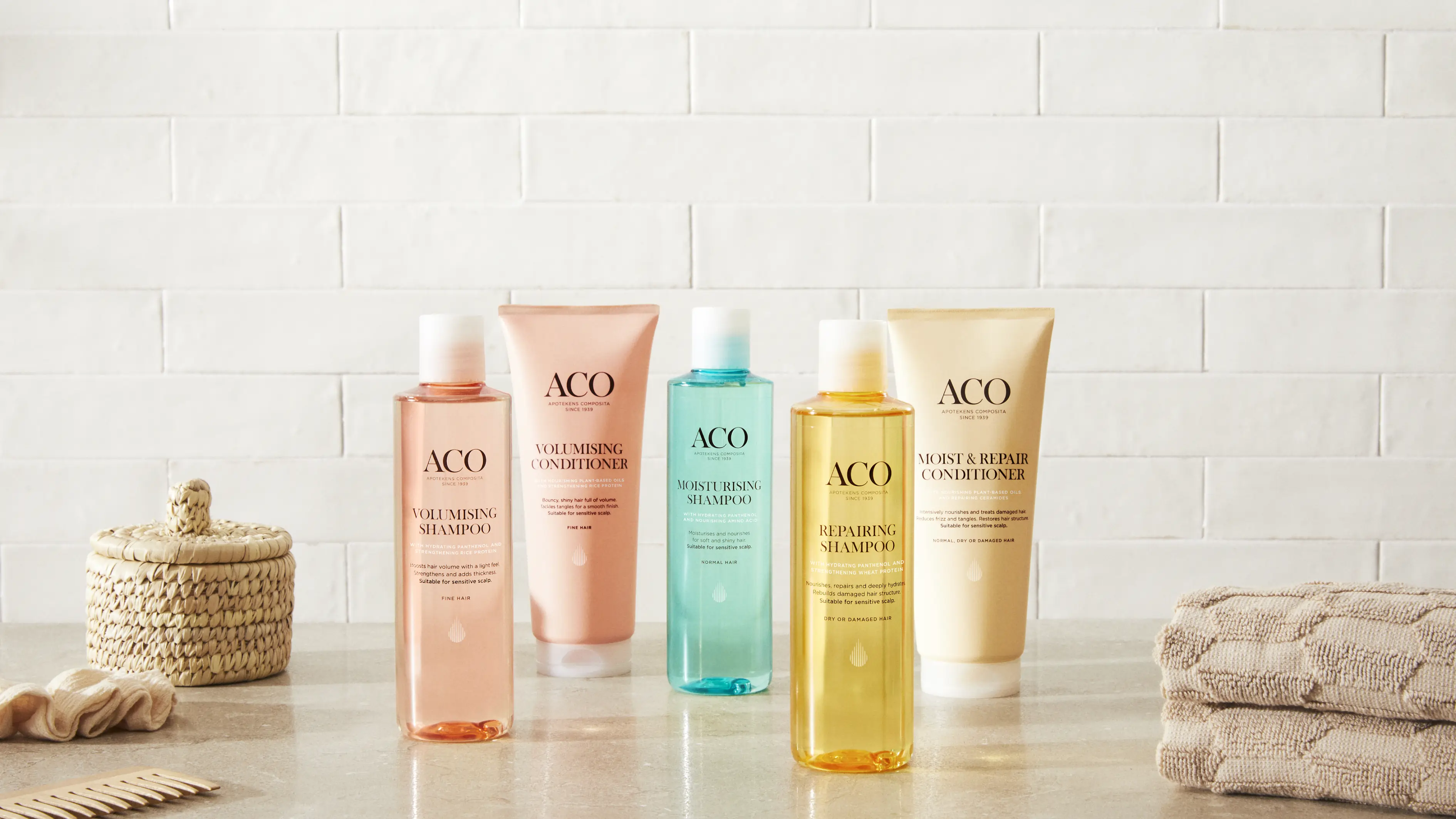
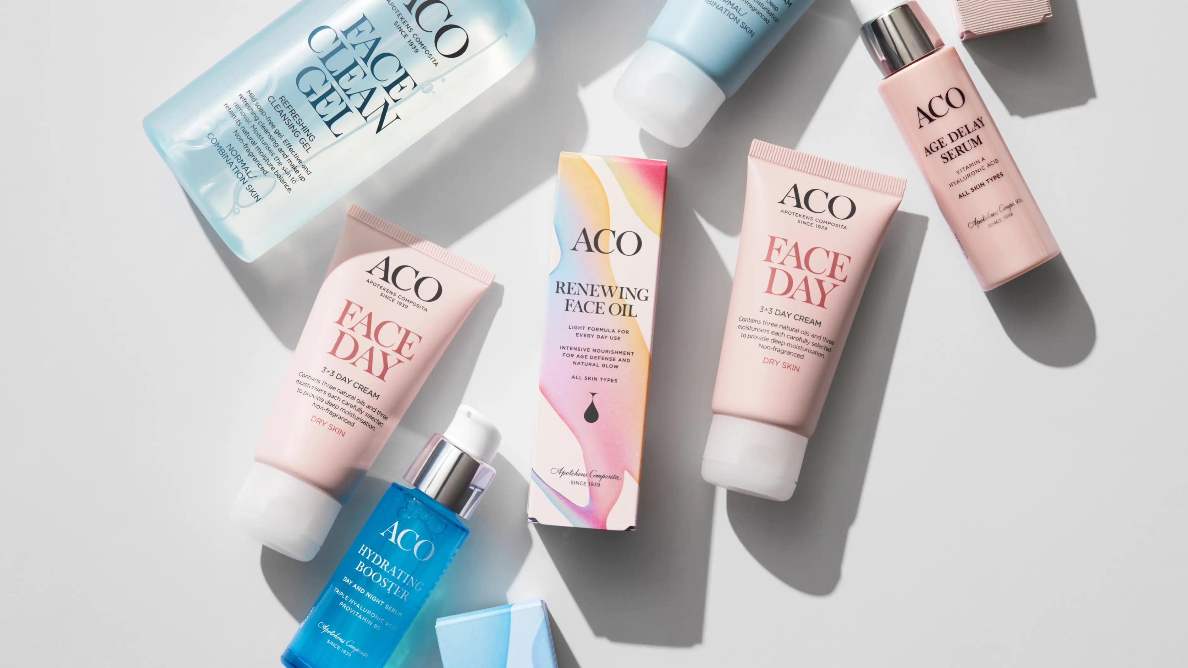
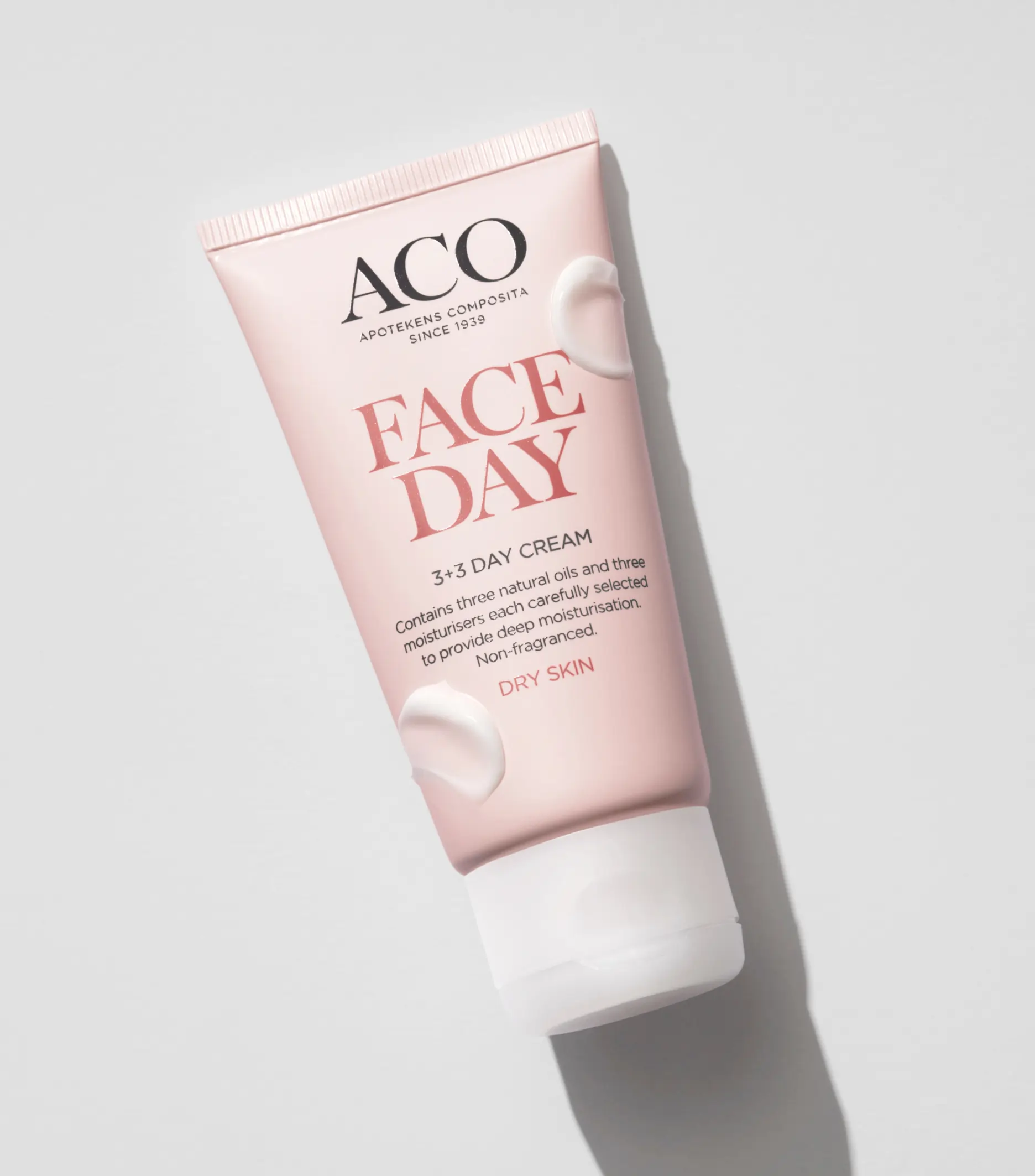
Founded in 1939, ACO stands as one of Scandinavia’s premier skincare brands, now serving customers in over seven markets worldwide. With a continually expanding product range to meet the ever-evolving needs of our consumers, ACO maintains its prominence and top-of-mind presence through a brand identity and design that embodies simplicity and effectiveness – Simply effective.

Strategy informs identity
The strategic brand concept, “Simply effective” not only reflects the products but also embraces ACO’s heritage and drives the development of a contemporary Scandinavian design expression.

Few but hardworking elements
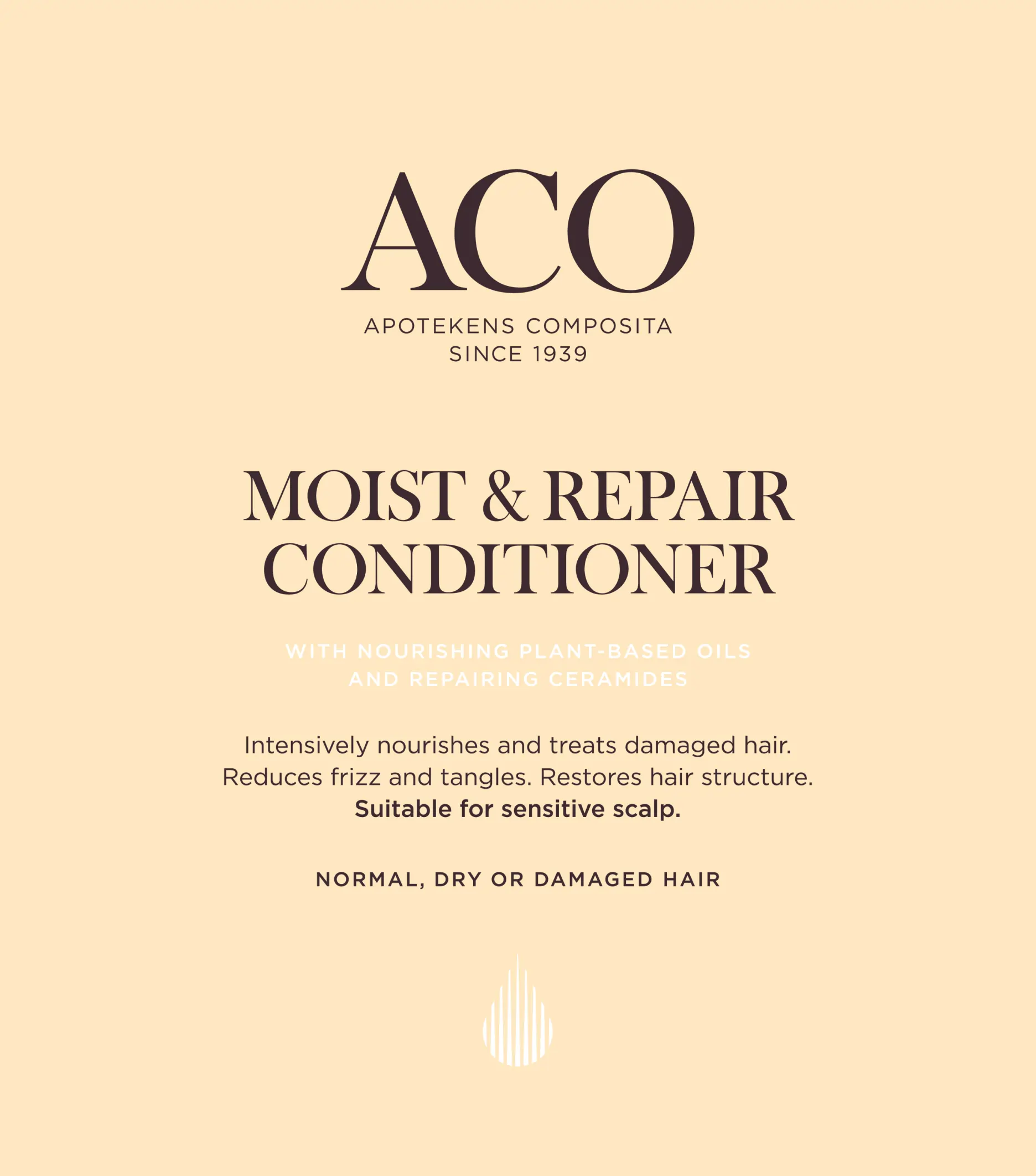
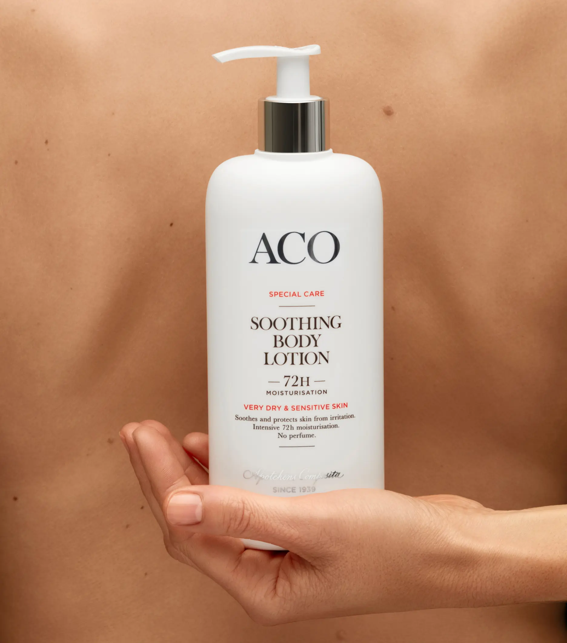
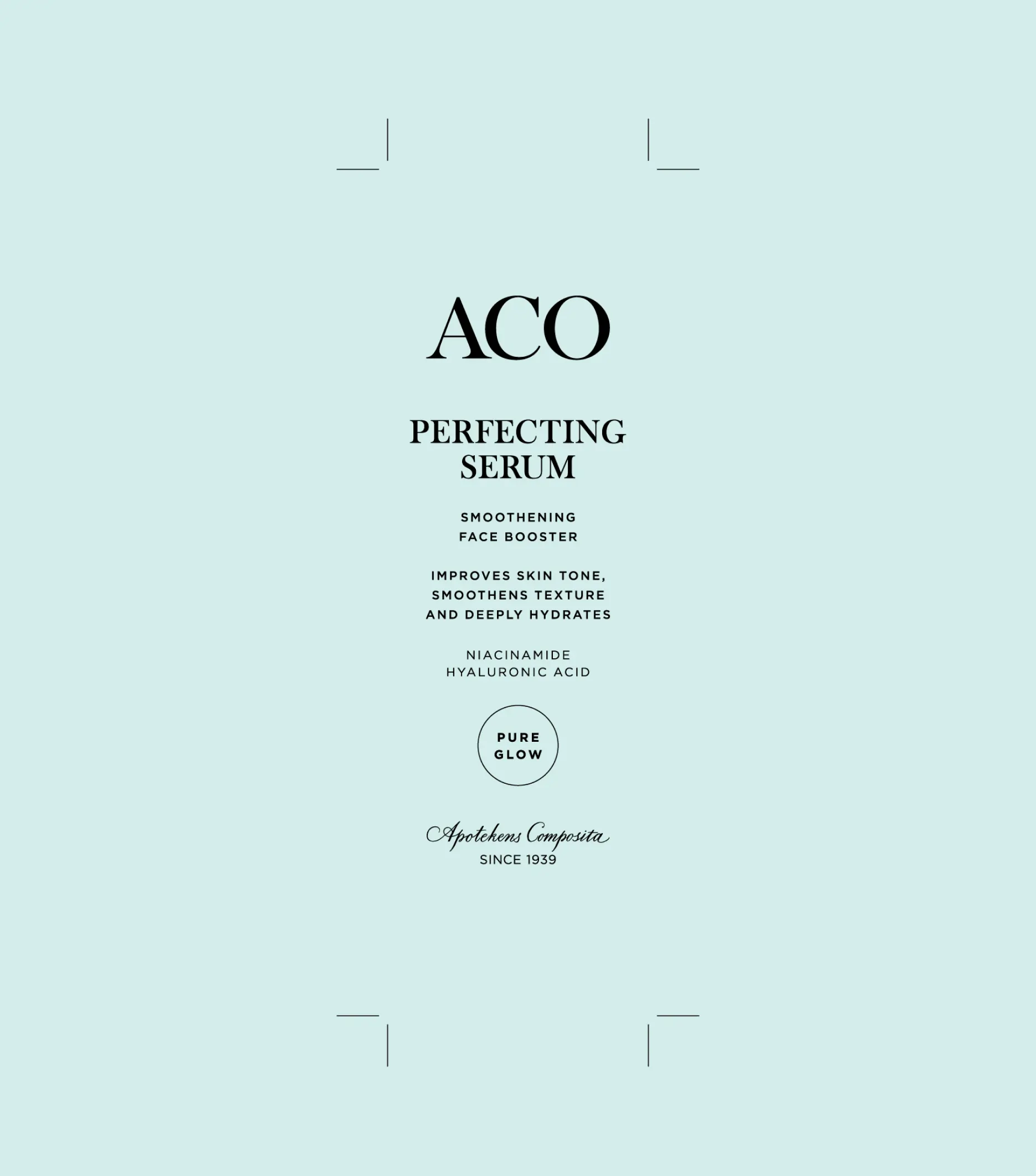
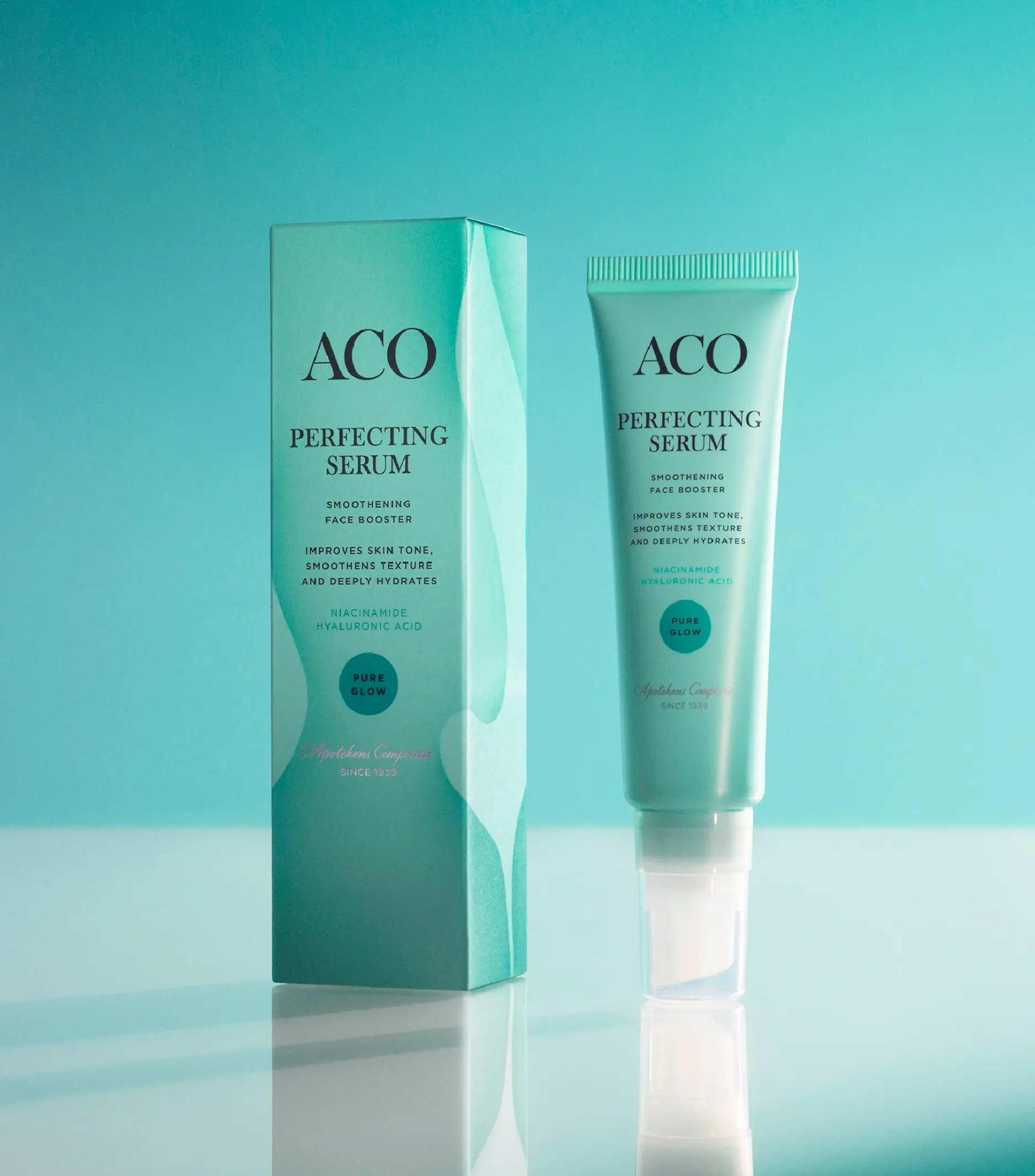
We developed a solid visual foundation, consistent across the portfolio, featuring a modern, elegant, and sophisticated wordmark prominently displayed at the center of the identity. This was complemented by well-defined typographic hierarchies and tactile colors that clearly differentiate between product ranges and price levels.


The impact
Since the initial repositioning and redesign in 2018, ACO has not only managed to stay at the forefront of the industry but also experienced a sales increase of 82%, awareness growth from 83% to 91%, and consideration from 56% to 67%. Quite impressive for an 85-year-old skincare brand.