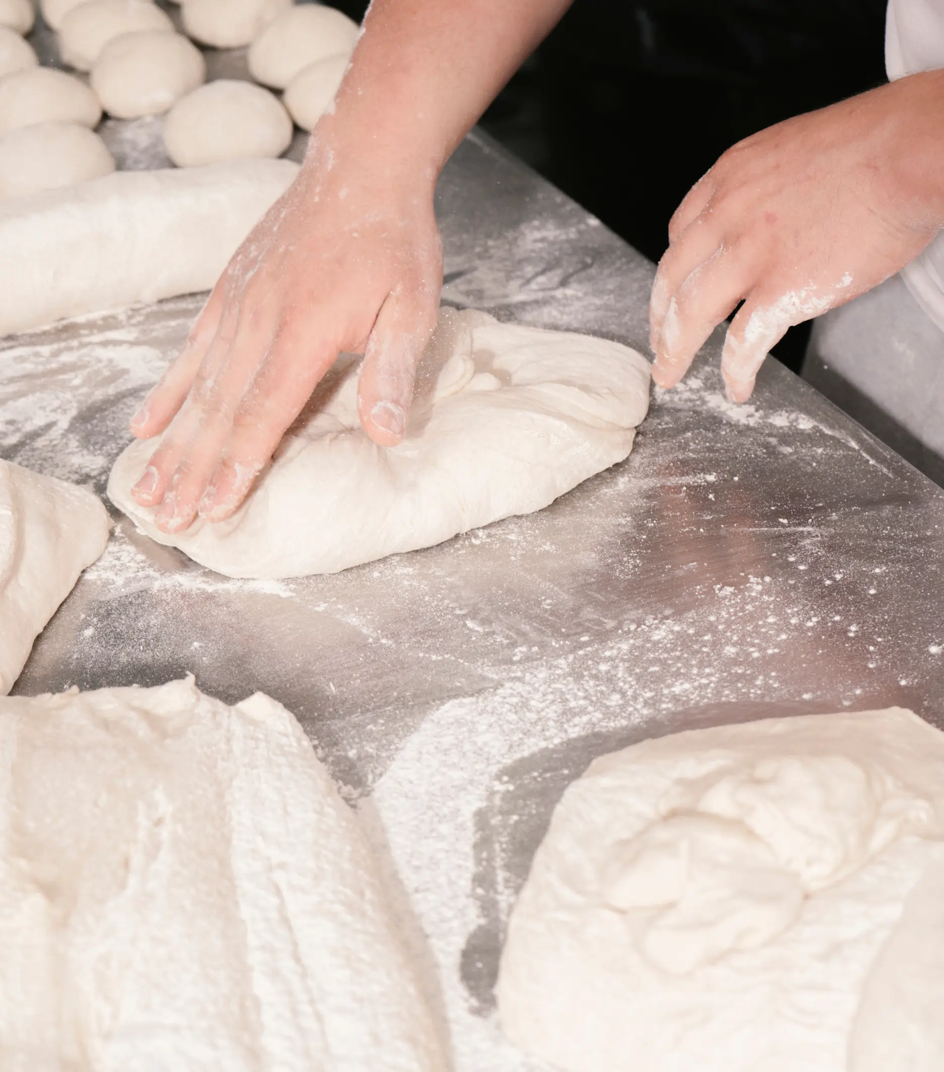
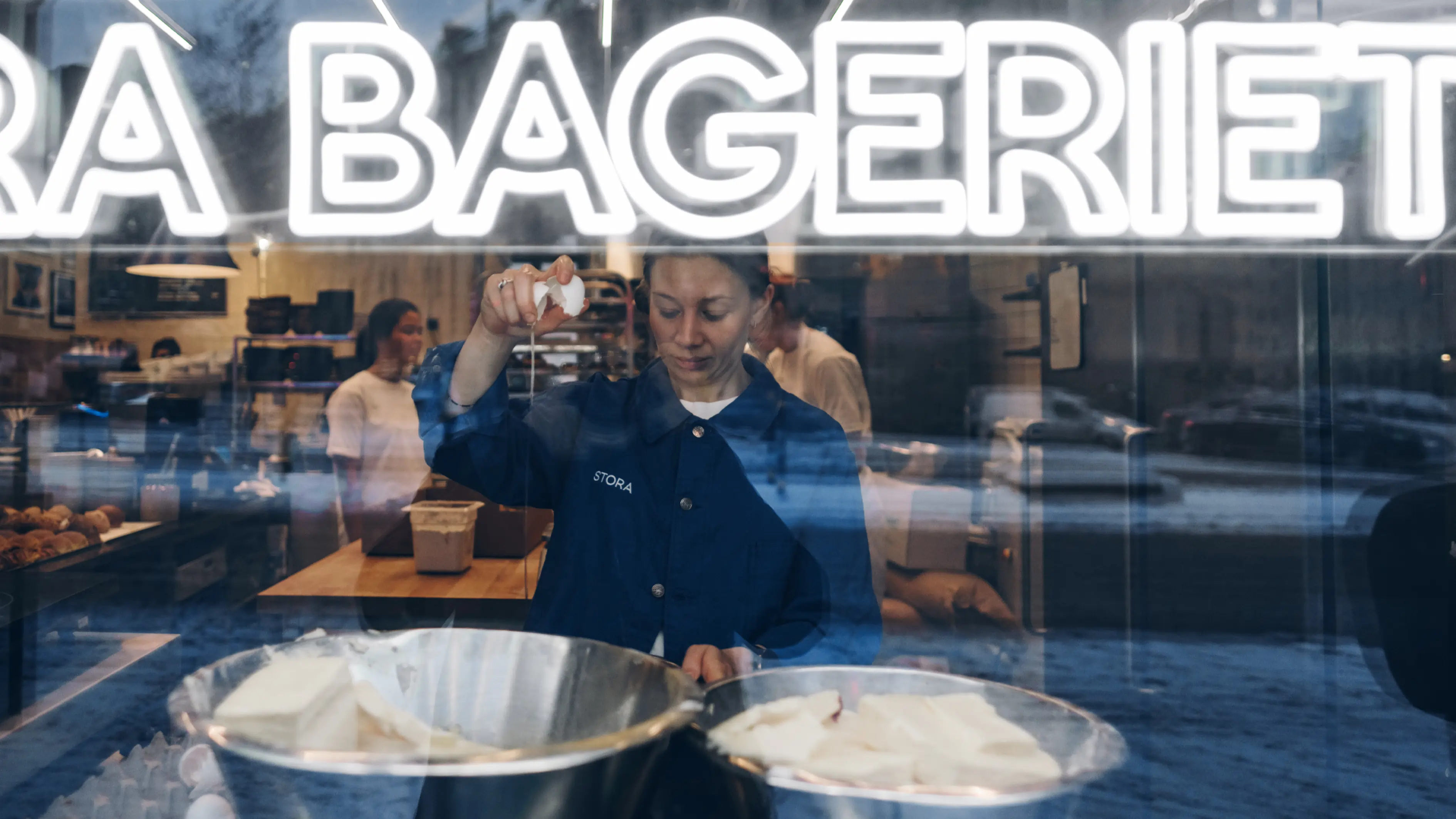
The hands behind the handcraft
Stora Bageriet
Brand identity
Design strategy
Brand implementation
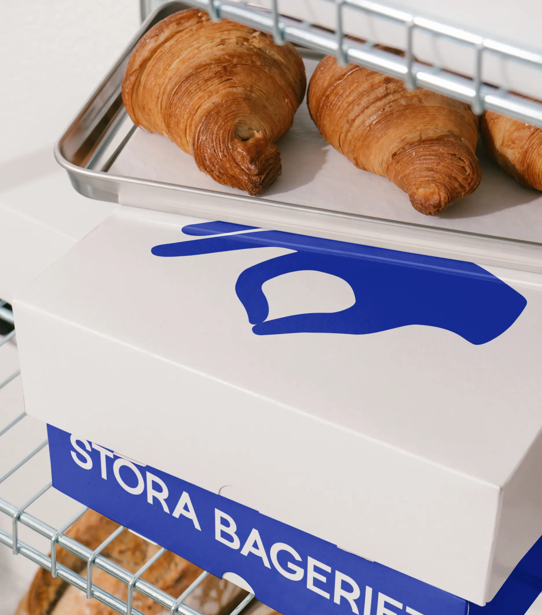
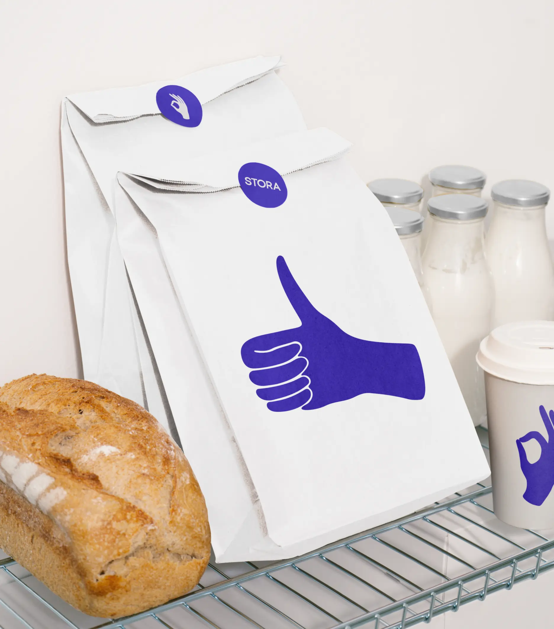
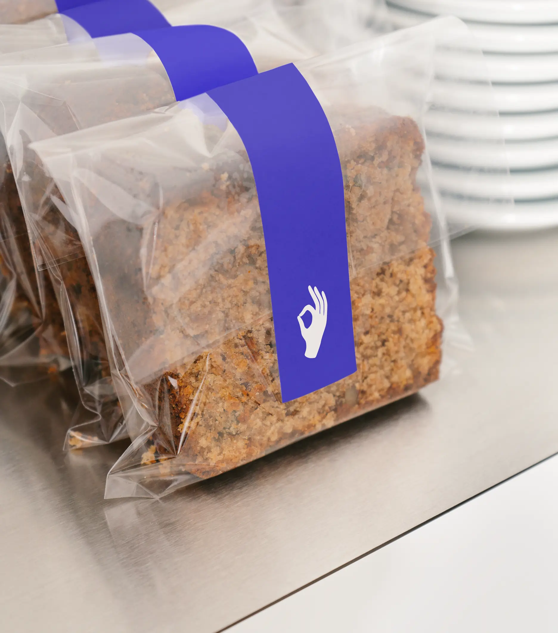
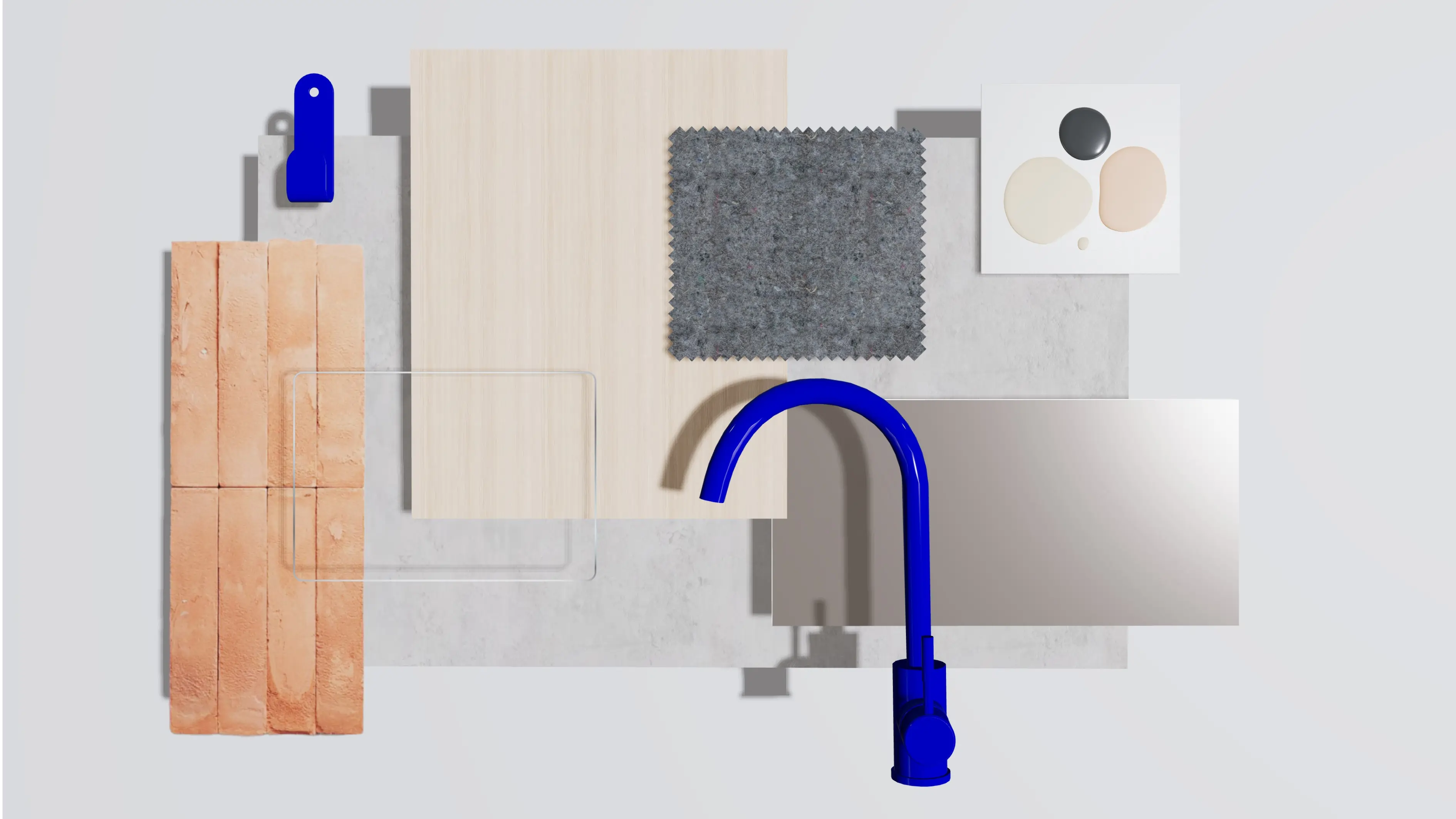
Packaging
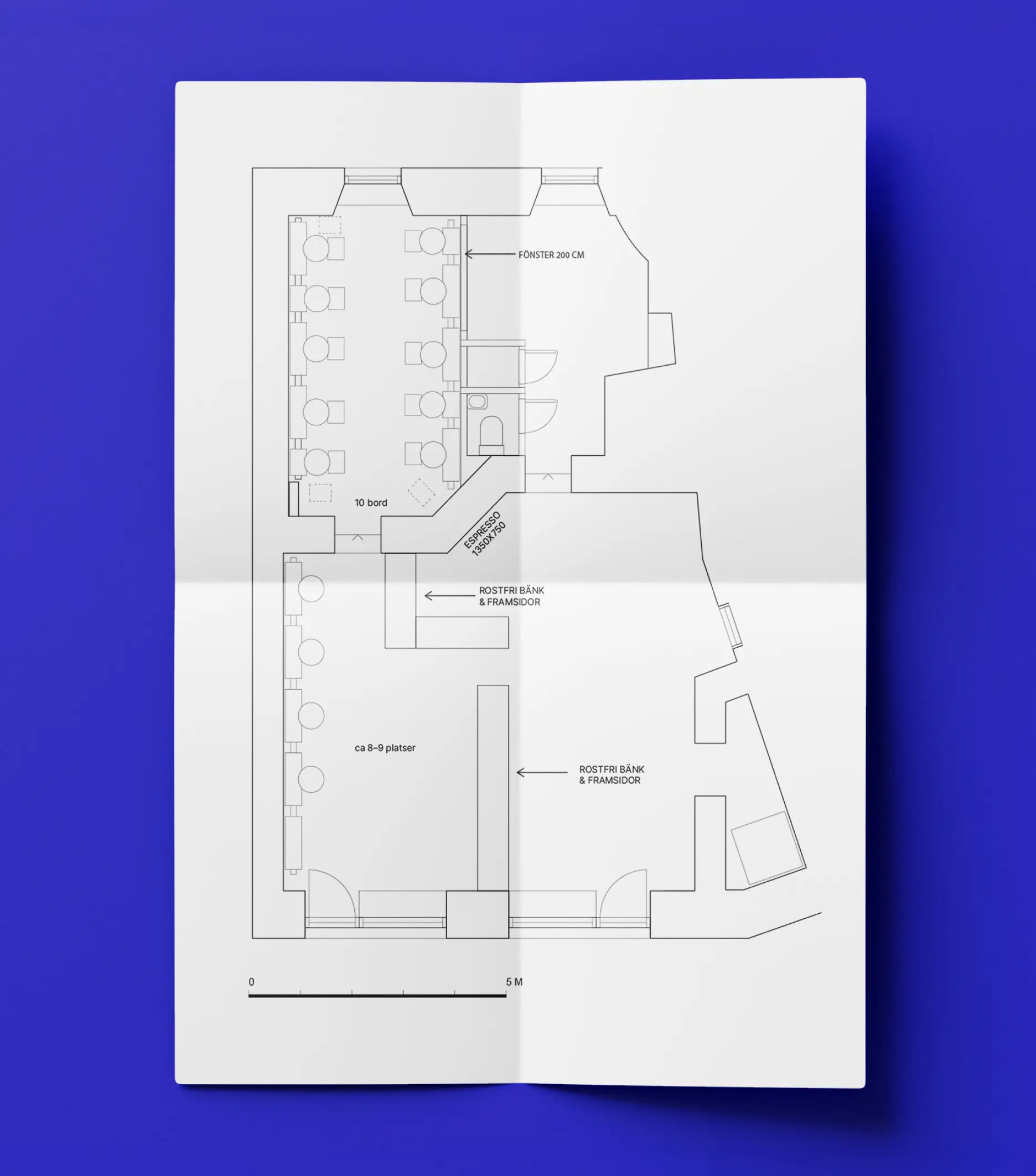
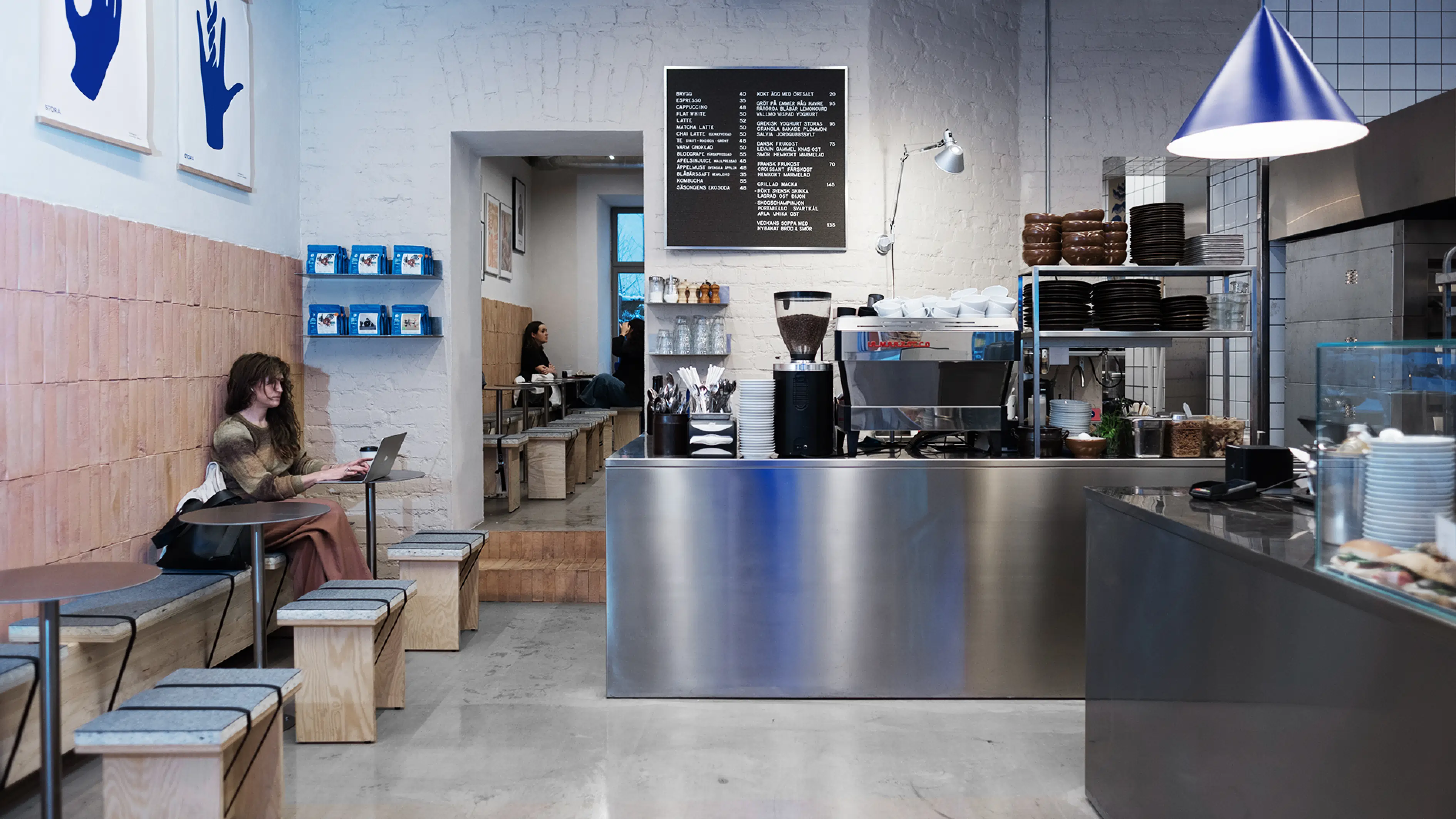
Spatial brand experience
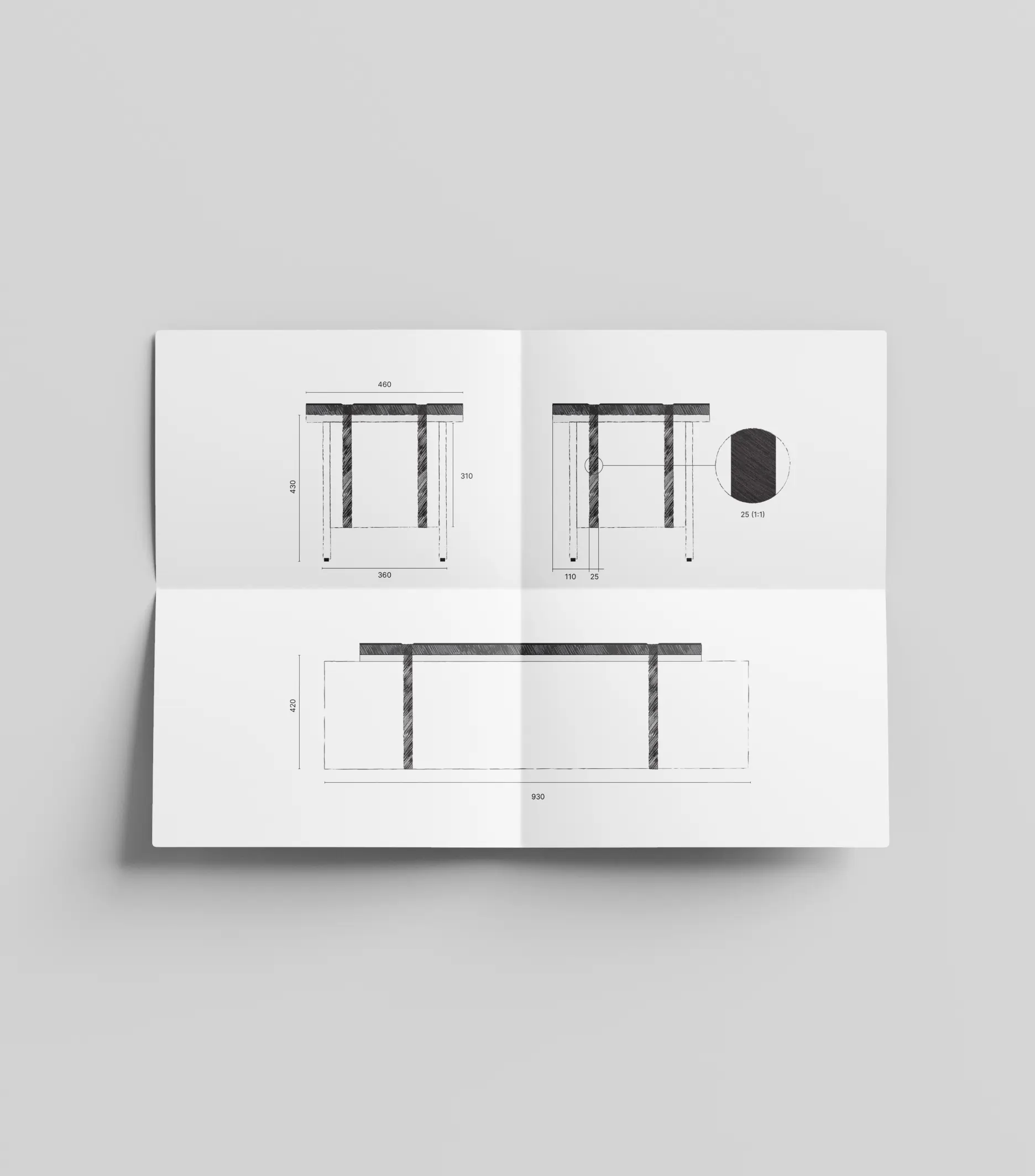
Interior design concept
The last thing Stockholm needed was another sourdough bakery—but when a space with baking history dating back to the 1600s was revived, it deserved something special. The concept was rooted in true craftsmanship, premium ingredients, and an aesthetic with European flair. To stand out, the identity needed to celebrate the artistry of baking in a way that felt fresh and bold.
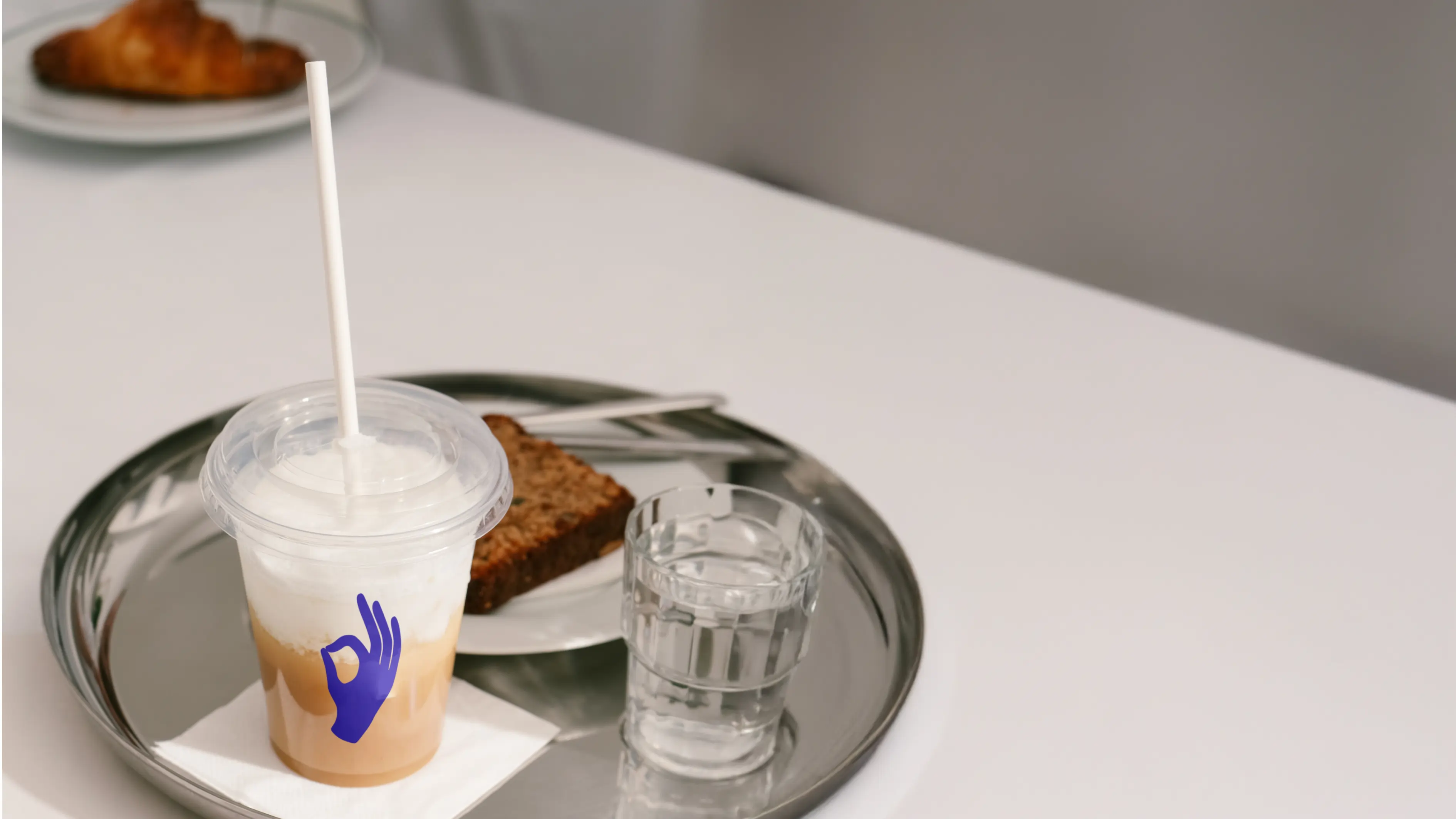
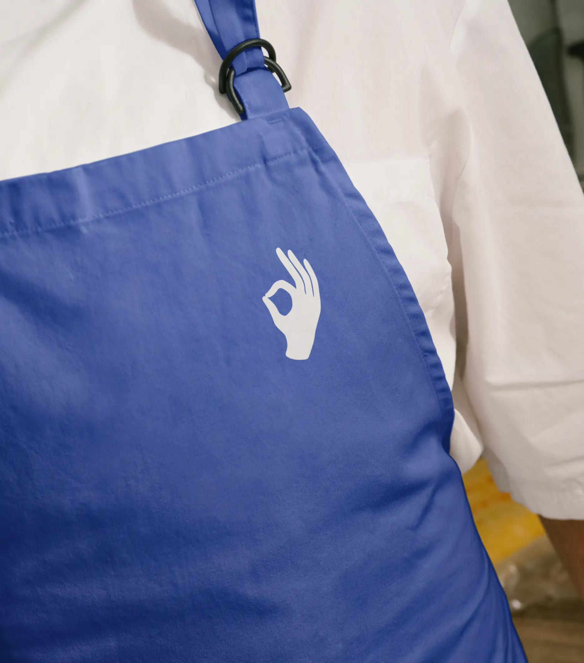
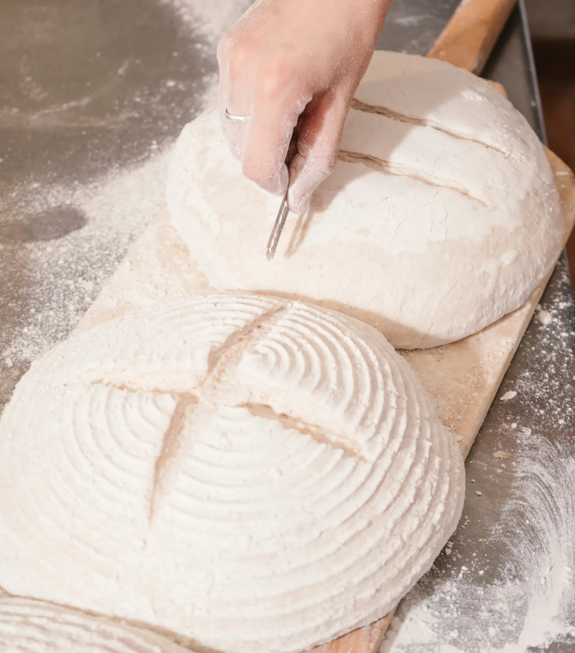
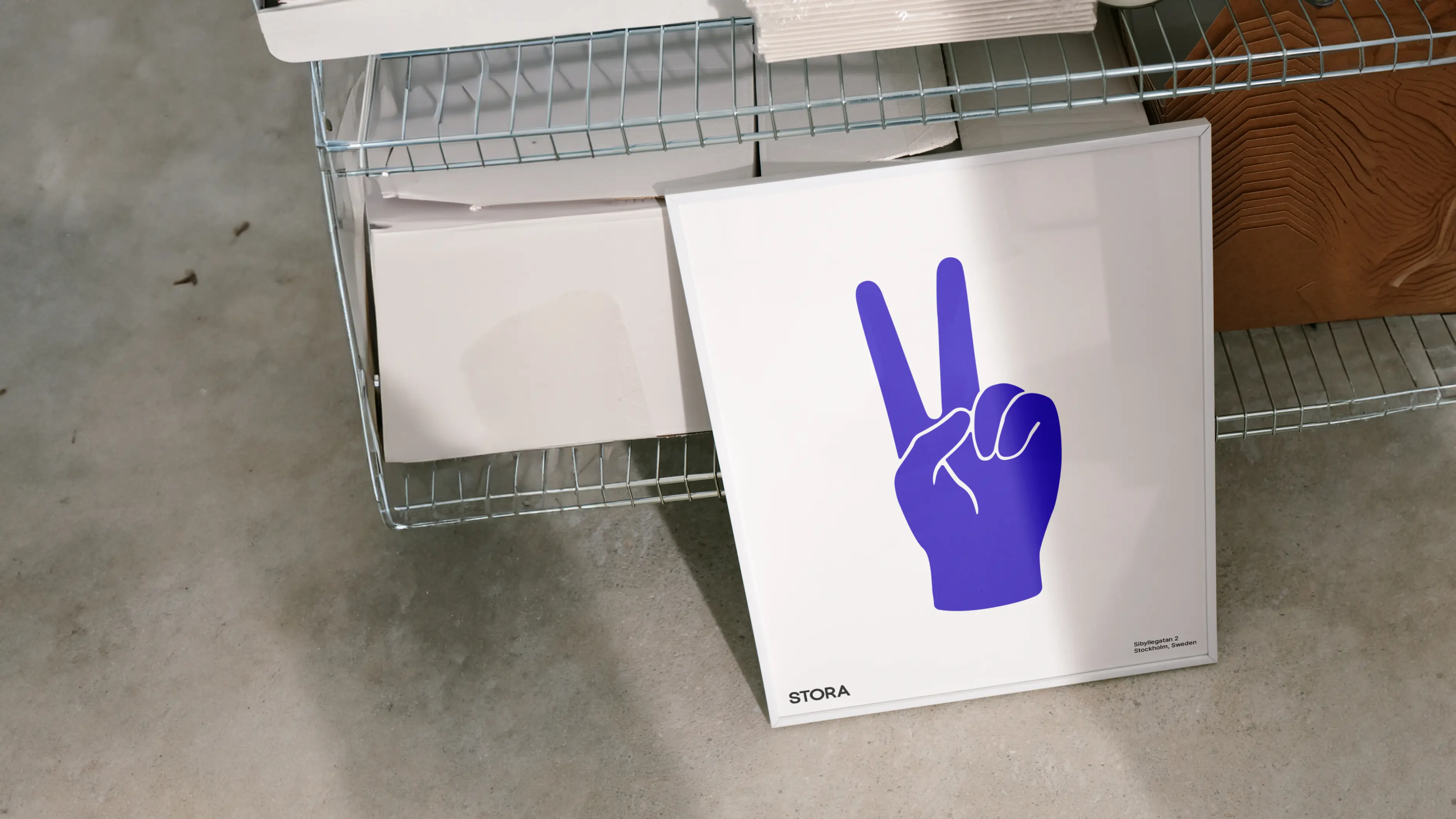
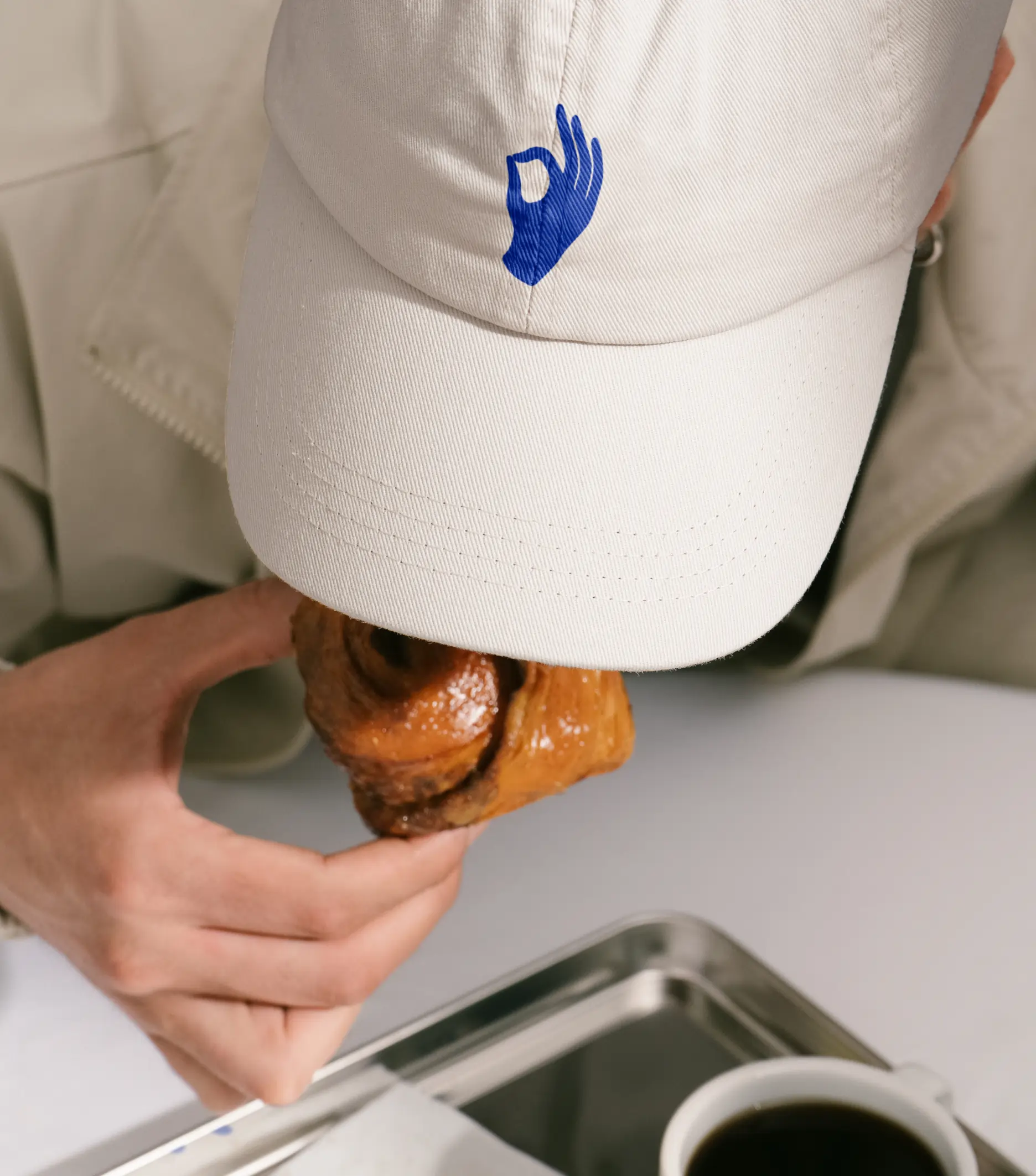
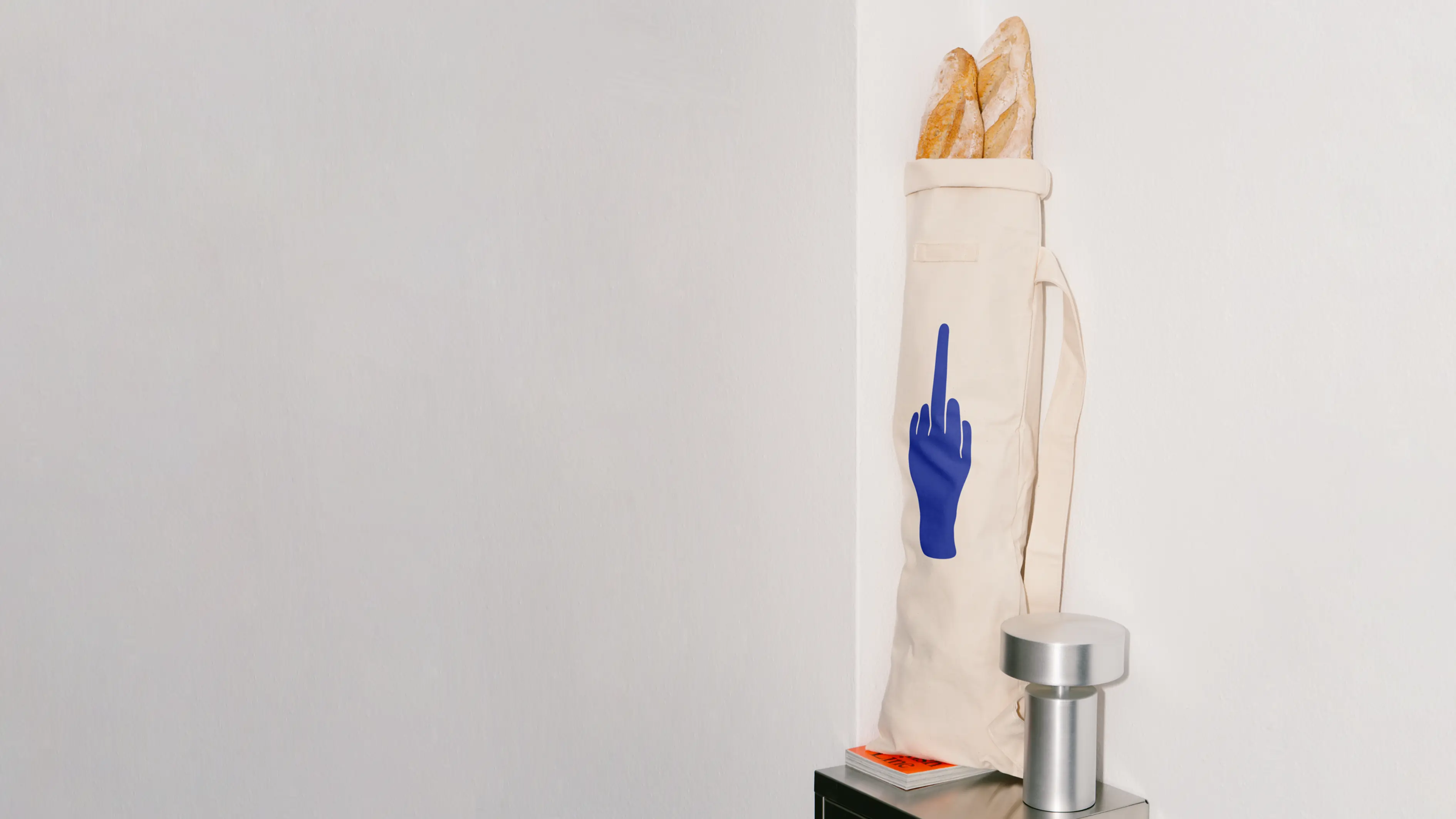
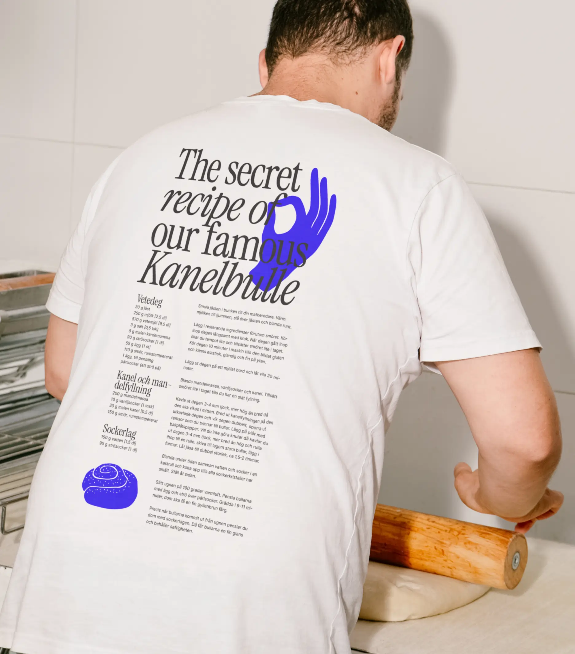
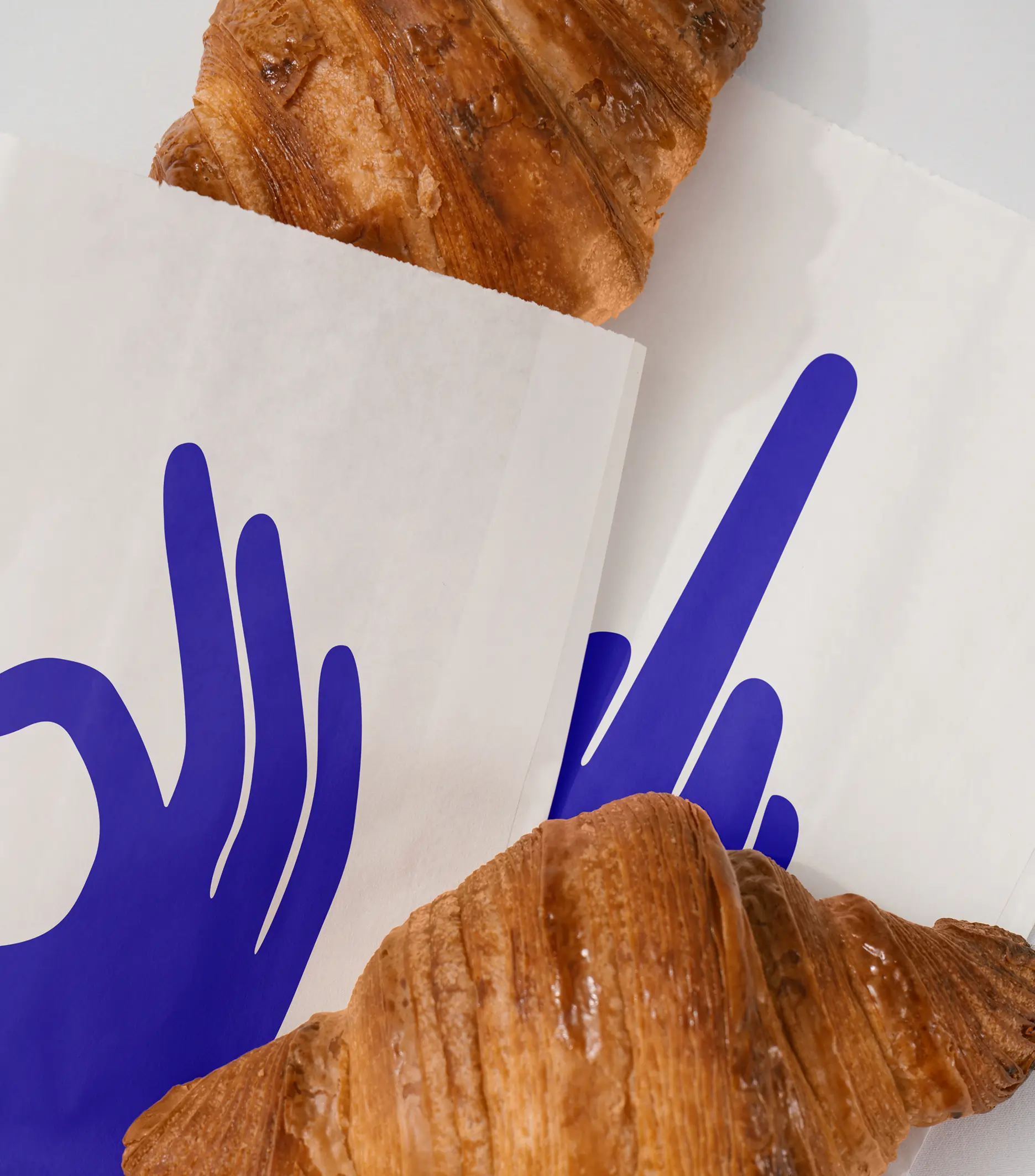
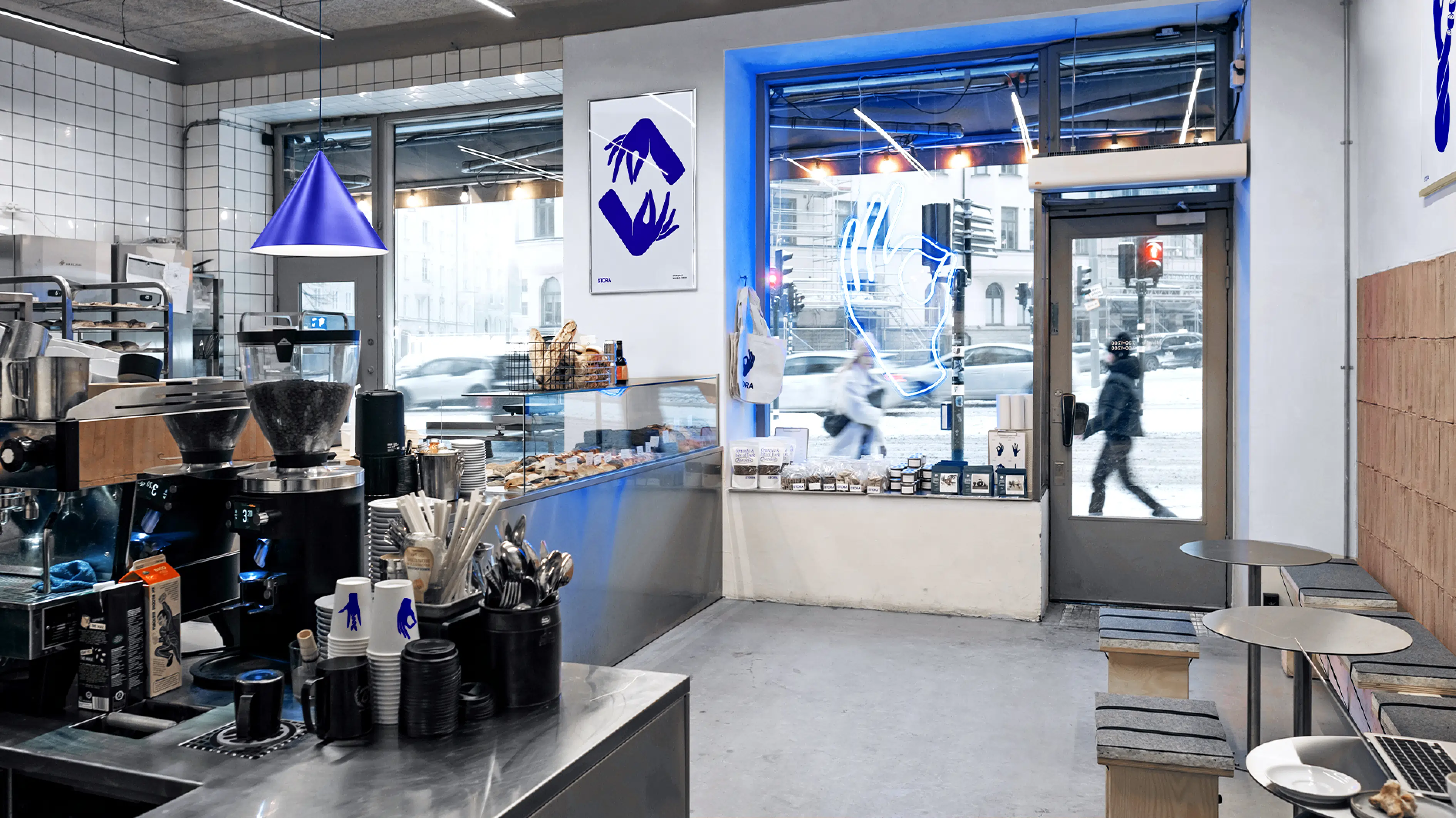
We focused on the hand—symbol of one of the oldest crafts still alive. Baking is human, tactile, and precise. It’s about skilled hands kneading, shaping, and decorating every day. That idea became the core of the visual identity: expressive illustrations of hands in motion, capturing the genuine, slightly punk spirit of the bakery. Honest, humorous, and approachable.
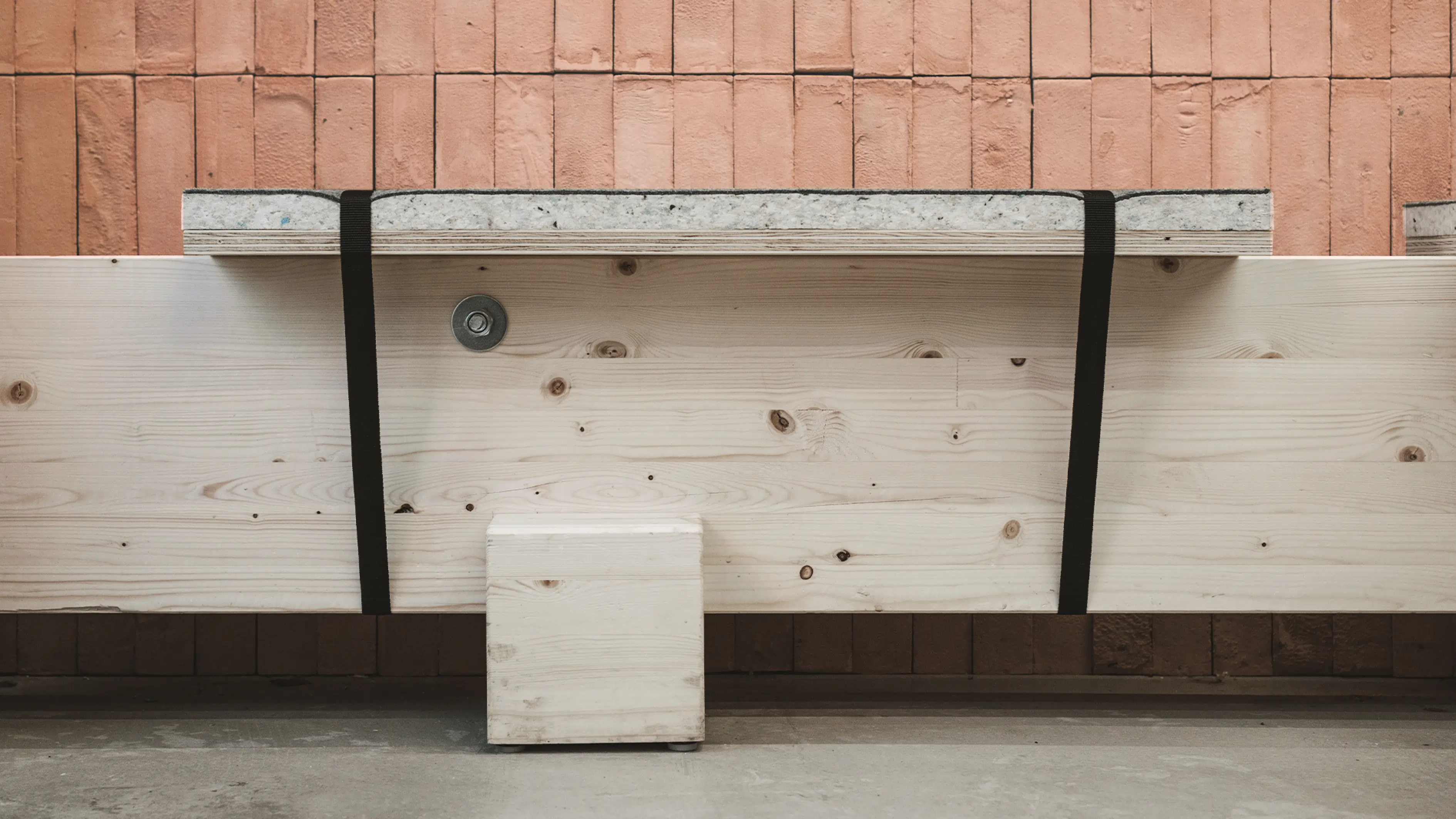
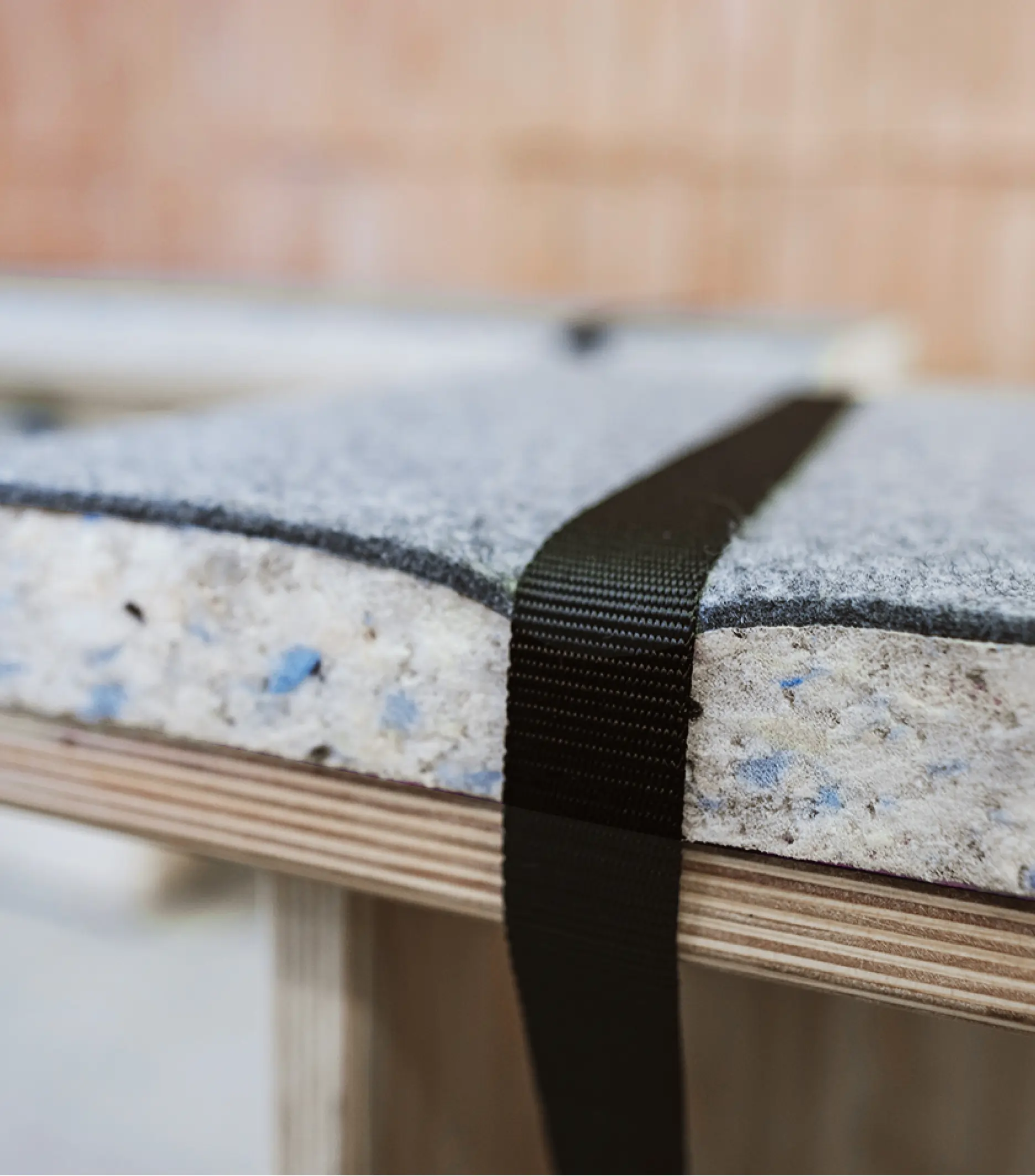
The interior reflects this duality. On one side: the bakery itself—clean, industrial, precise, with stainless steel and white flat tiles. On the other: the customer space—raw, warm, and tactile, with handmade ceramic tiles and benches made of thick, untreated pine. Together, they represent the balance between technical skill and handcrafted soul.
Design-wise, inspiration came from porcelain detailing and old flour sack aesthetics. A clean white base paired with cobalt blue created a timeless yet lively look. The hand illustrations became central to the brand and sparked demand for merch—now, that iconic blue hand pops up on both social media and the streets of Stockholm.
A modern take on tradition, crafted to connect with a trend-aware audience.