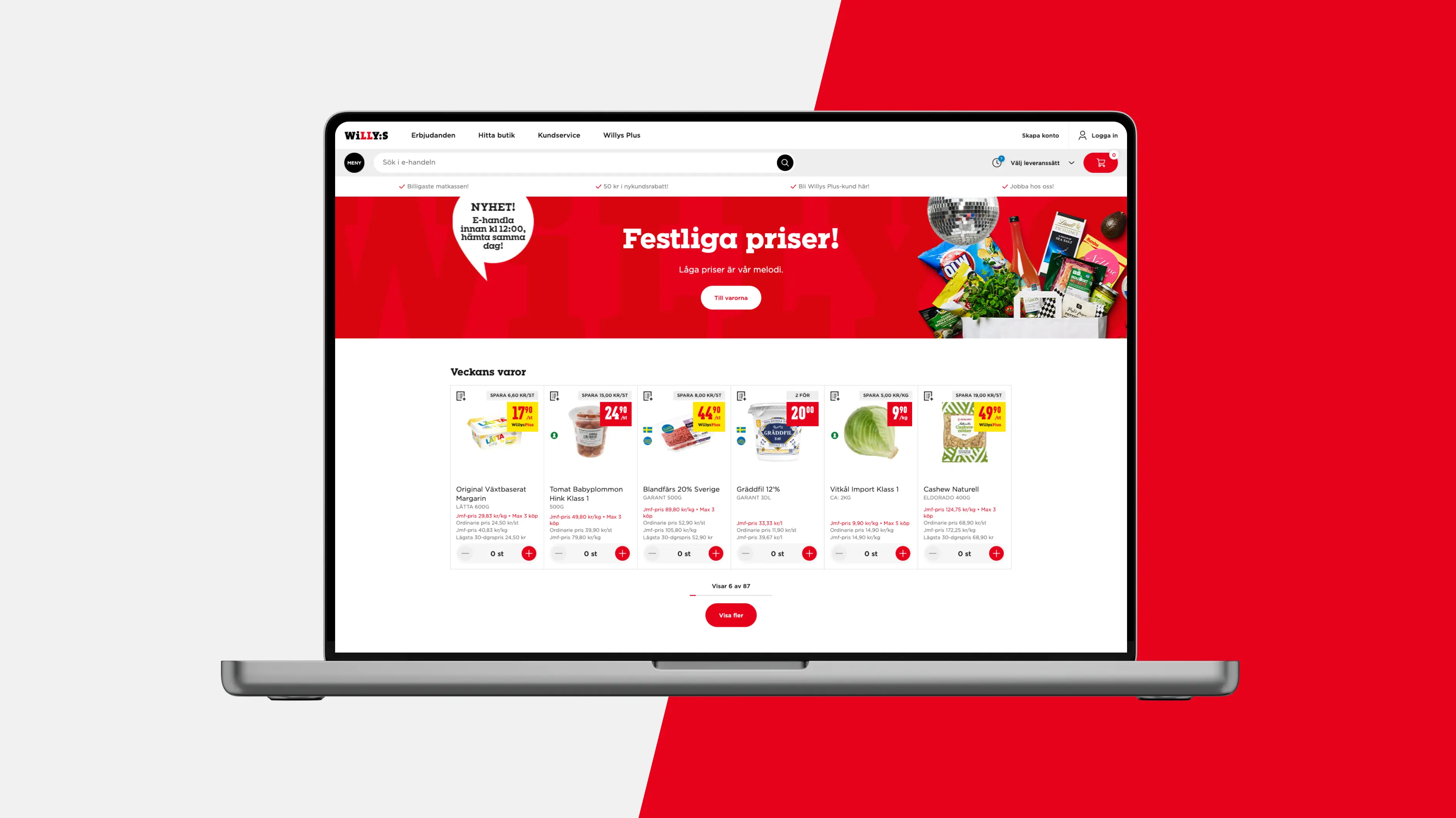
E-Commerce experience
Willys
Digi-physical
Brand experience
UX design
UI design
User test and prototypes
Customer journey mapping
UX copy
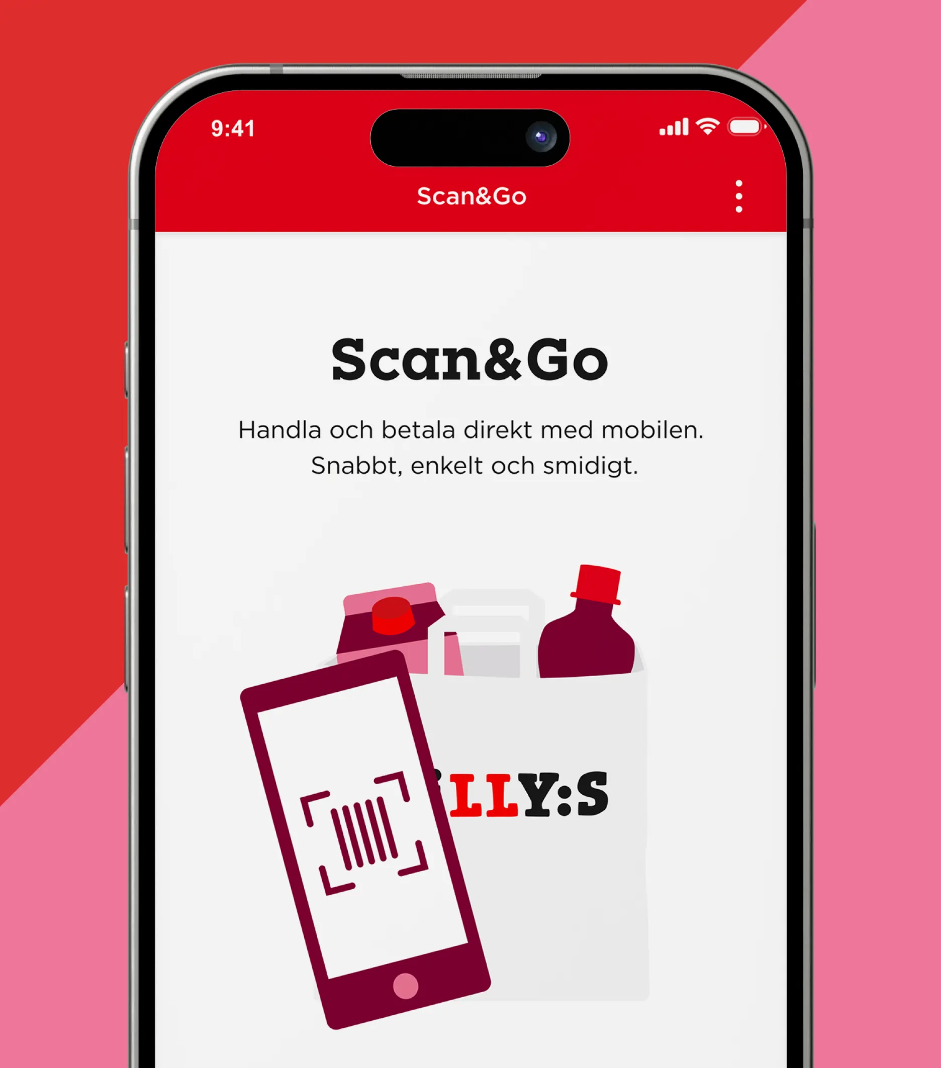
Building on our prior experience with growing Willy's brand – one of Sweden’s largest grocery store chains – our insights and expertise have facilitated a seamless integration of digital and physical brand experiences. This has successfully enriched the brand identity and enhanced overall brand perception for Willy’s customers. This remains consistent across all touchpoints, whether in store, through advertising and communication, or via Willy's increasingly important digital channels, such as the e-commerce site, the Willy's App, or when utilizing Scan & Go for a swift and convenient in-store shopping experience.

Strategy informs identity
A significant part of our work is insight-driven, concentrating on pinpointing pain points and opportunities within the customer journey across diverse digital channels. By conducting UX research, customer interviews, analyzing feedback, and mapping, we acquired an essential understanding of user's shopping experiences and the overarching lifestyle factors impacting their routine shopping habits. Guided by these insights, the design process encompassed brainstorming sessions, user testing, and prototyping to guarantee our design resolved the identified pain points and introduced new opportunities.


Few but hardworking elements
By integrating scanning technology to streamline the payment process in the Scan & Go feature of the app, and by extending and enhancing the 'Hämta' service - Shop Online & Pick Up In-Store – we have significantly increased convenience and customer satisfaction. This ultimately elevates the digi-physical experience for the Willy’s shopper.