Spaces falling into place
Easypark
Visual identity
Digital design and brand site
Signage
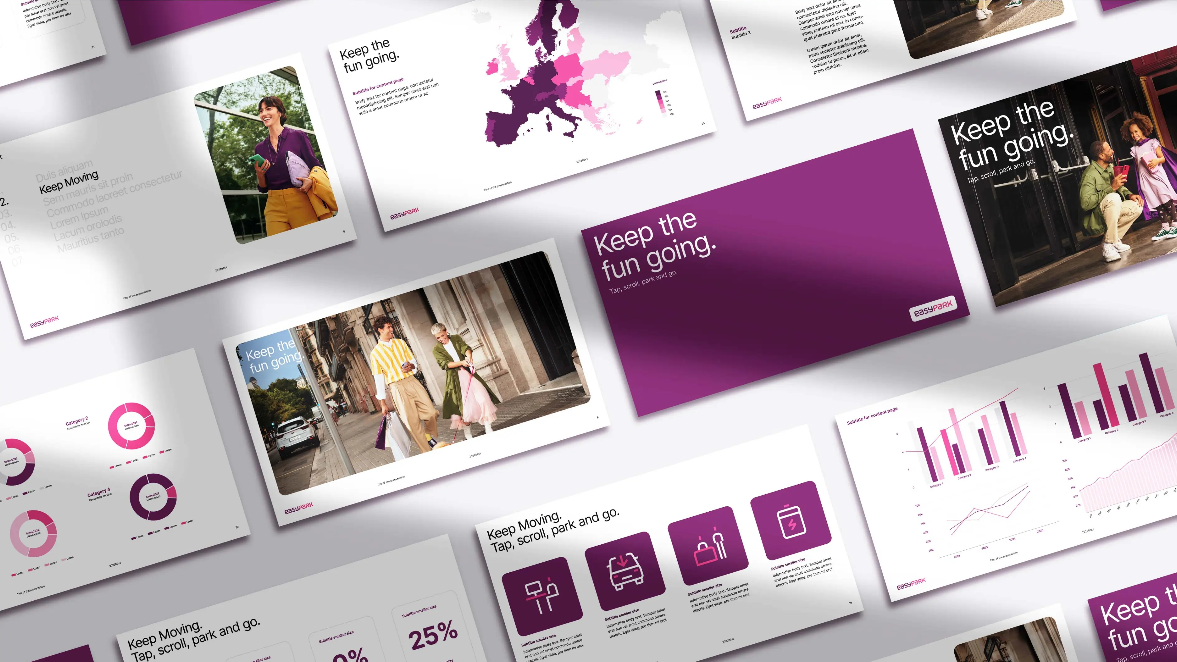
Communication templates
Illustrations and art direction
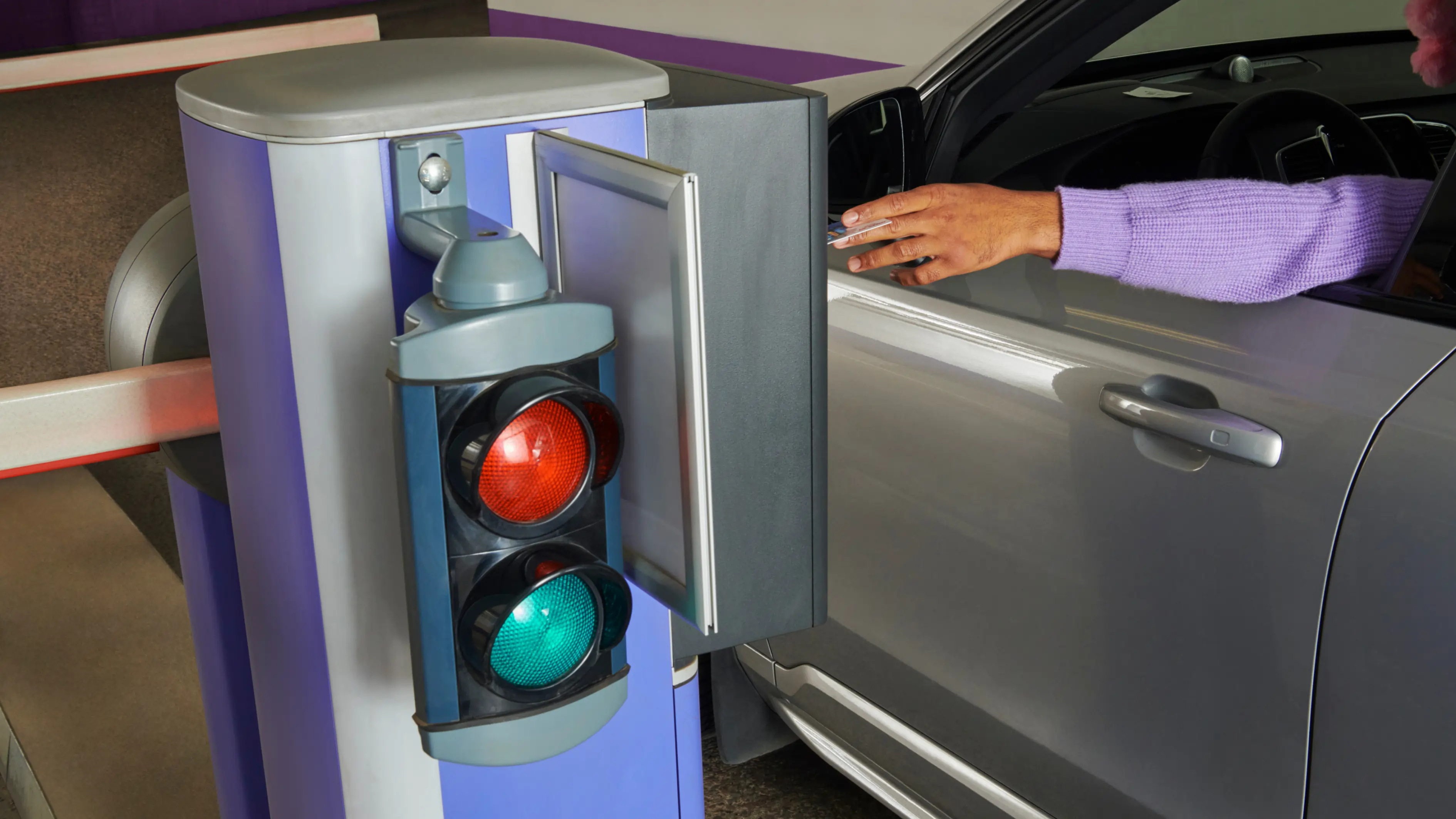
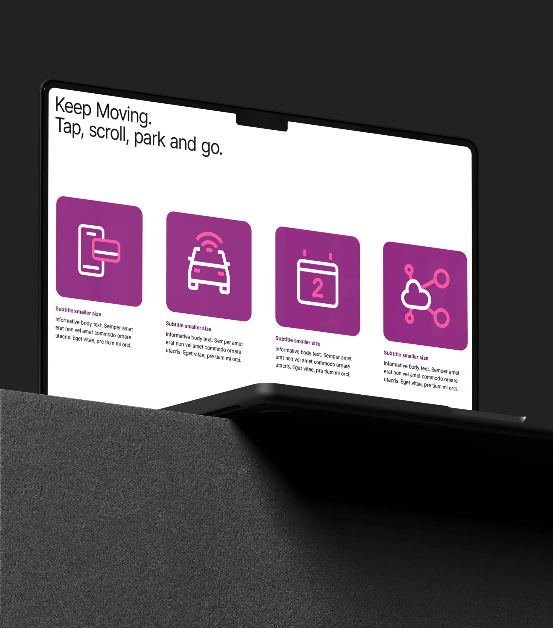
EasyPark is a global leader, aiming to make cities more livable by offering mobility-related services that span parking, traffic data, and innovative integrations. Their conceptual brand world is encapsulated in the theme "Movable space, everything falling into place," which is built around the oblong-shaped "Spaces" brand device. Its flexible application enhances the sense of mobility, as the space itself moves throughout the design system.

Colors
The entire brand identity embraces an expanded pink and lilac color palette, which is instantly recognizable as EasyPark, while also offering a more nuanced and modernized appearance.


Spaces
Within the brand identity, the infographics, iconography, templates, and signage all incorporate the “Spaces” brand device. This cohesive approach supports communication, enhances functionality and focus while creating a playful yet sophisticated appearance across analog, digital and physical spaces.


Imagery
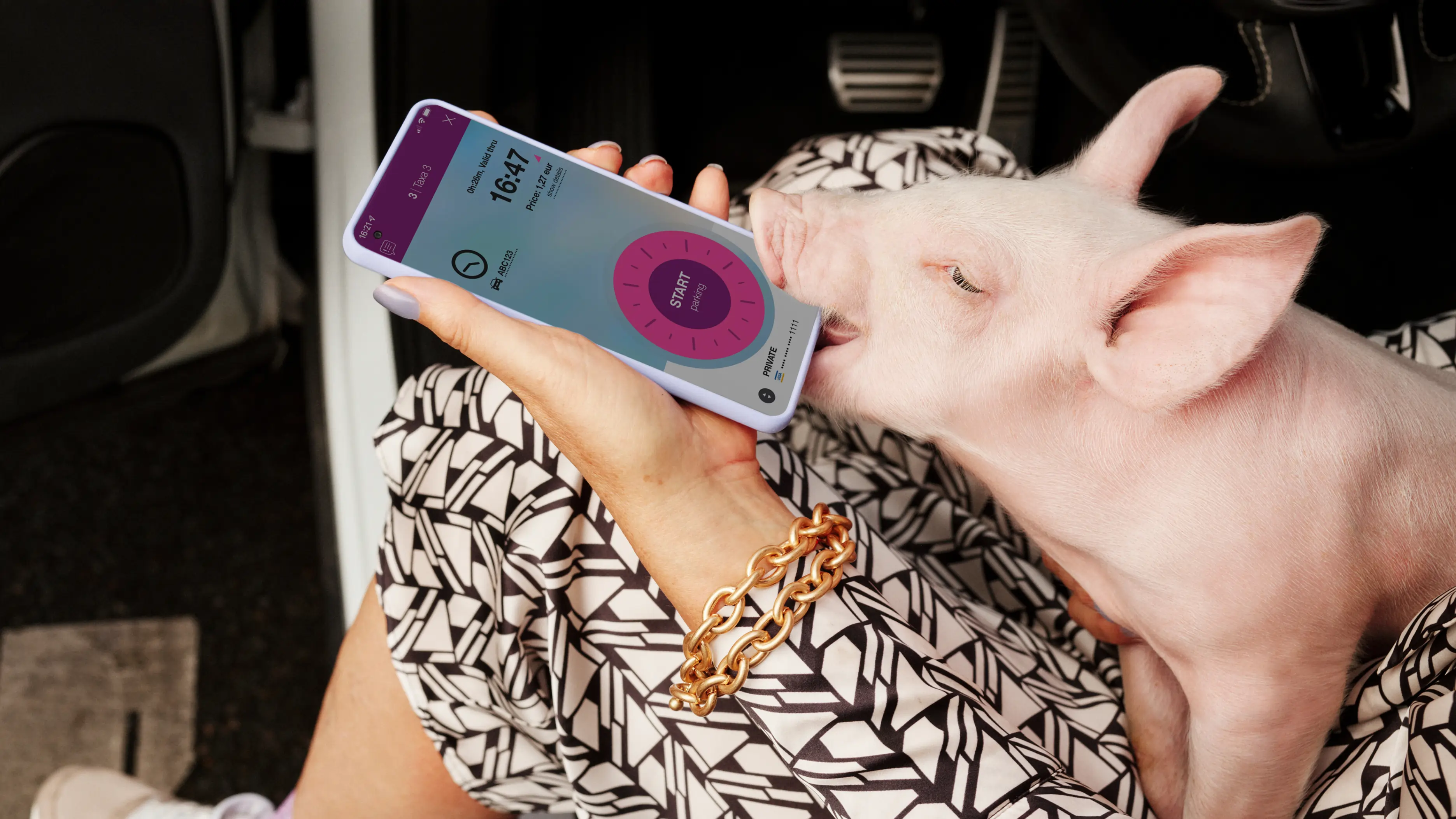
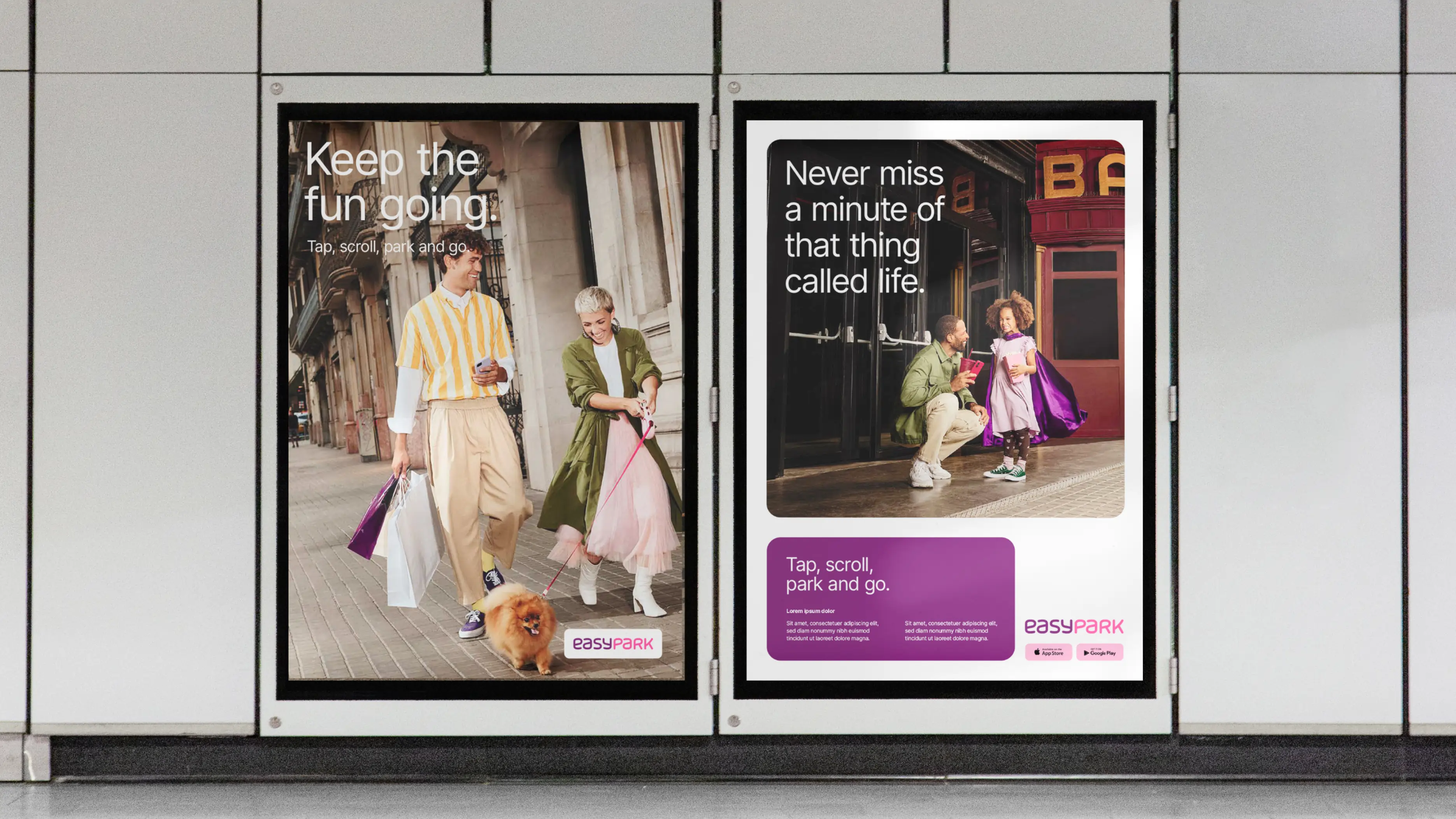
The brand imagery adds both energy and personality to an otherwise traditional category, transforming EasyPark into a lifestyle choice, not just a parking app, encapsulating the essence of "The keep moving energy".