K-Menu
Kesko
Packaging
Art direction
Design strategy
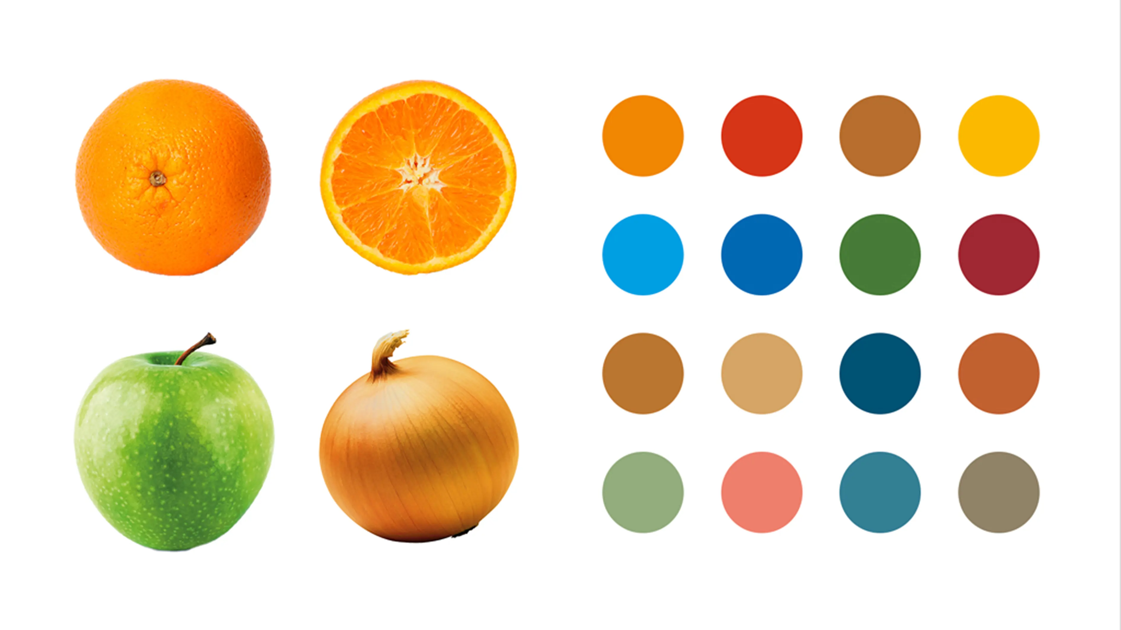
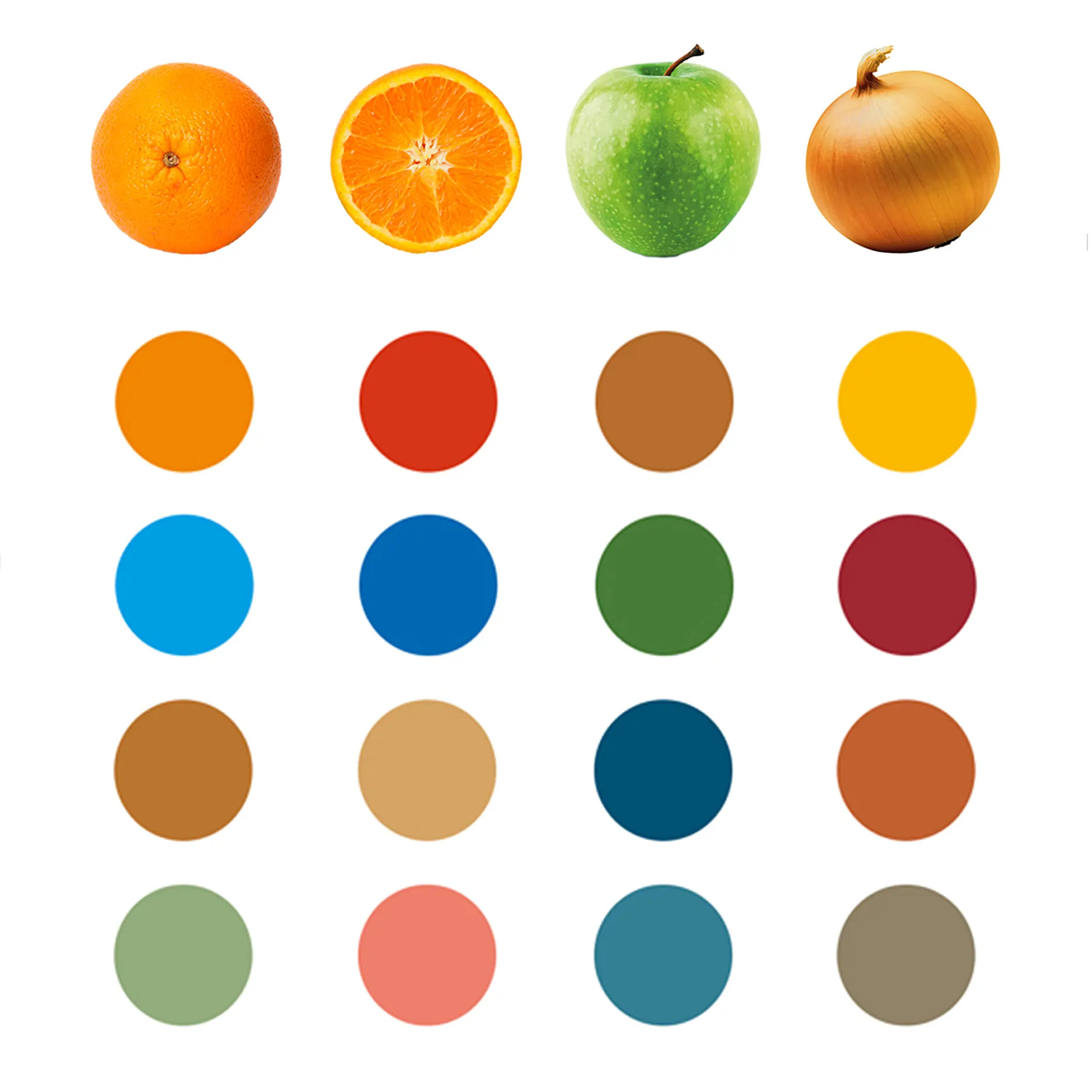
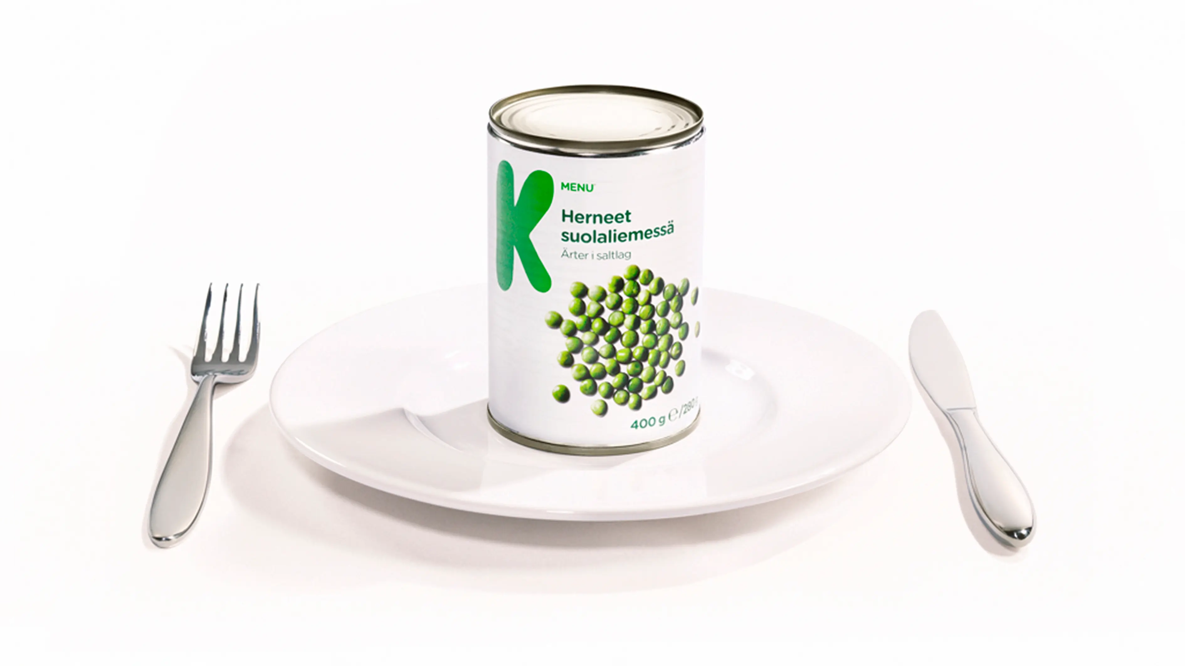
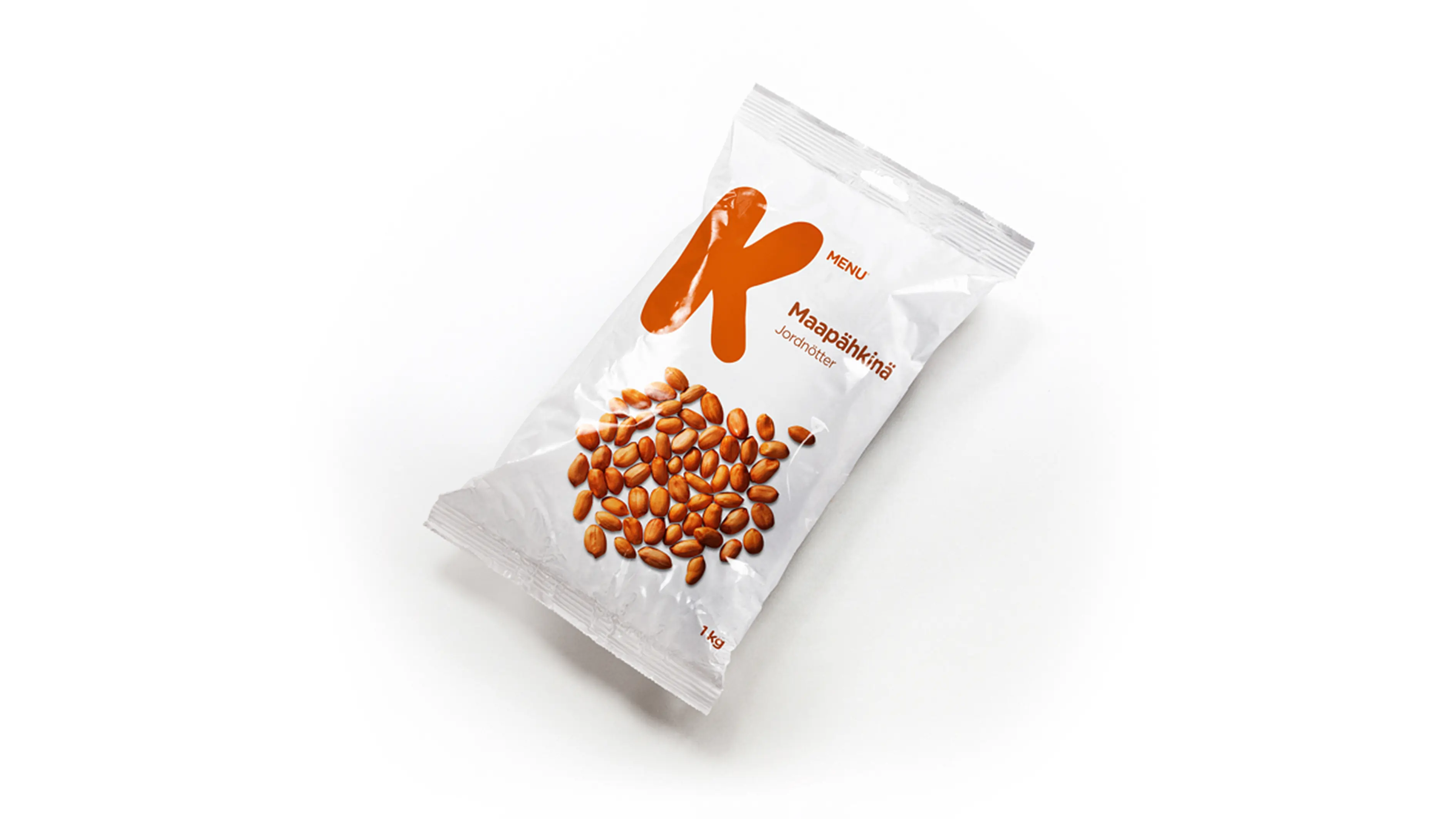
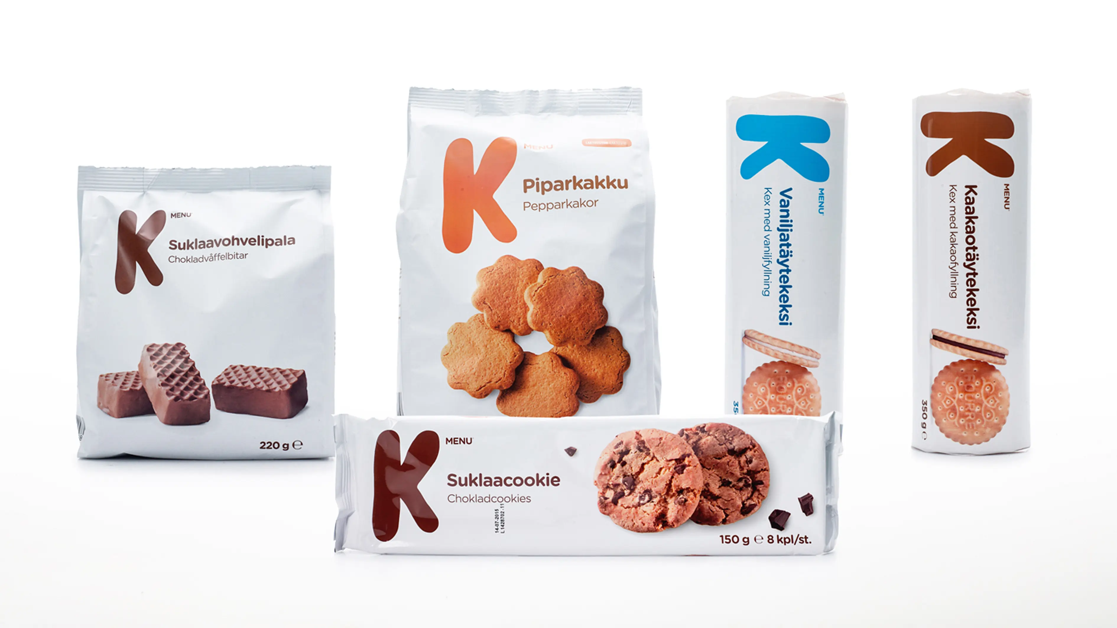
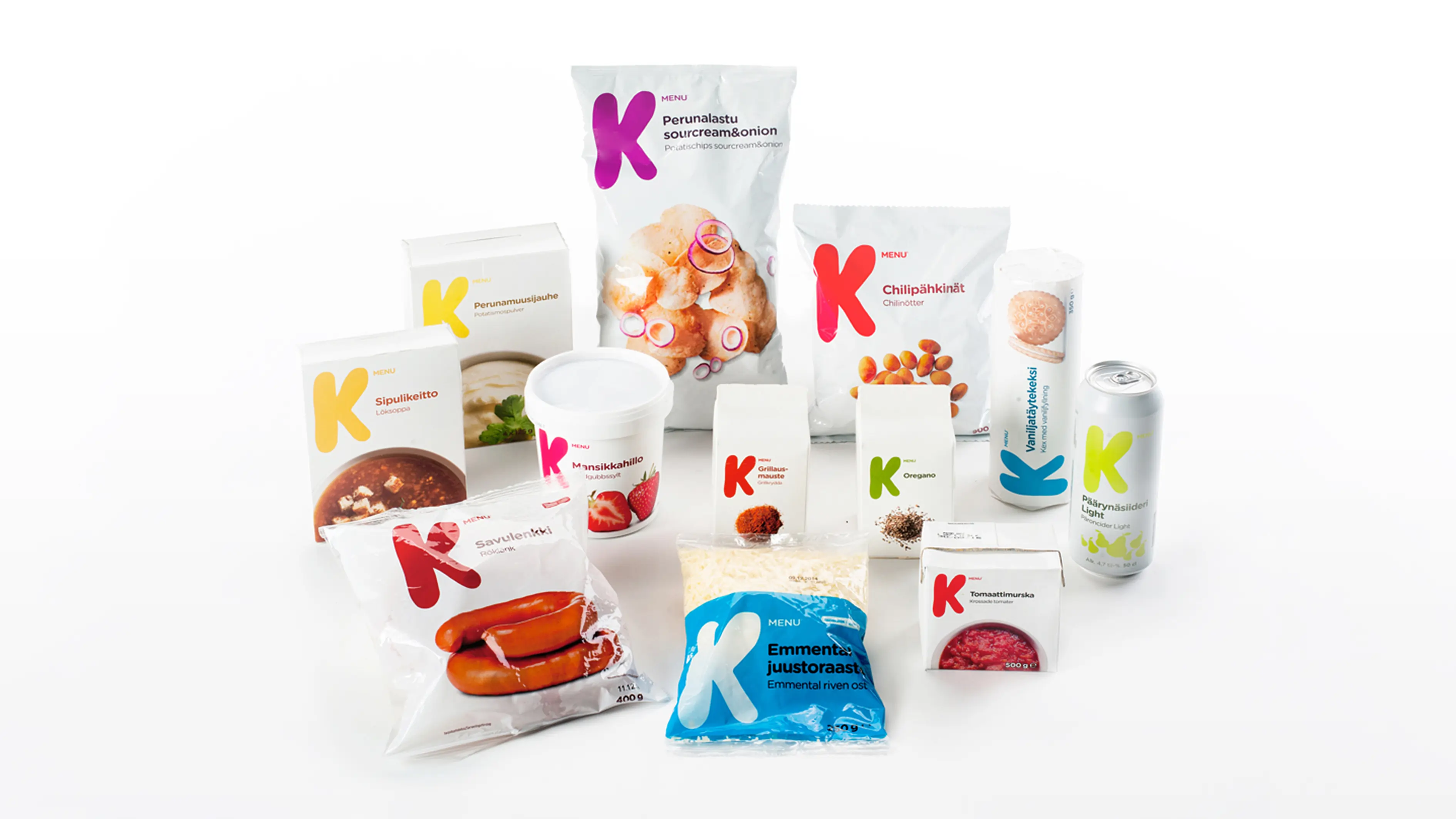
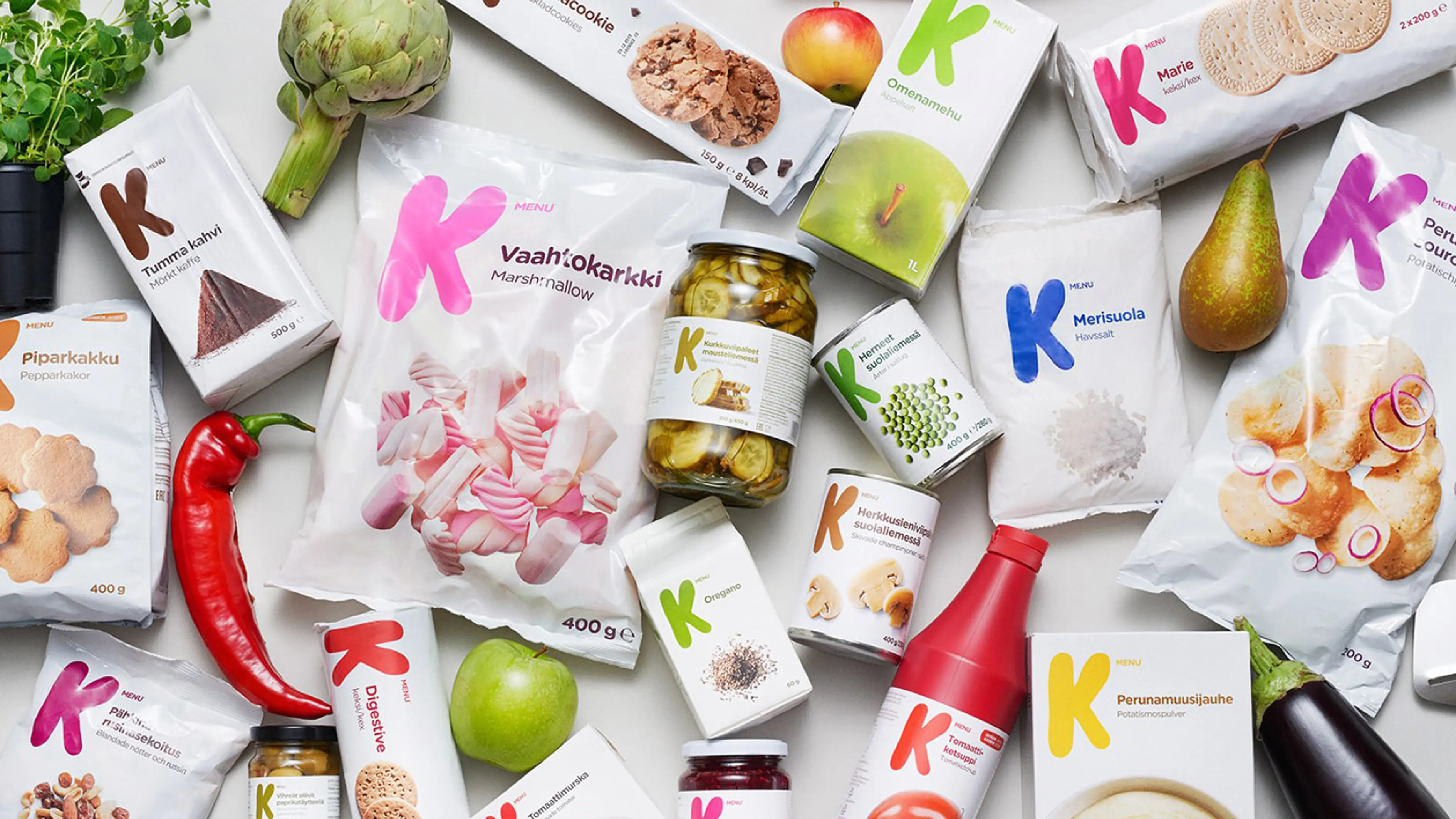
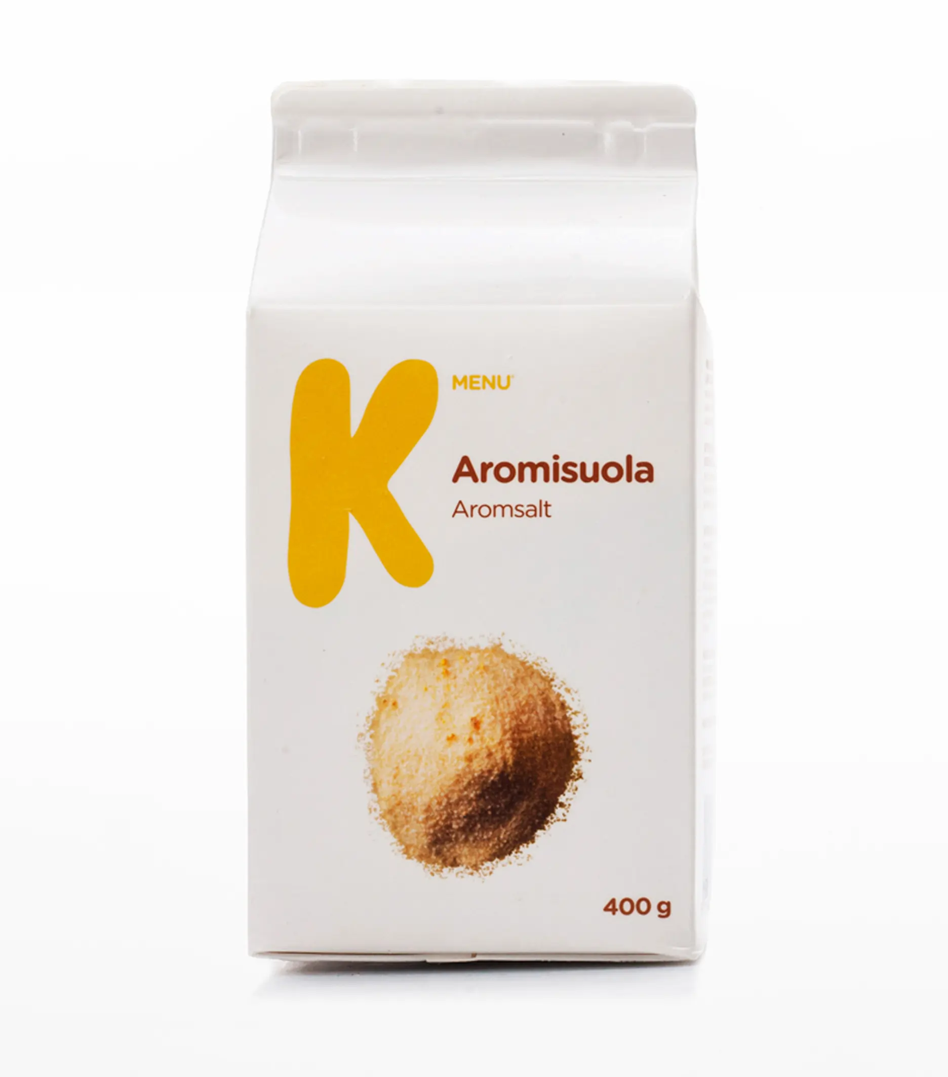
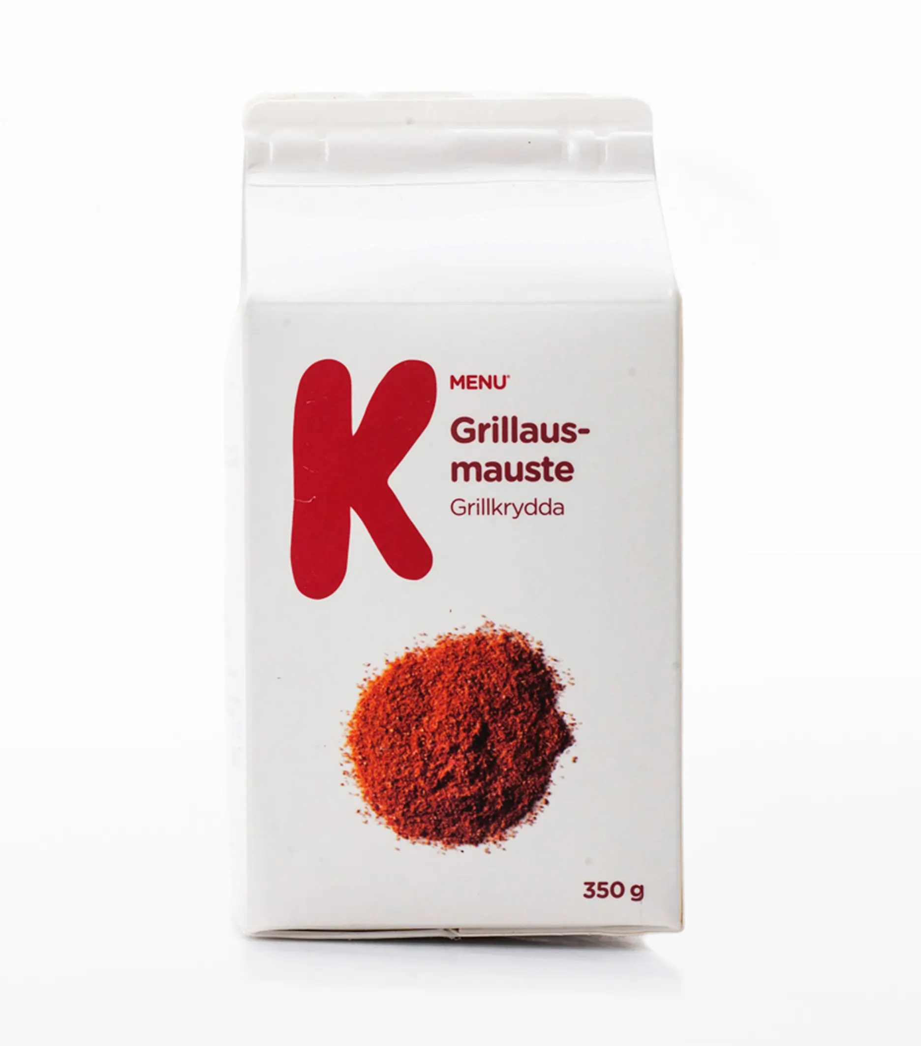
For the Finnish brand Kesko, we created the private label K-Menu. Our assignment included the creation of the brand name, visual identity, a new packaging concept and communication. To establish a strong connection to and strengthen the mother brand Kesko, we made the K the hero element. The powerful visual expression creates a confident shelf impact while maintaining a simple and humble look that signals value for money and everyday use.
The impact
The clear design system and photographic approach allow for effective implementation on a wide product range. K-Menu was launched in 2014, within the value-for-money segment, and has since expanded to include hundreds of products.
