From field to fork

Lantmännen
Visual brand concept
Art direction
Image style
Production
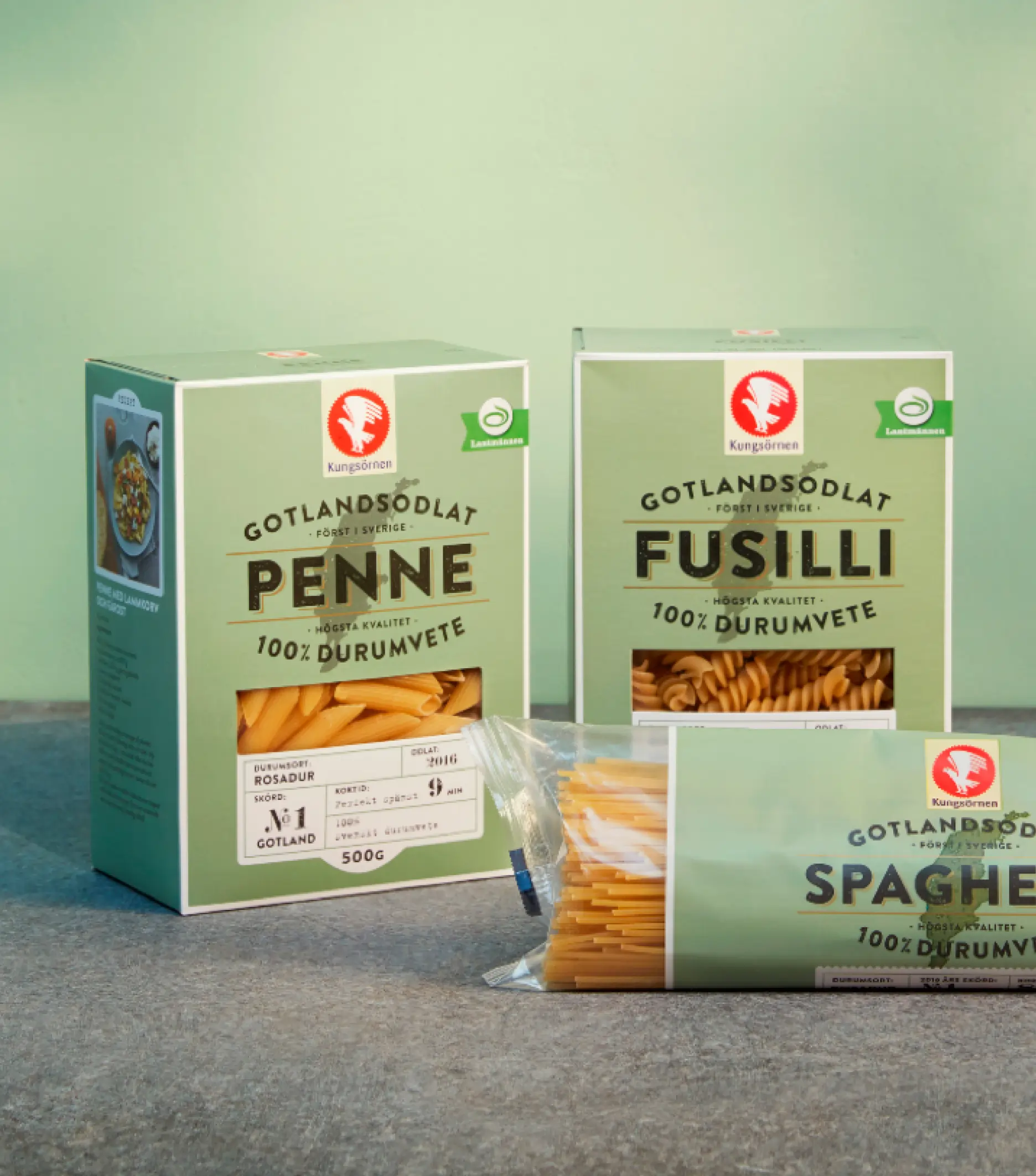
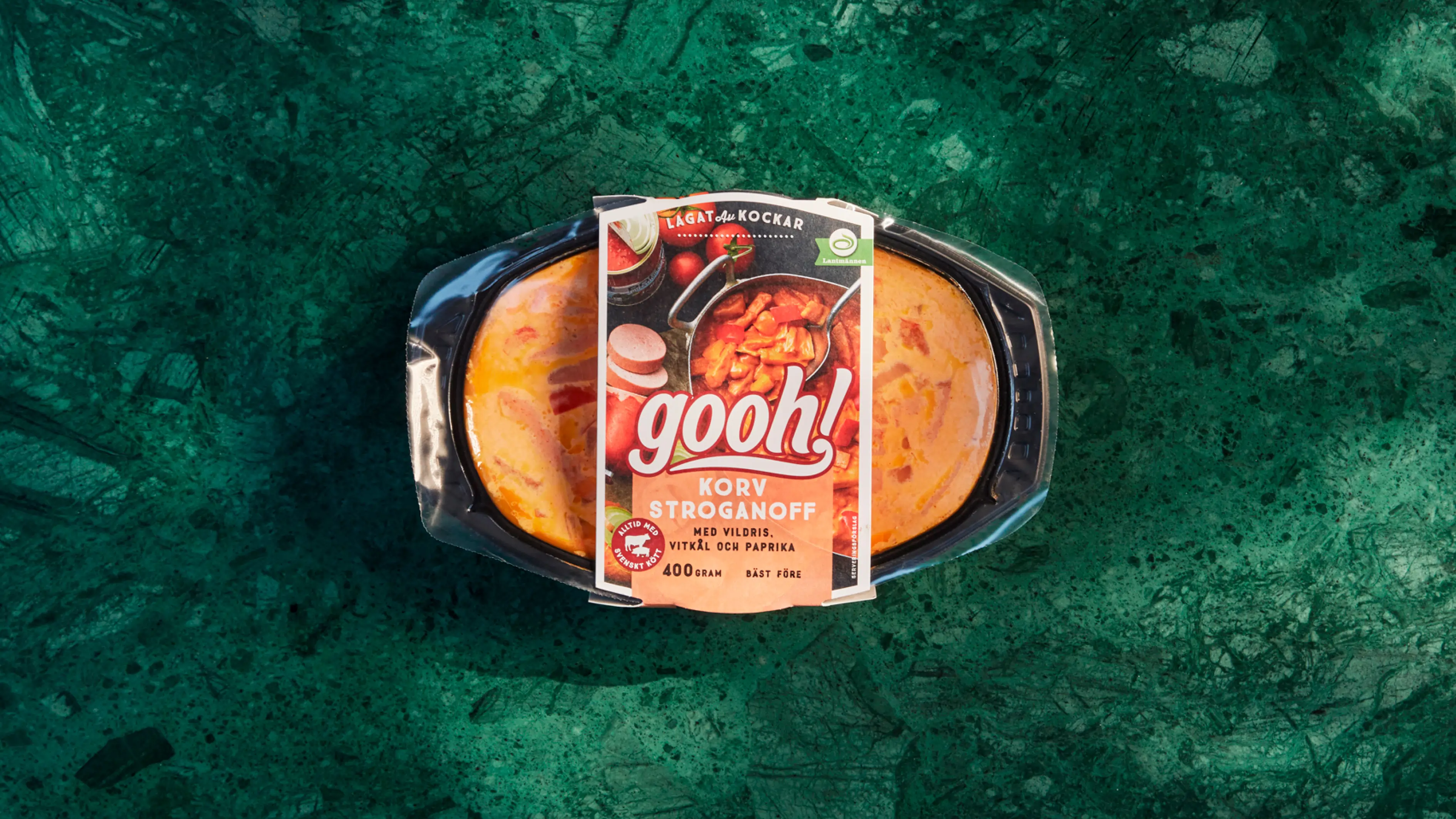
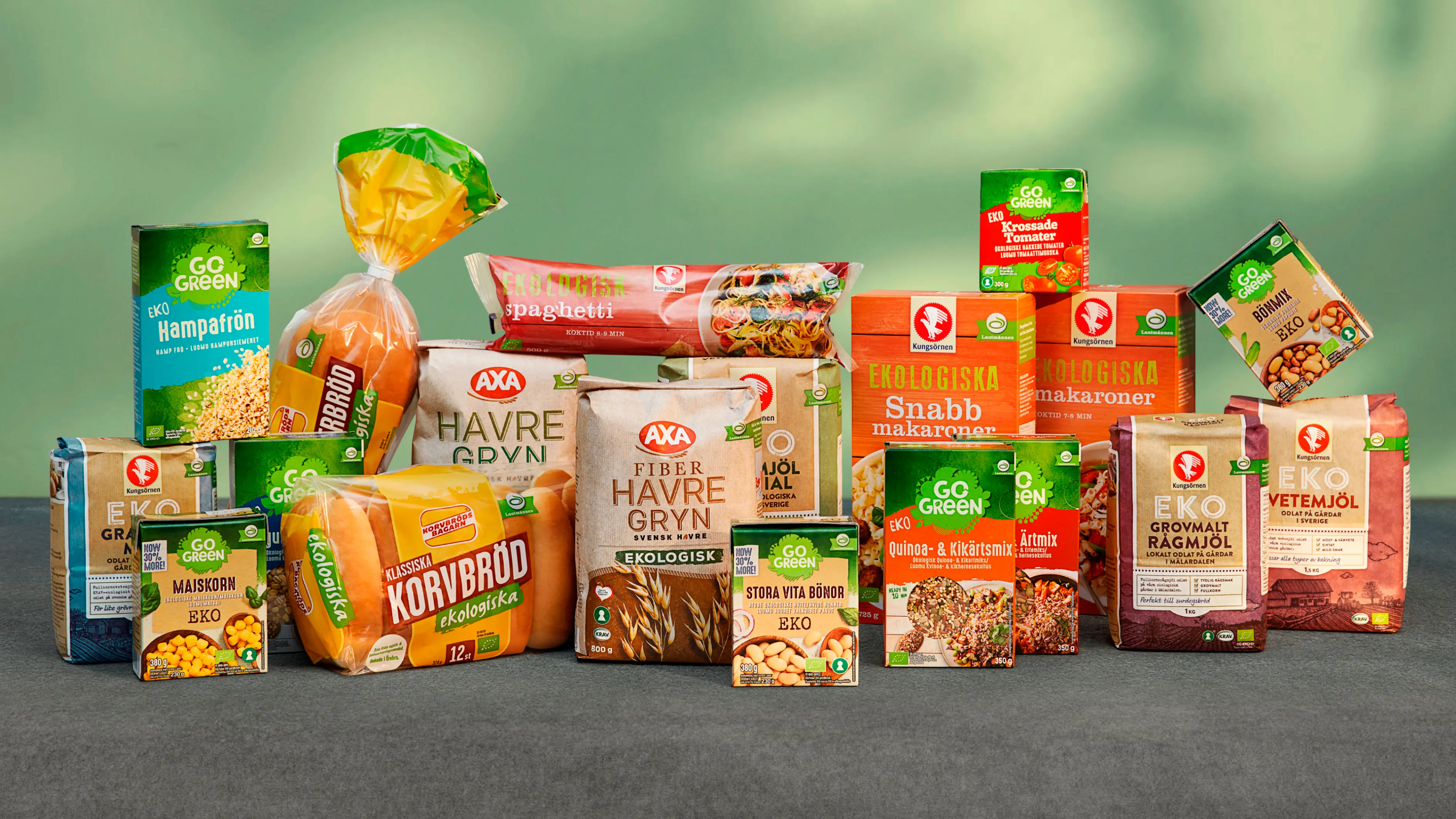
Lantmännen, an agricultural cooperative owned by 18,000 Swedish farmers, is Northern Europe’s leader in agriculture, machinery, bioenergy and food products. They own a diverse portfolio of consumer brands, each with unique brand identities and appearances. Our task was to develop a strong visual concept that clearly defines Lantmännen as the overarching brand, using both still and moving imagery. This led to an array of content, ranging from straightforward pack shots to inspirational food imagery and comprehensive campaigns.


From field to fork
Lantmännen is perceived as a green brand with a strong identity in the world of green shades. Its origins stem from their brand promise, "From field to fork." To maintain a consistent visual brand expression regardless of content, these two building blocks form the foundation of the visual brand concept. Translating "From field to fork" into photography results in a play of light and shadow, giving the impression of nature's constant presence. The green color appears in props, background colors, food and board materials. To appeal to the target group, the selection of materials and props should be commonly found in an ordinary home, and the set design should convey a sense of everyday life.


