The unusually caring bank
SBAB
Brand strategy
Brand identity
Digital brand wxperience
Typeface design
Motion identity
Illustration
In a world where ‘the bank’ is often viewed as greedy and non-transparent, a necessary evil, SBAB sets itself apart. As a state-owned entity, SBAB has consistently challenged these perceptions with its commitment to honesty, thoughtfulness, and clarity, backed by a high level of credibility. Moreover, SBAB offers down-to-earth interest rates, reinforcing its image as a transparent and customer-friendly bank.
Strategy informs identity
The new strategy transformed SBAB from being solely a price challenger brand to offering the most comprehensive ecosystem of products and services aimed at supporting customers' entire homeownership journey. SBAB became the foundation for sustainable financial homeownership. This resulted in a pedagogical identity that was refreshingly non-bank-like, unusually caring, and likable.

Few but hardworking elements
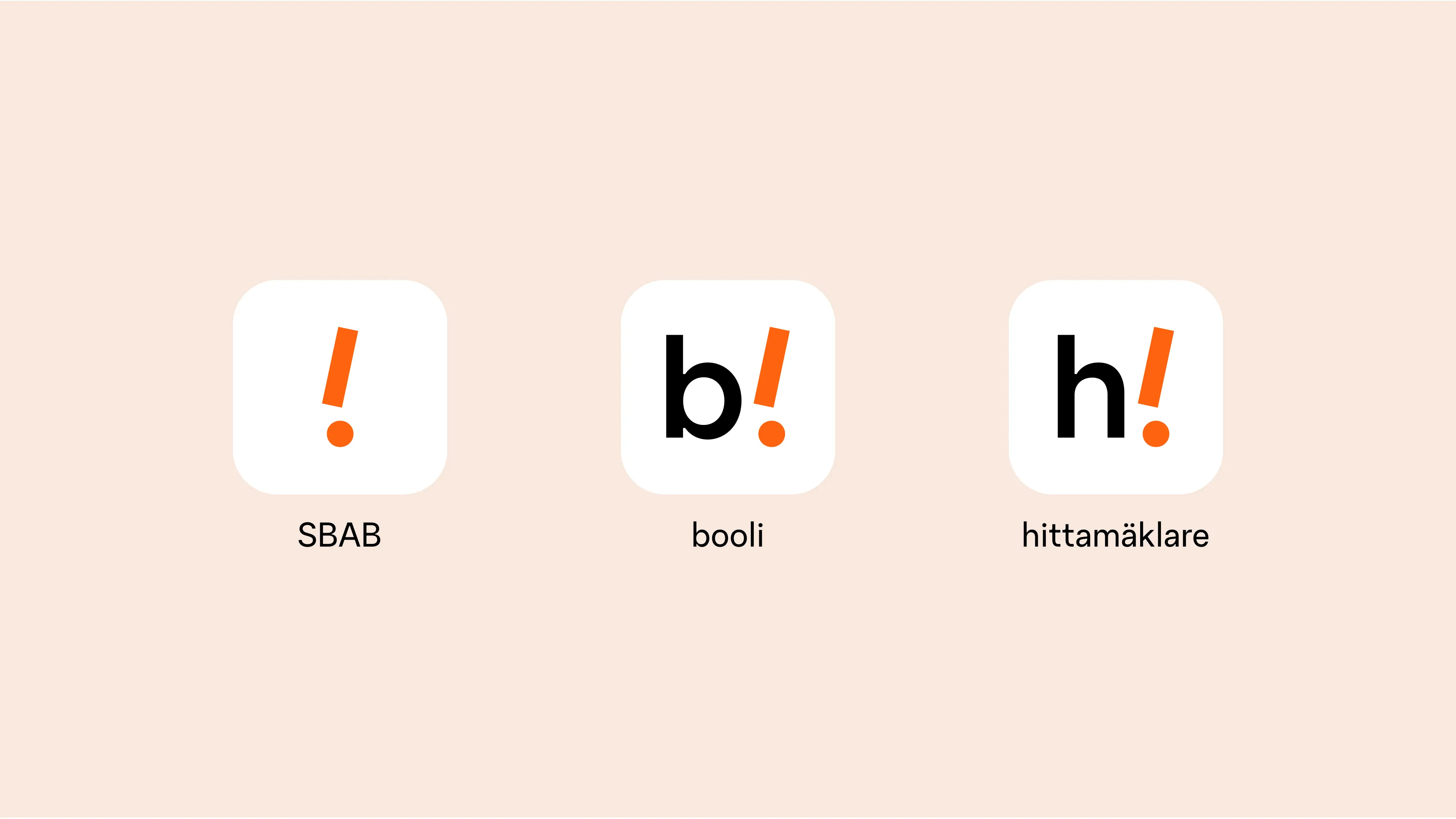
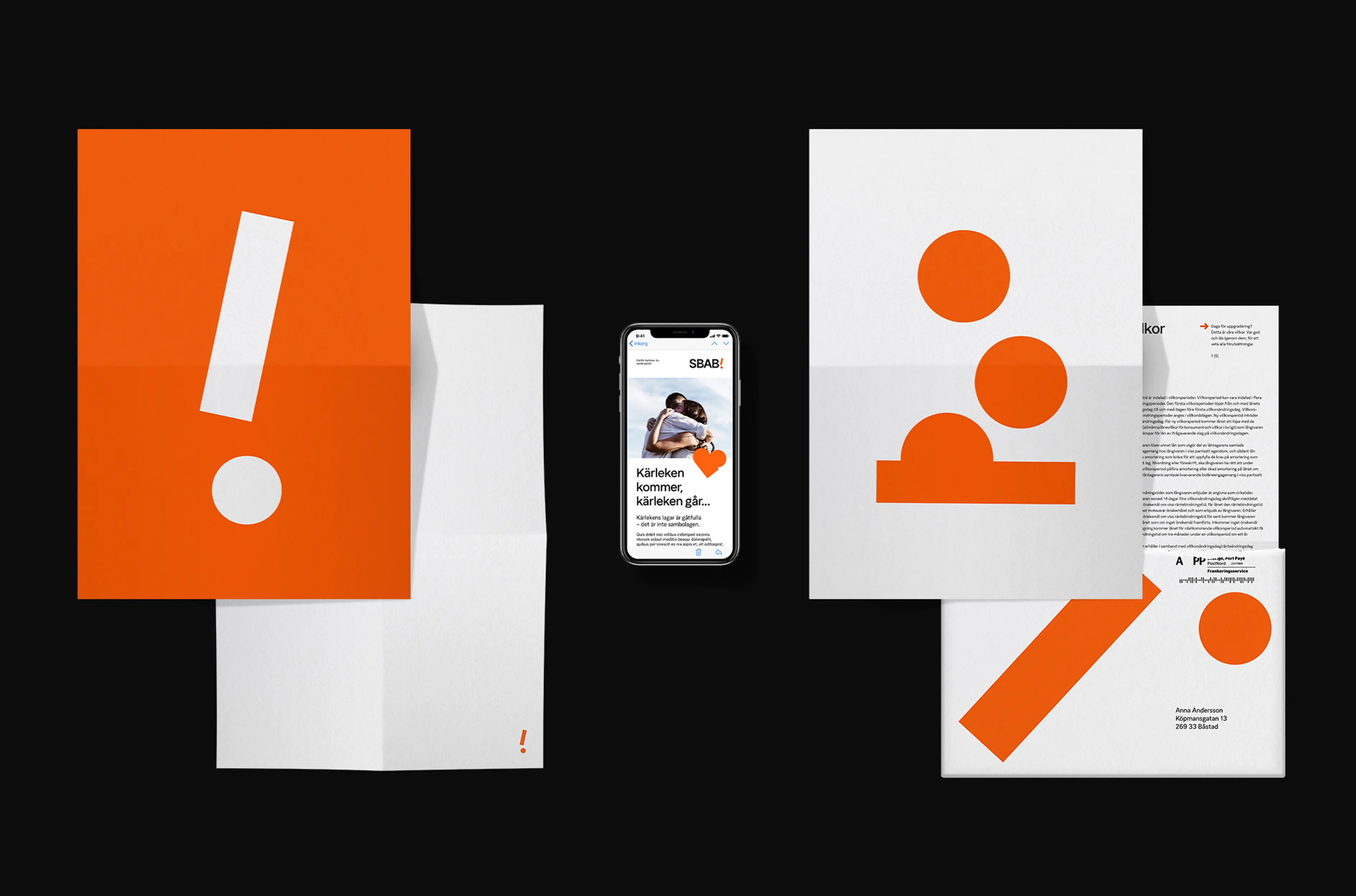
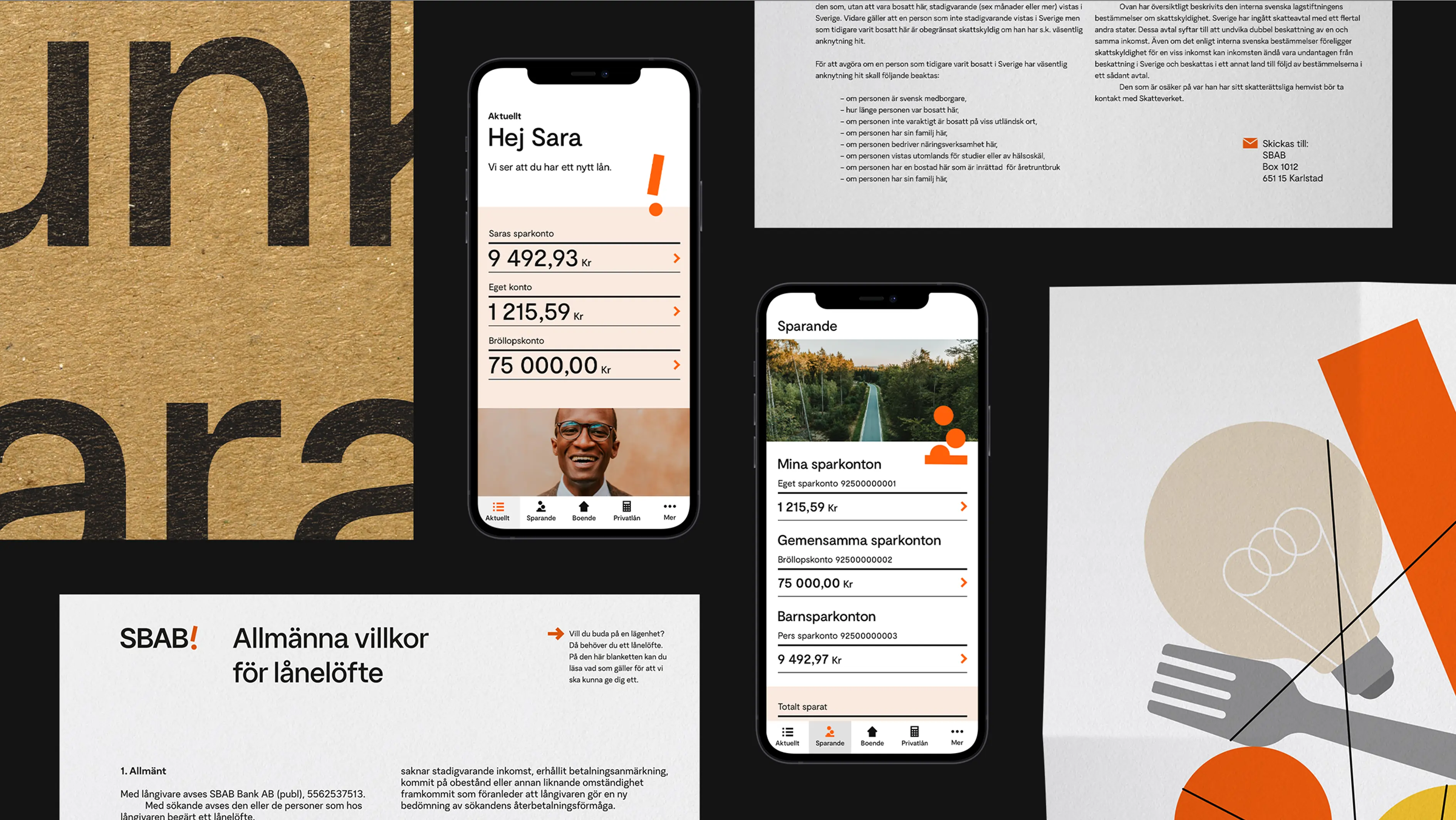
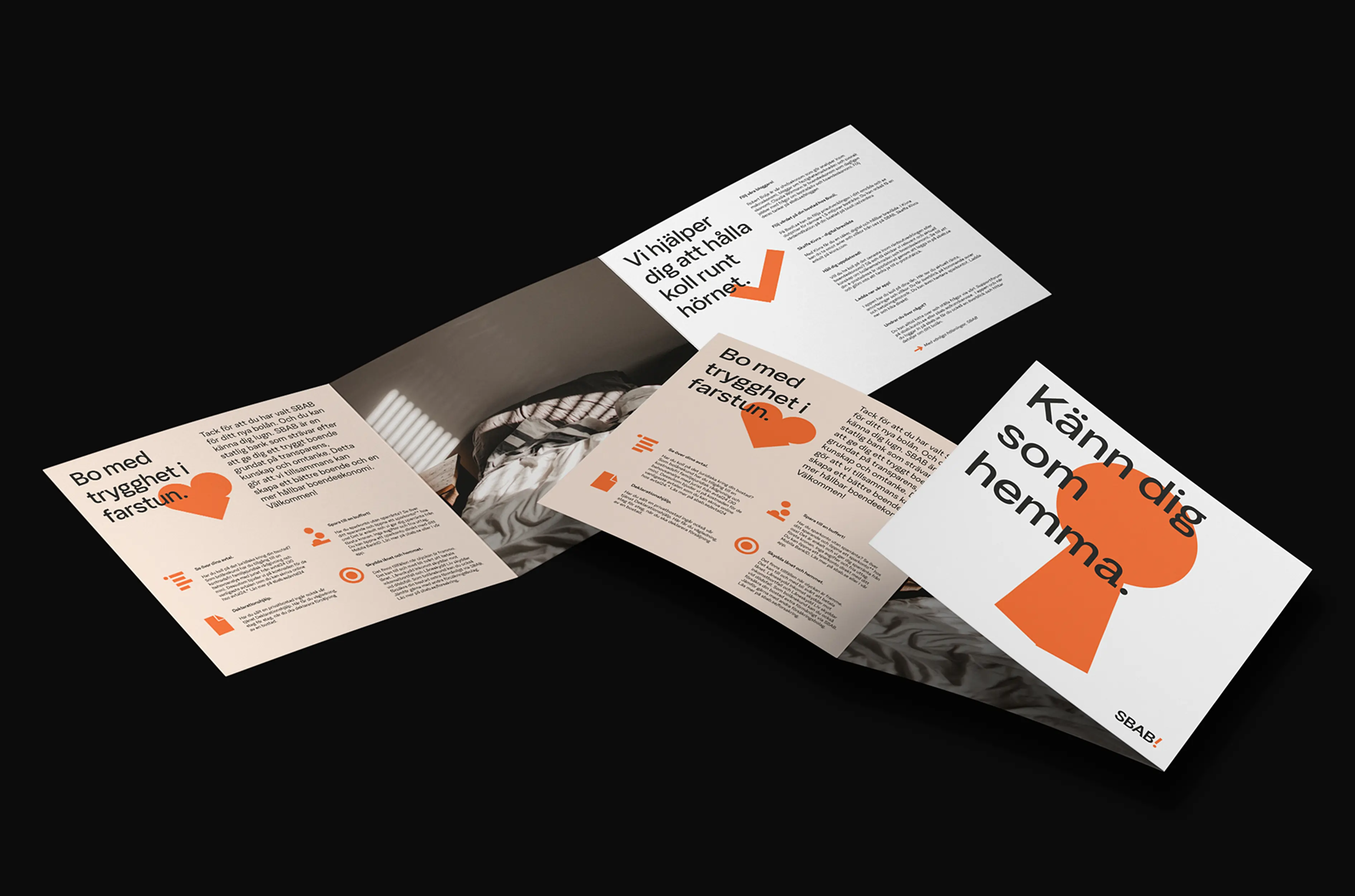
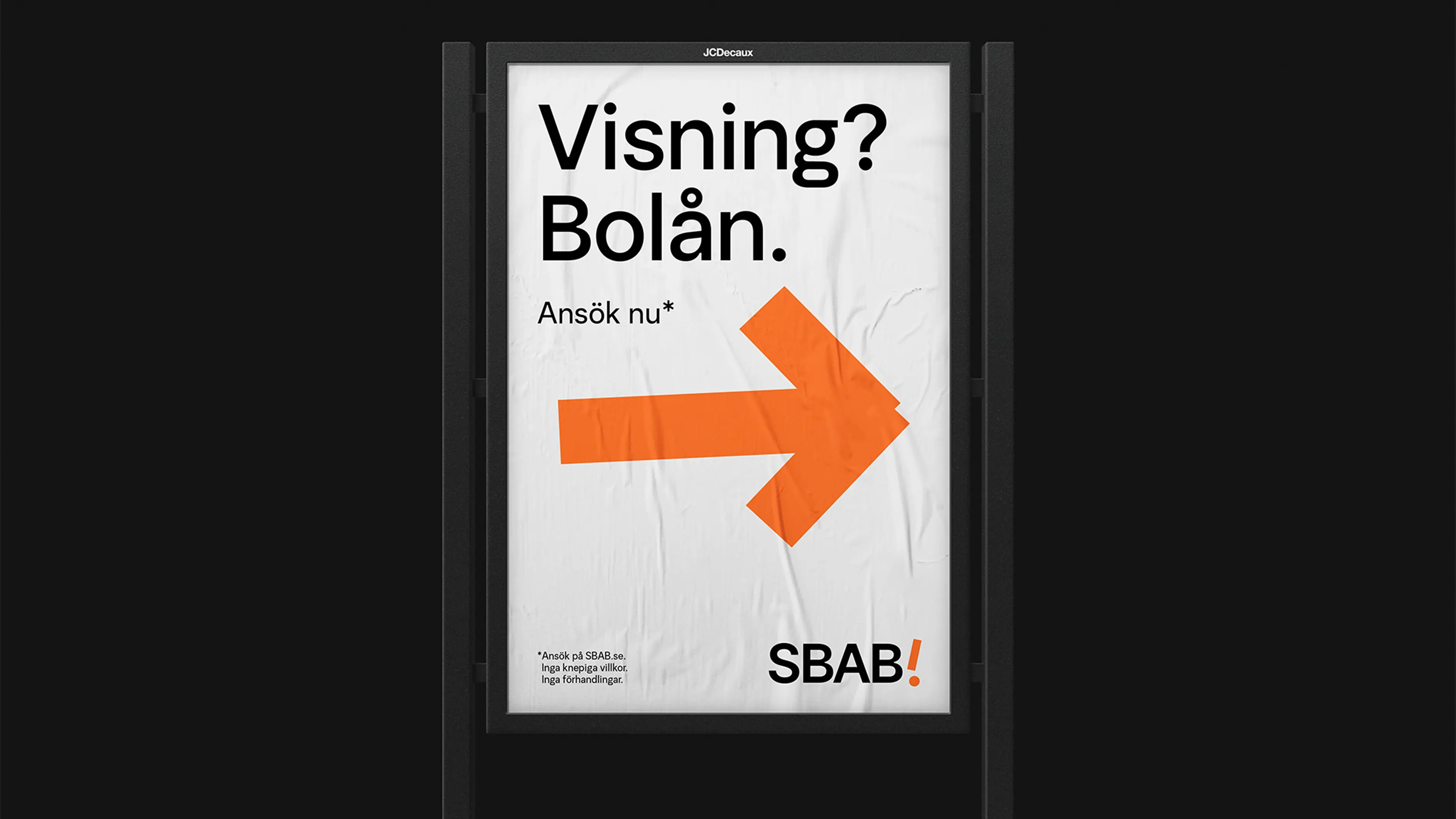
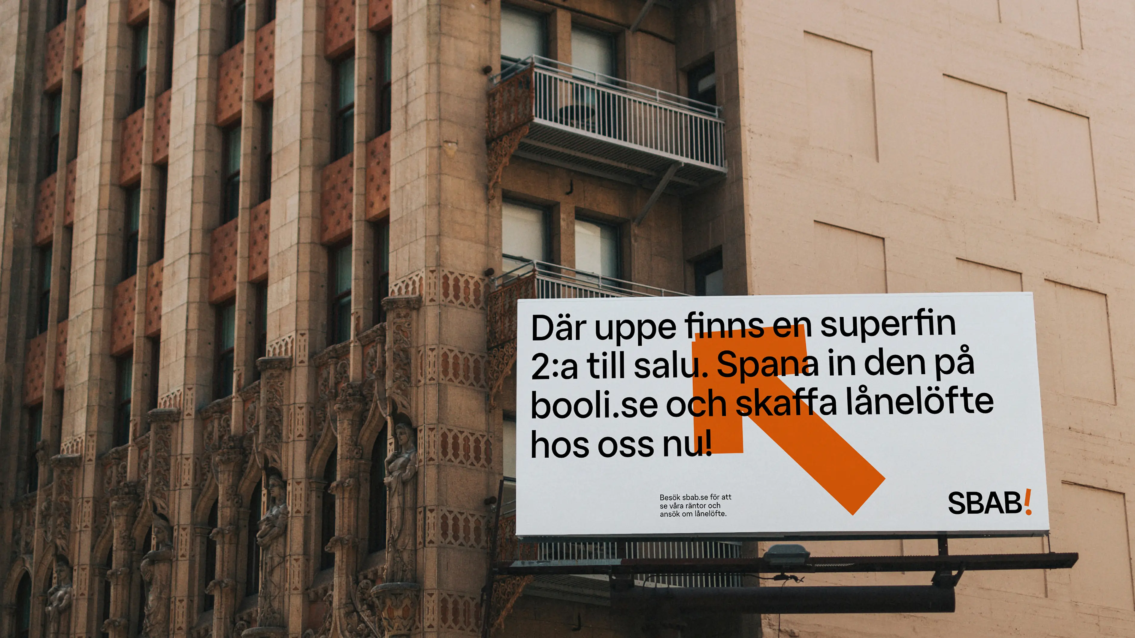
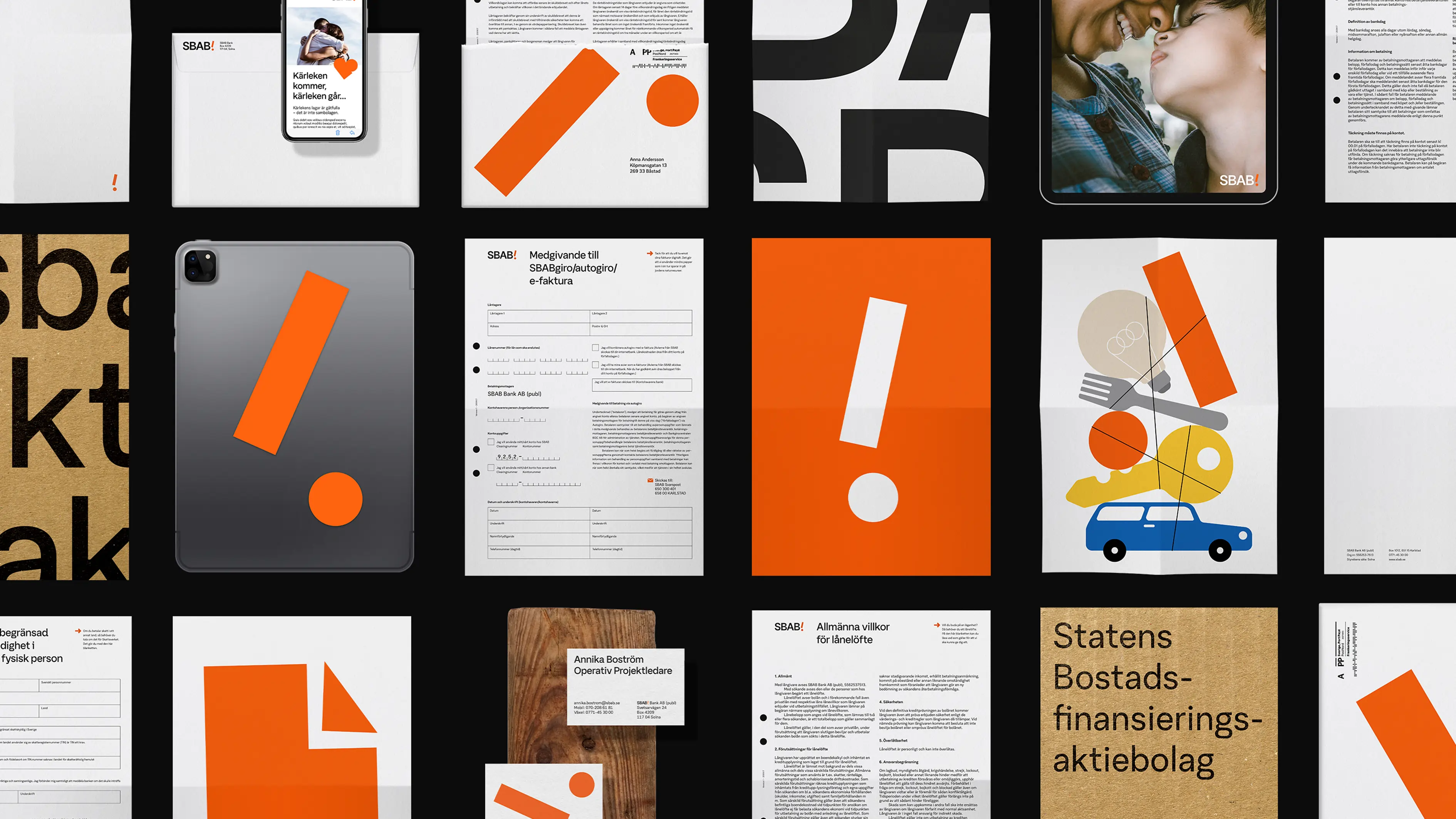
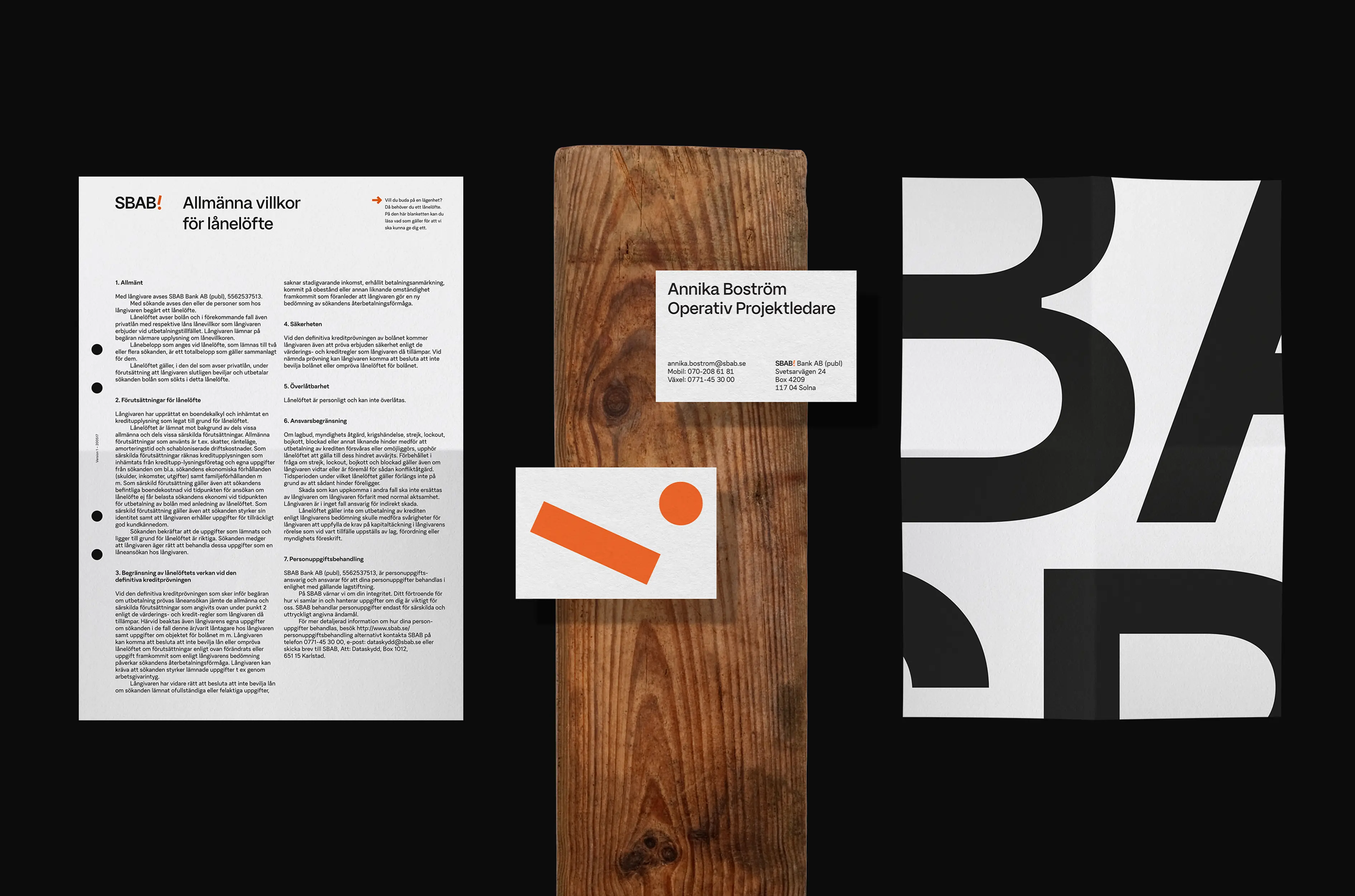
We not only updated the SBAB orange brand color but also evolved their exclamation mark into a brand portfolio symbol. We created unique iconography and introduced a stand-out, playful illustration style, which even incorporated the exclamation mark. The entire identity narrative and its caring nature were implemented across all touchpoints, including web and app interfaces, as well as products and services.


The impact
Traffic to the SBAB site successfully increased by +20%, resulting in a significant change in cross-brand traffic and raising awareness of the entire brand portfolio. Additionally, app ratings and web Lighthouse scores improved. The brand-new identity has elevated SBAB to a new level of appreciation and commercial development.