Unleashing opportunities
Telenor
Brand identity
Custom typeface design
Motion identity
As one of the largest telecom companies in Sweden. Telenor set out to leap beyond its competitors and into the future.
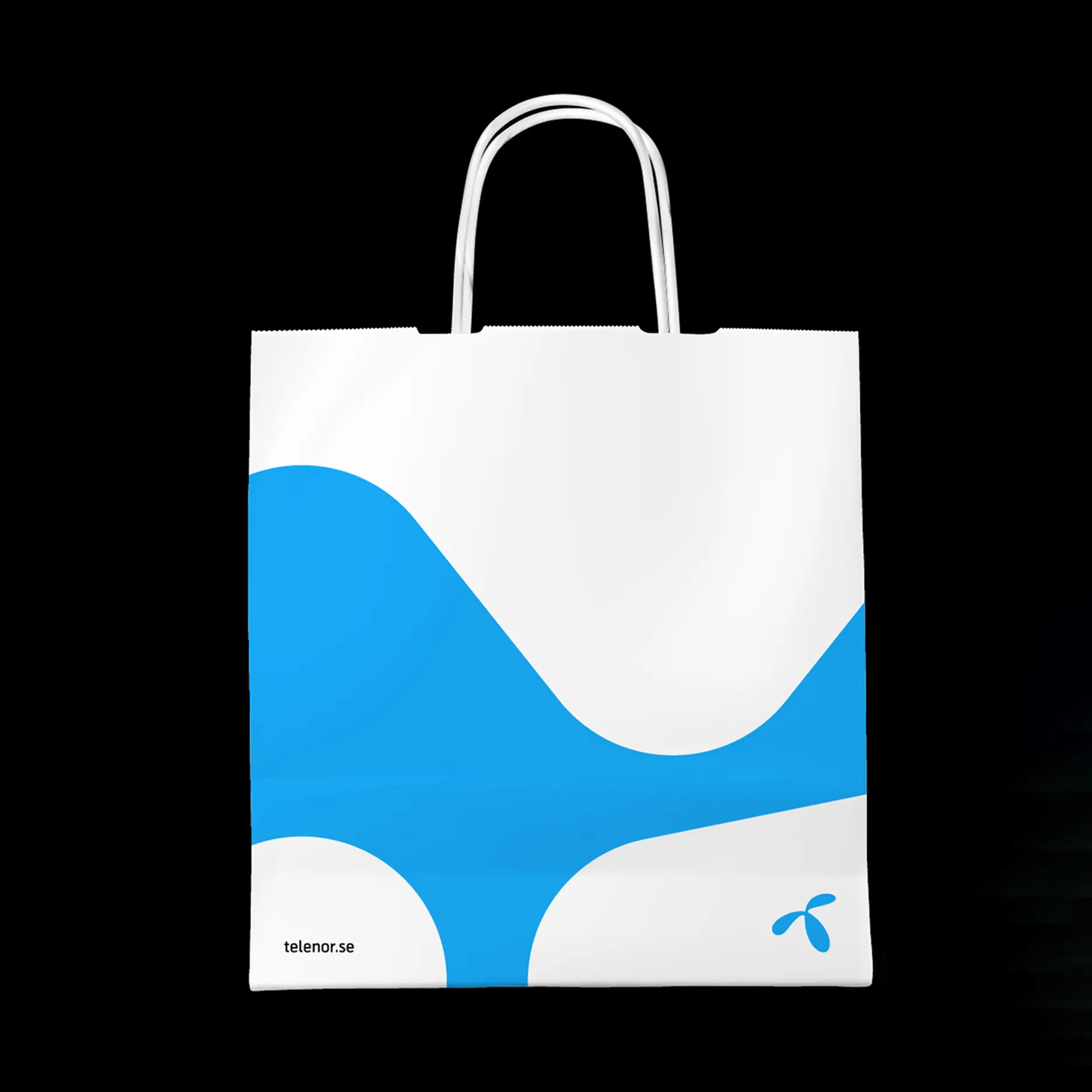
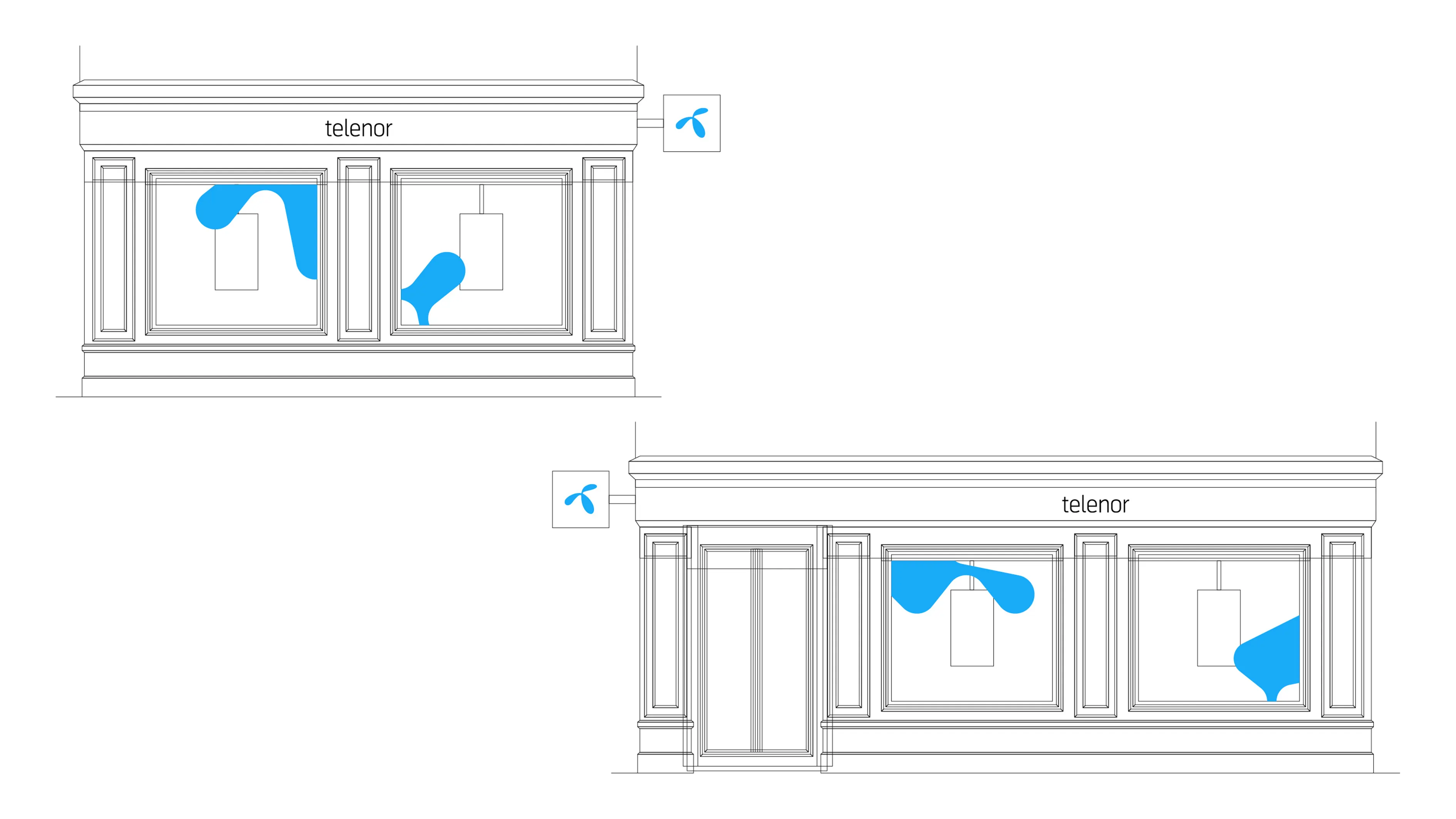
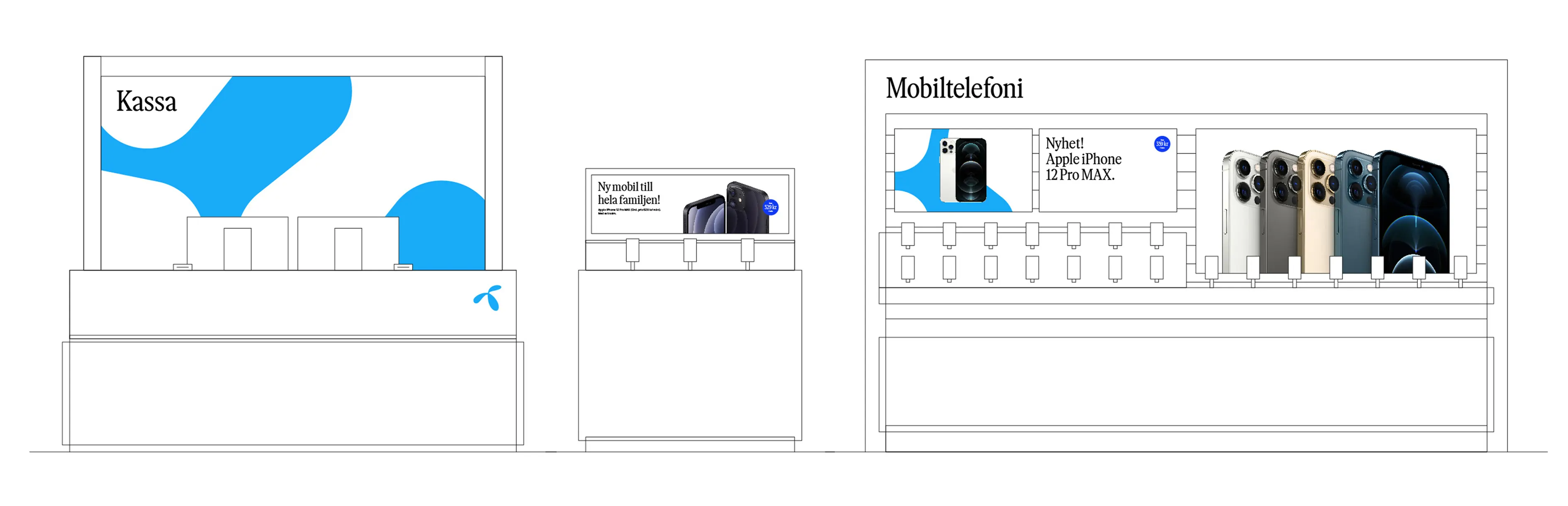
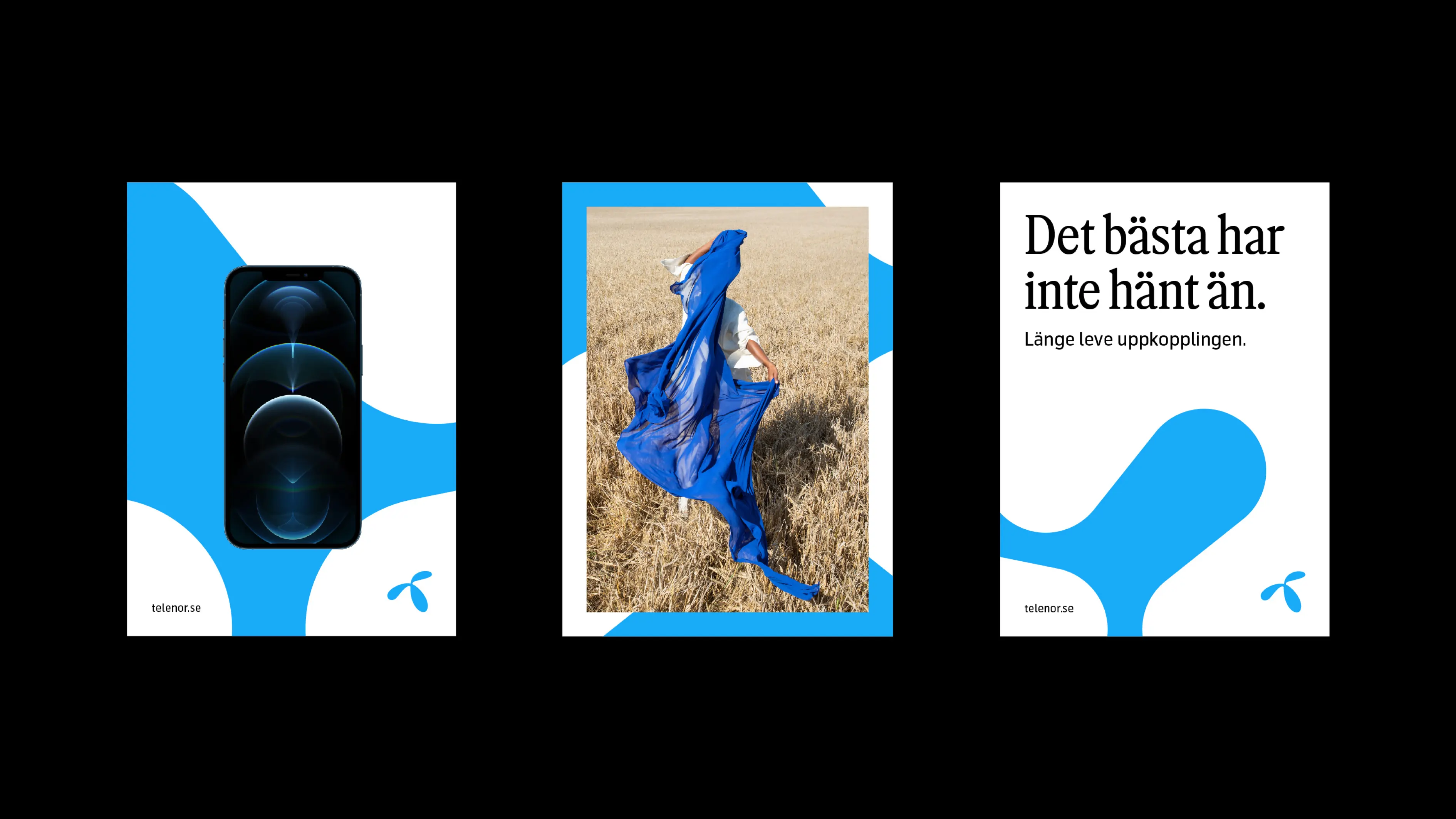
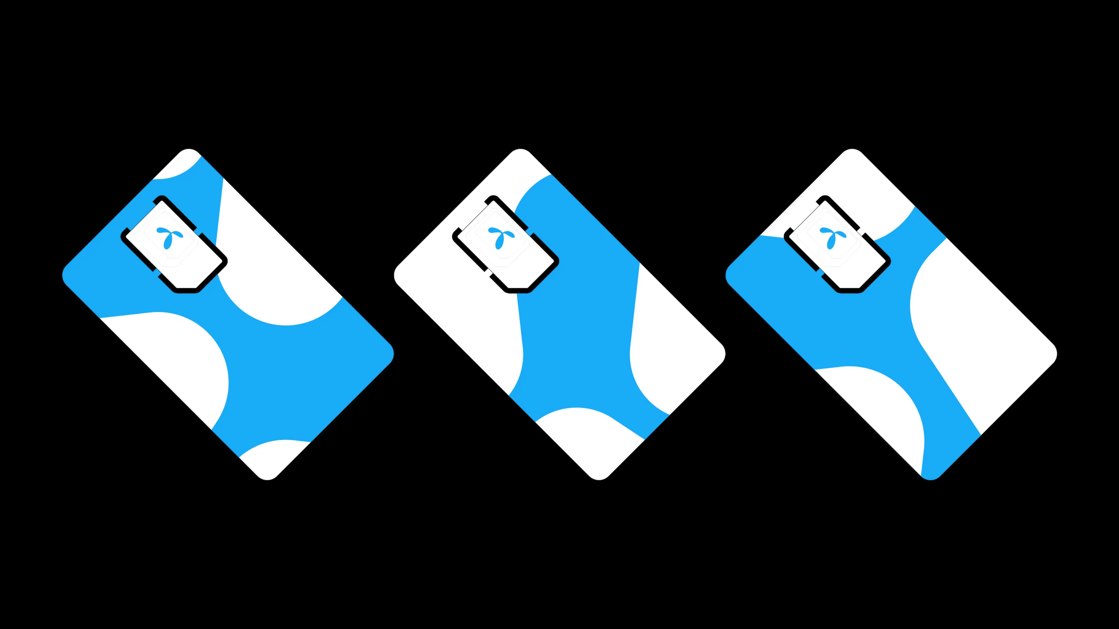
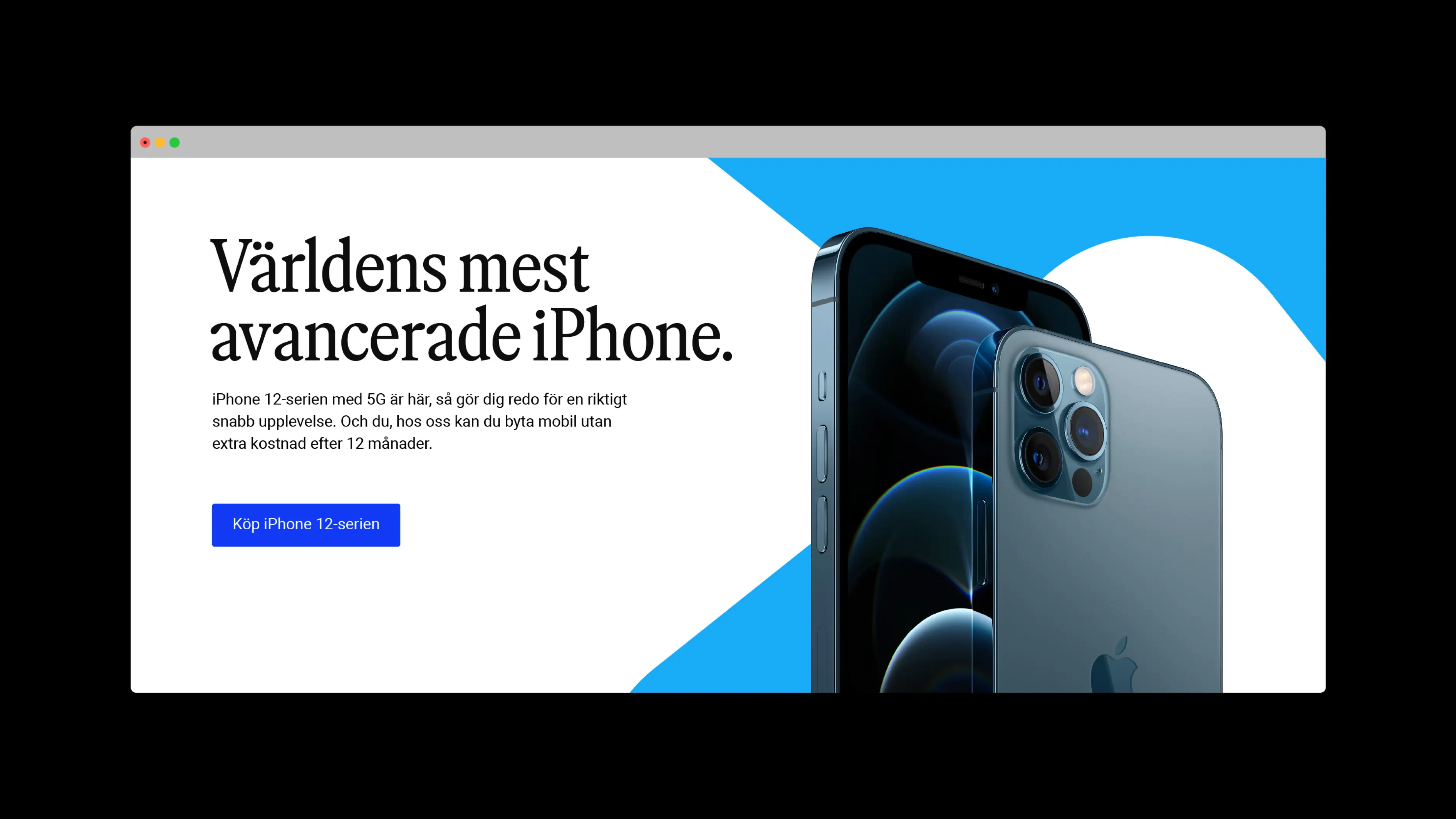
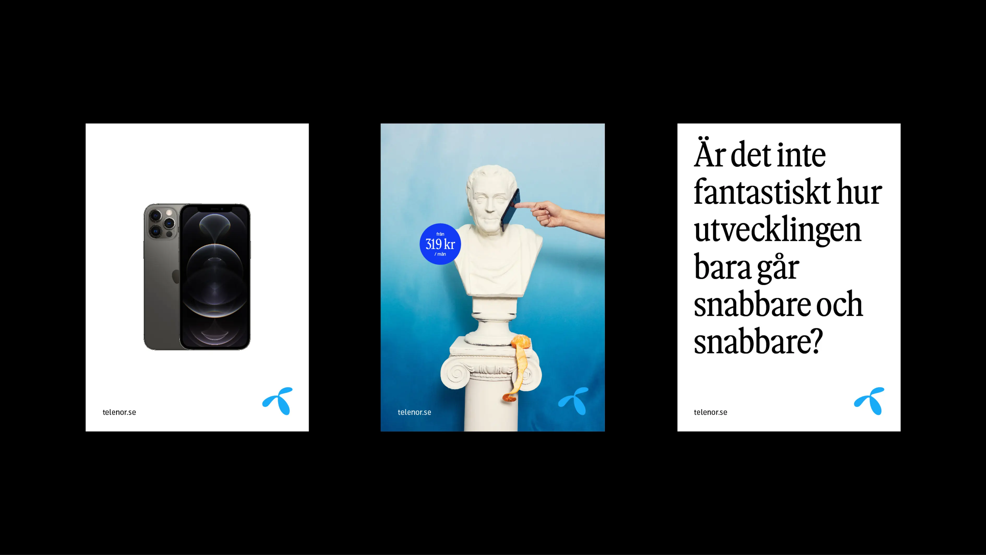
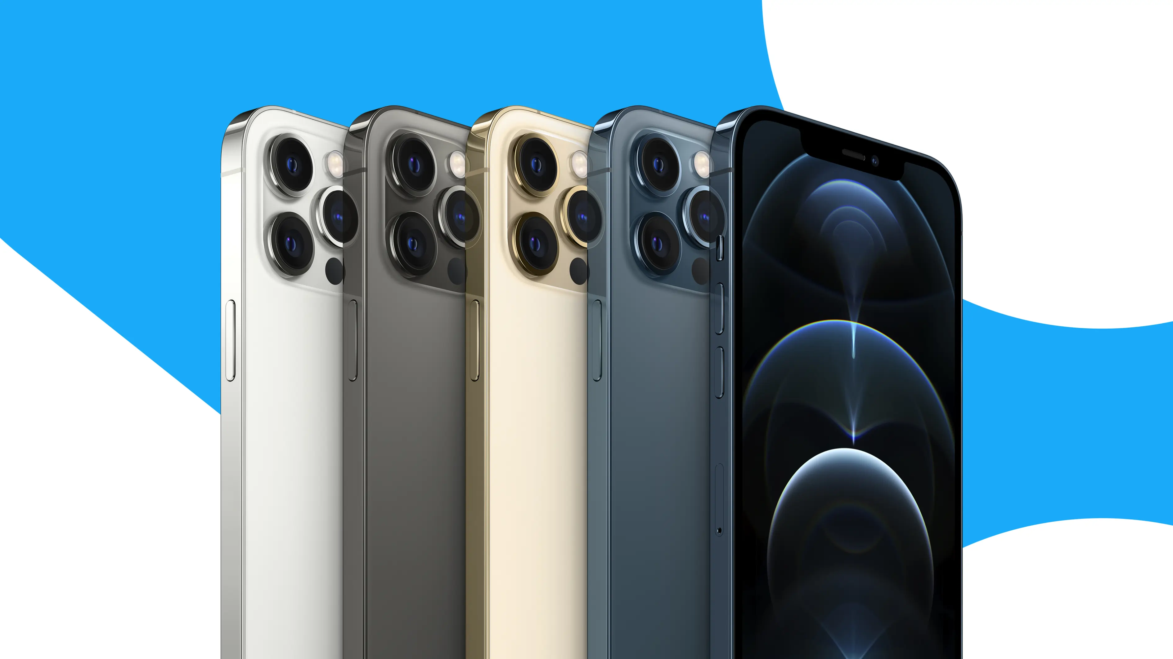
We unleashed the Telenor blue in a versatile brand device, creating a coherent and flexible design system across brand, tactical, and retail communication. A more vibrant, active blue reinforces Telenor’s position as a truly blue brand.
The lockup has been rebalanced with a smaller symbol and larger wordmark. On most applications, however, the symbol stands alone as the primary signifier of Telenor.

Typography
In collaboration with Letters from Sweden, we developed a custom typeface for Telenor Sweden. The new headline typography is a serif font, adding character and distinction in an otherwise repetitive telecom landscape. Inspired by the shapes of the Telenor symbol, the humanistic design gives the font a uniquely Telenor expression.

Brand device
To strengthen brand recognition and create a consistent blue thread across all touchpoints, we introduced a dynamic new brand device.
Built from a flexible system and expressed in Telenor’s signature blue, the device forms bold, abstract shapes that bring energy and coherence to every application.