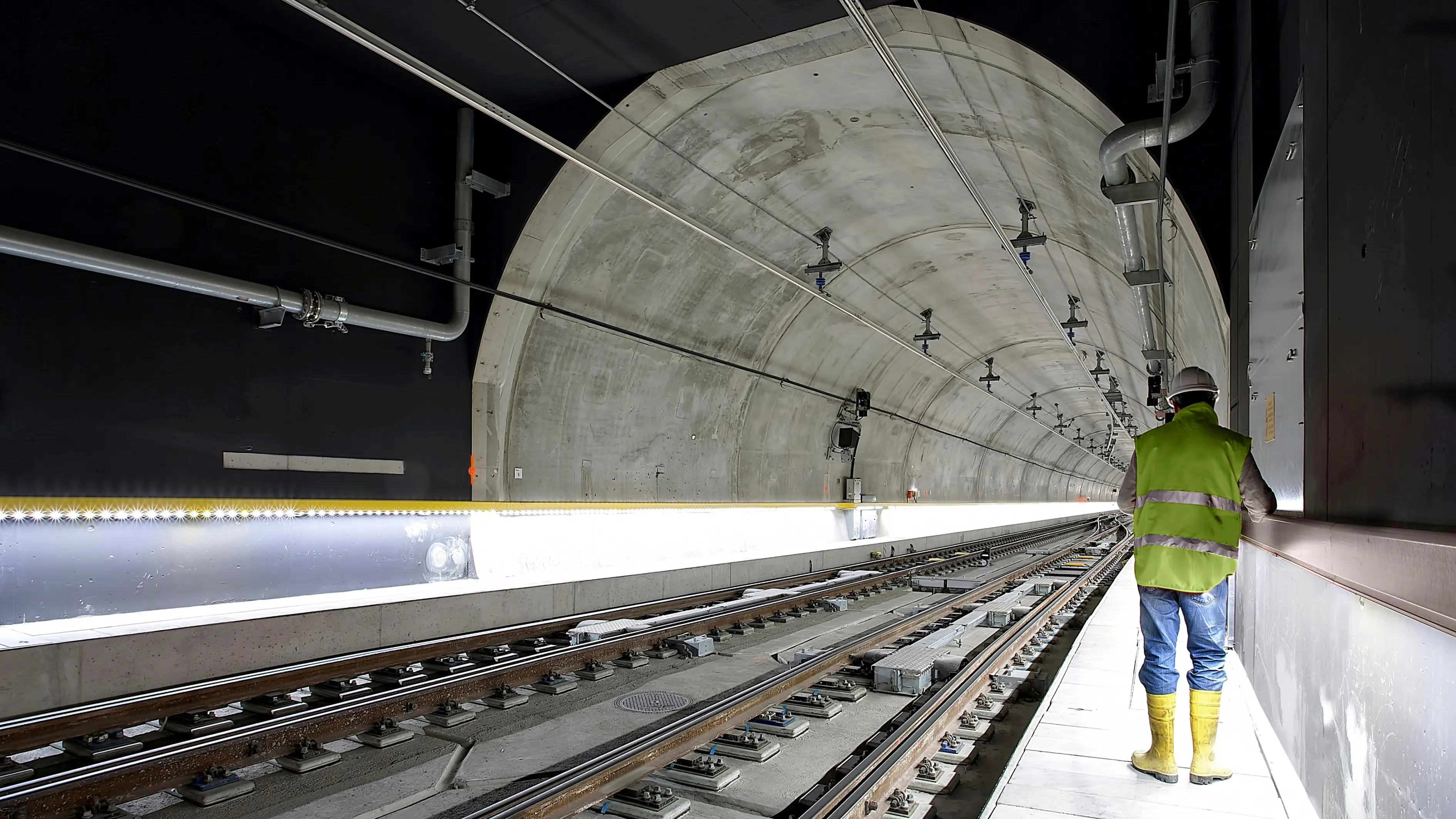
Positively clever
Wibe
Brand strategy
Brand identity
Digital brand experience
Motion identity
3D visualization
As one of Europe’s largest companies within cable management systems, we helped strategically reposition the WIBE group of companies to extend beyond their globally recognized product quality and design. Our customer research revealed a unique, differentiating mindset focused on proactive responsibility and creative, ingenious solutions that alleviate the challenges faced by their customers. The identity as problem solvers is solidified by creating clever solutions together.
Positively clever
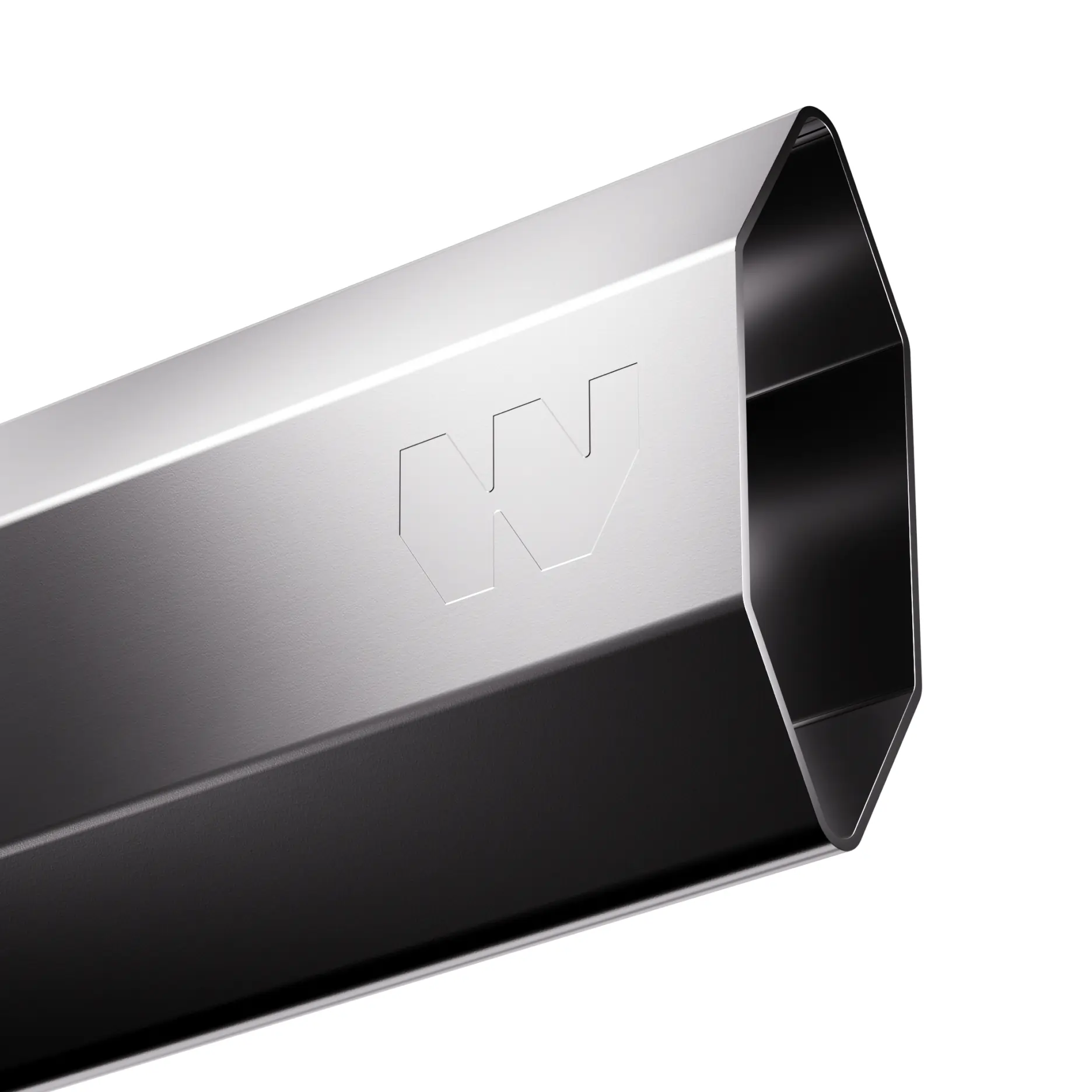
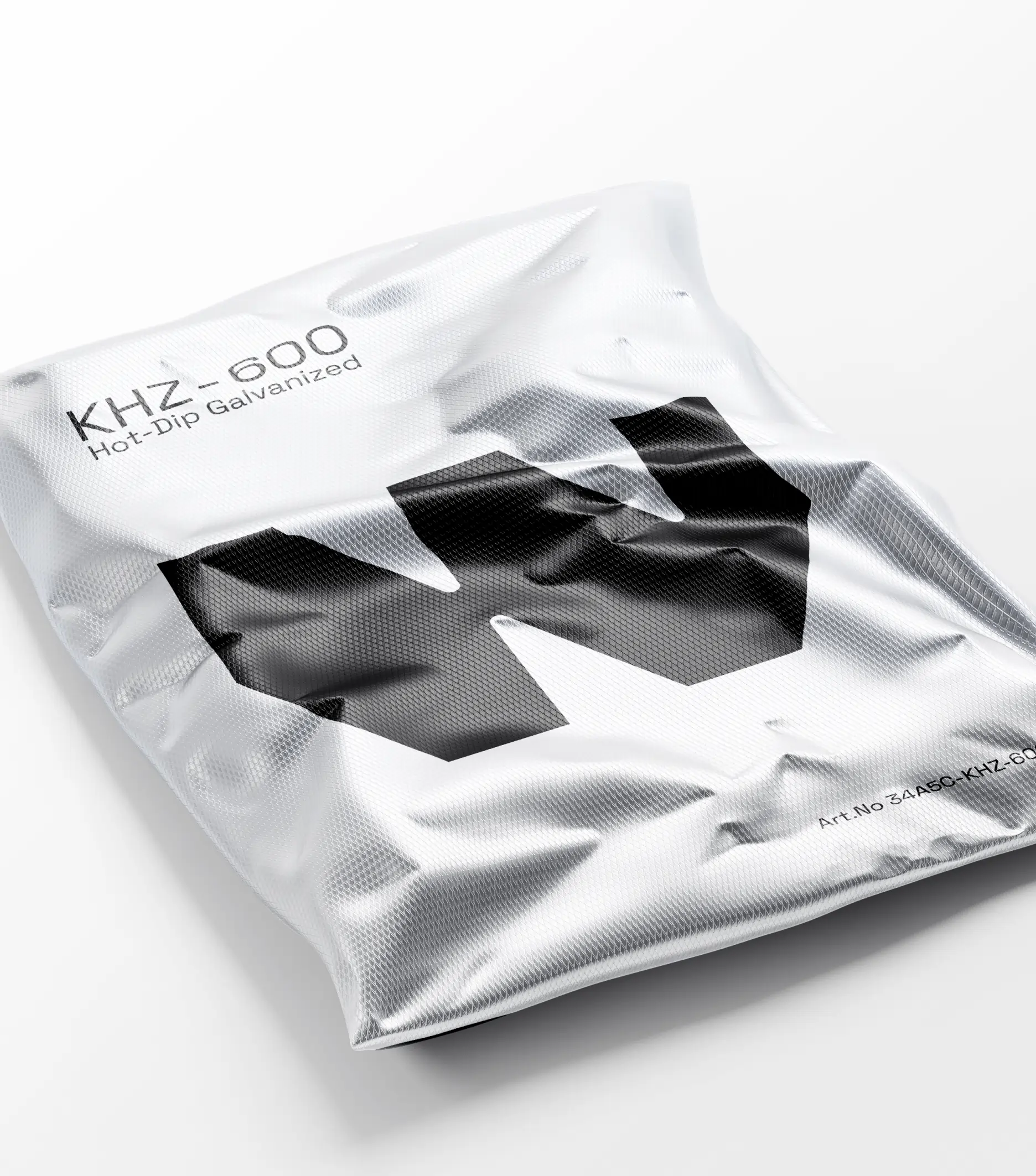
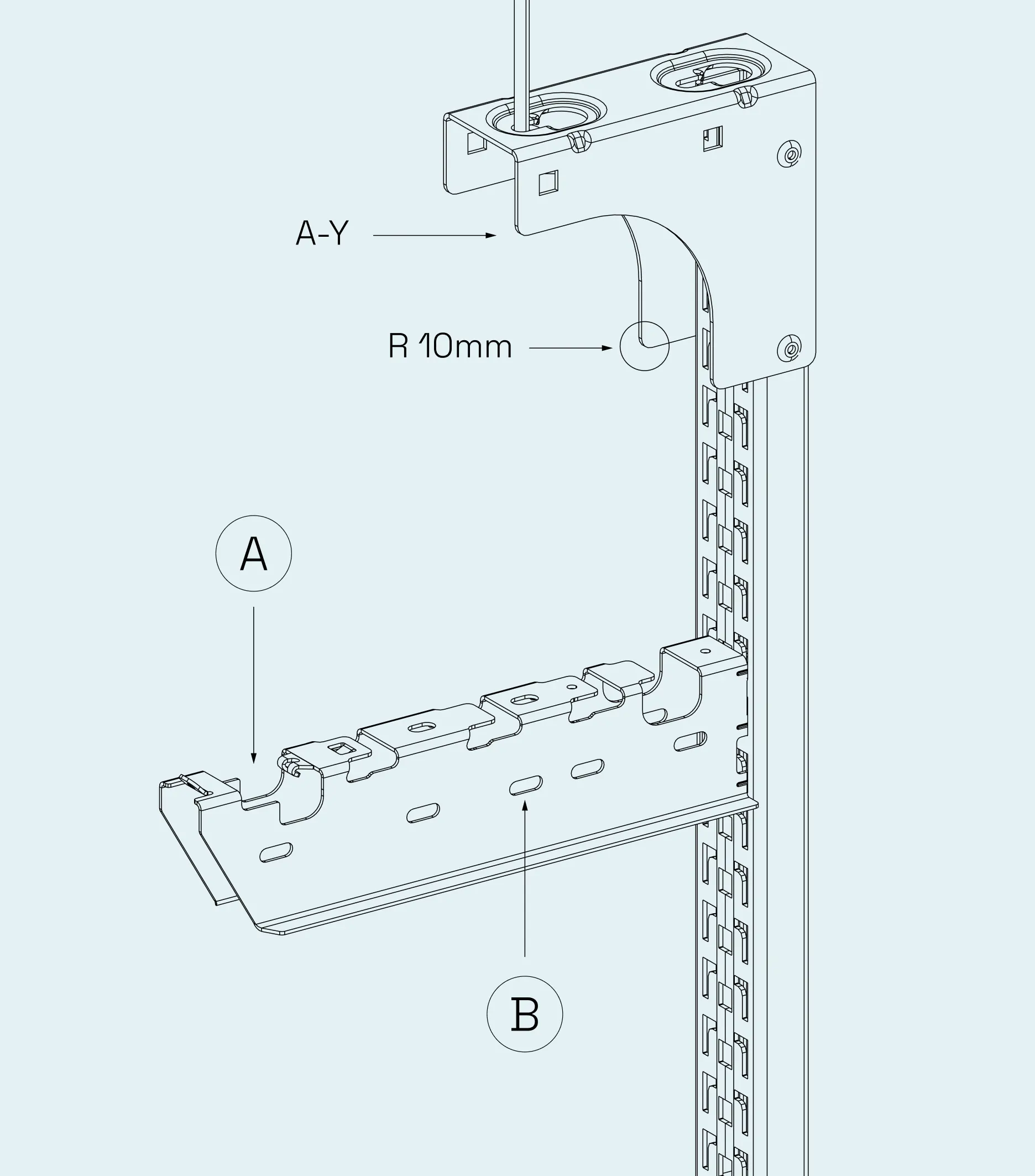
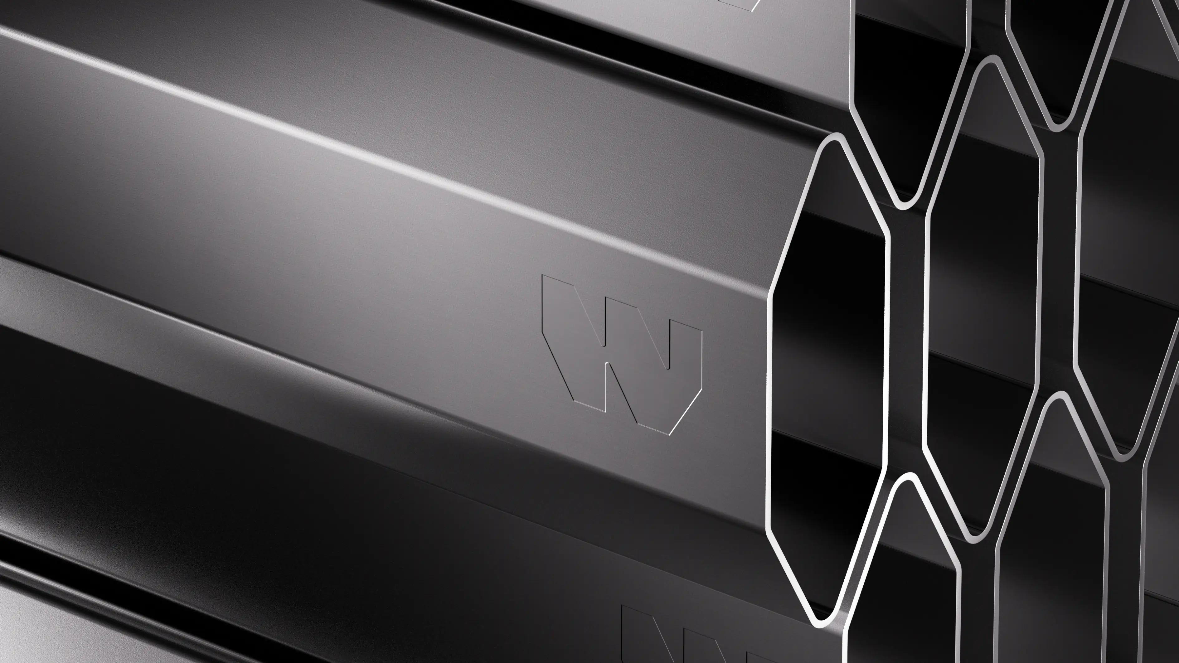
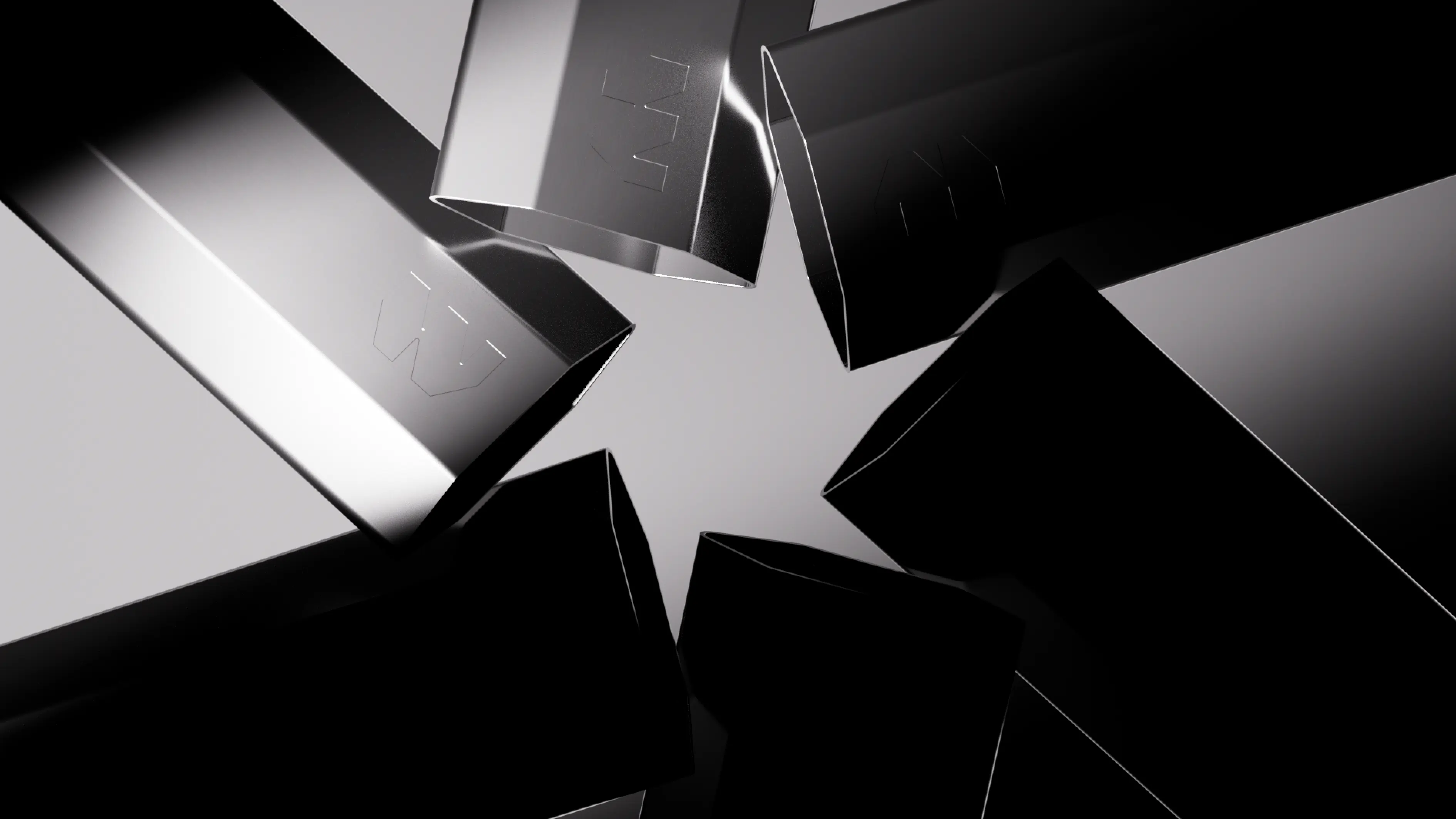
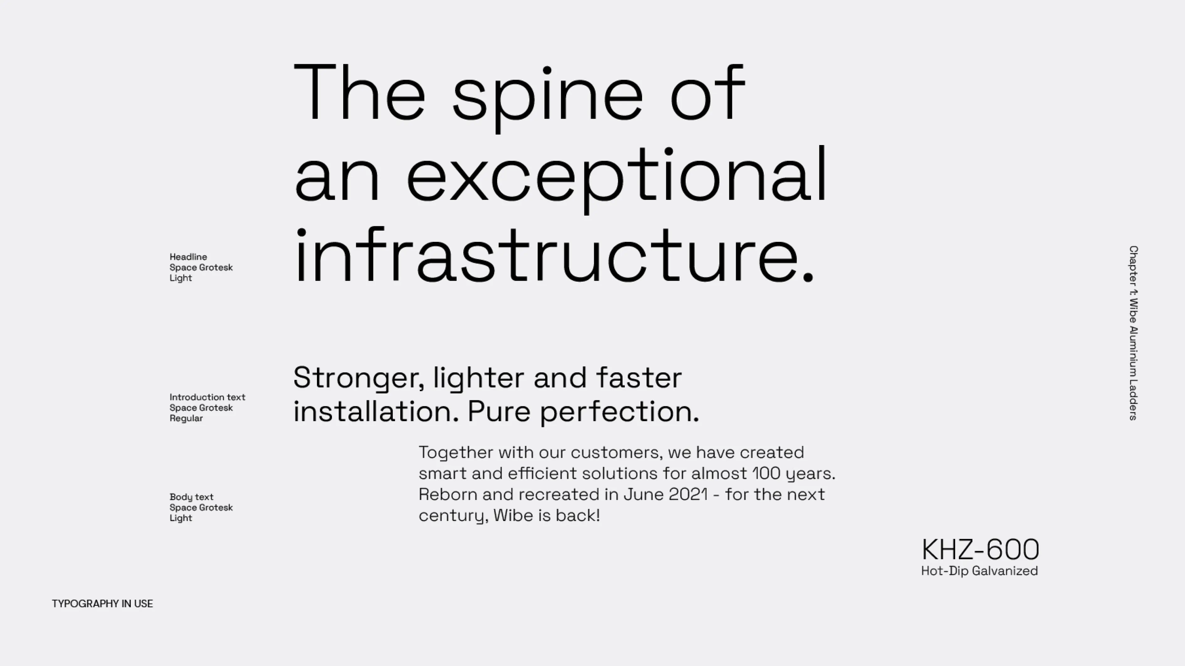
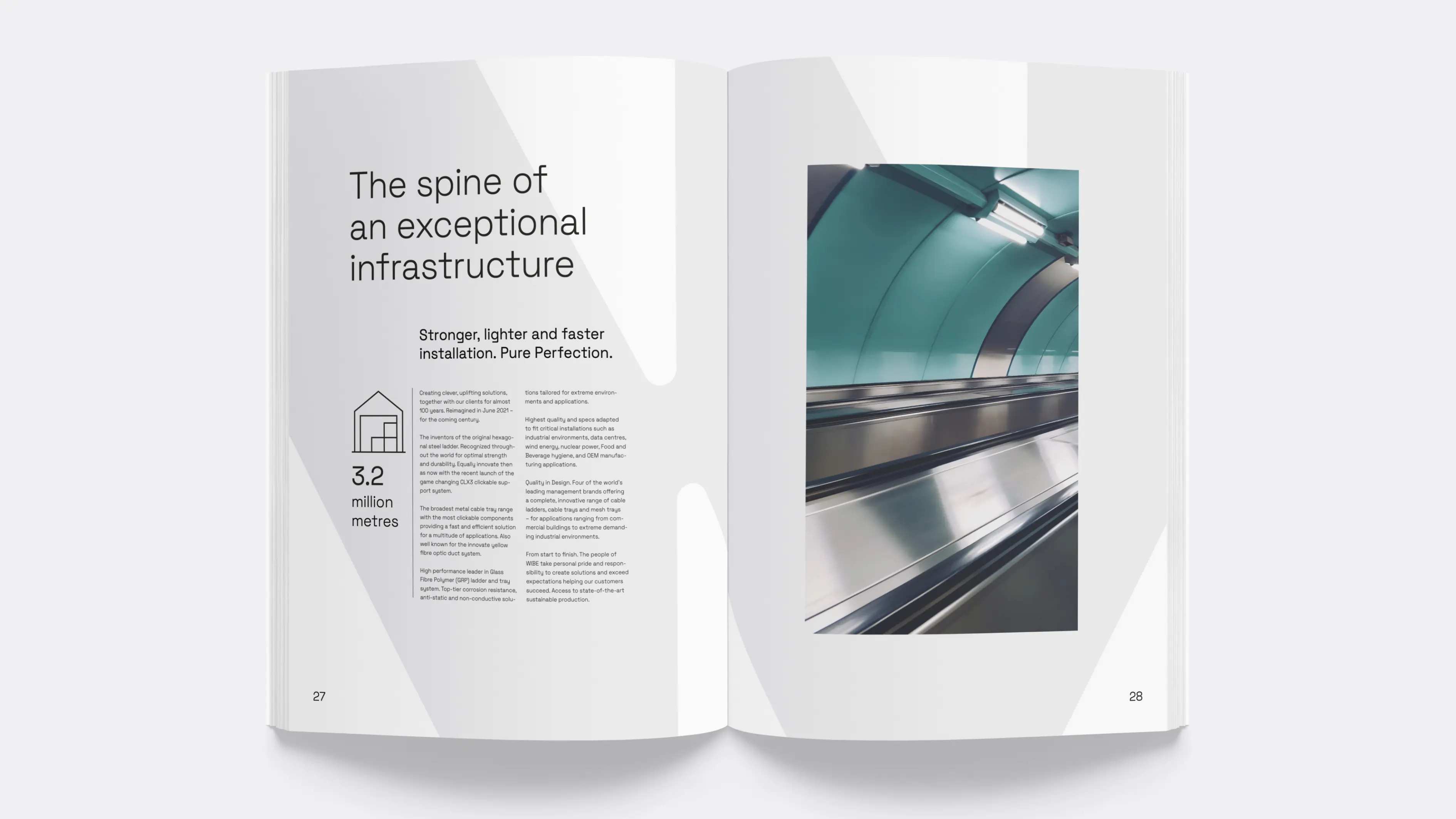
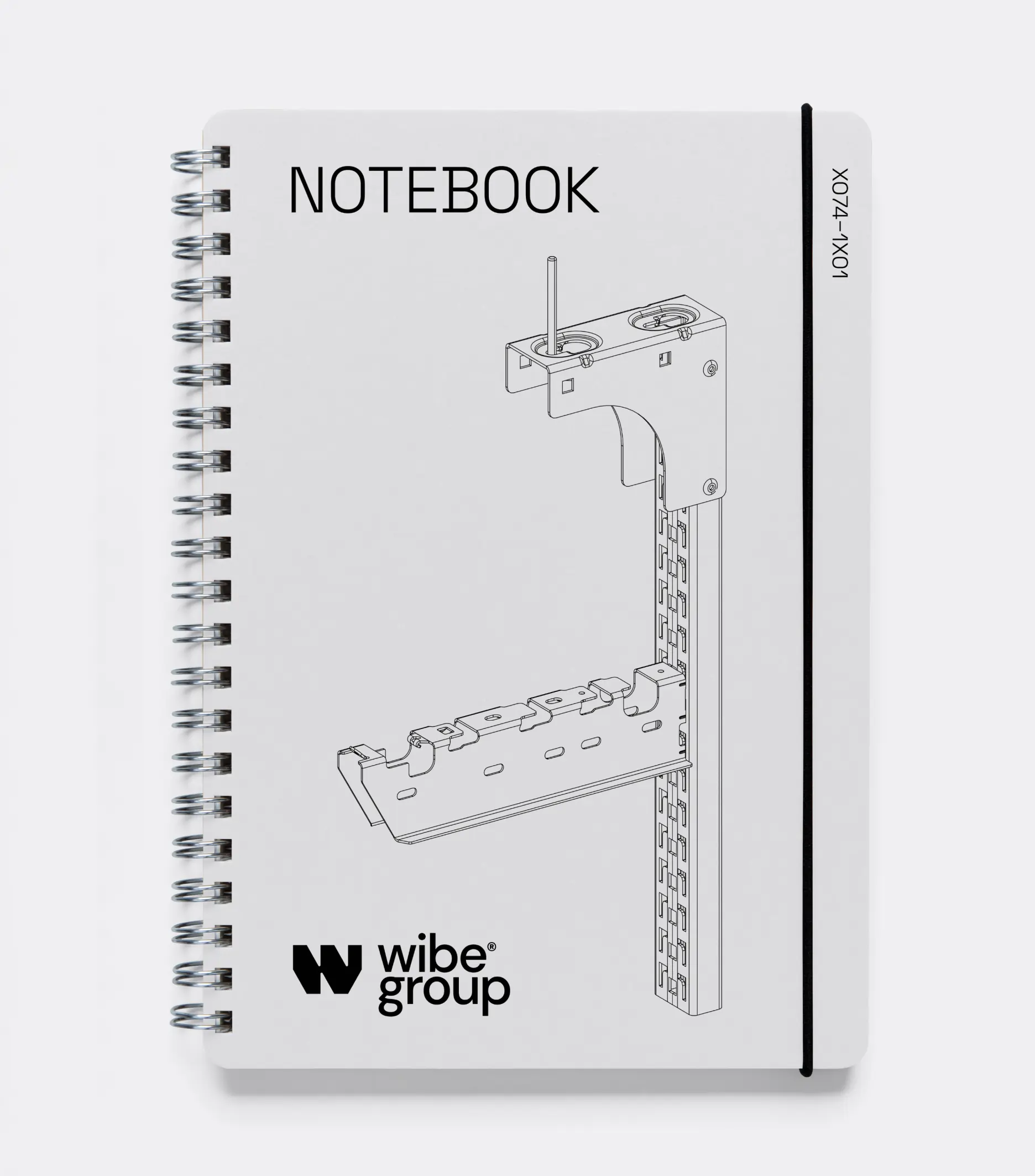
By translating their iconic hexagon product heritage into a new symbol, we modernized the traditional B2B color scheme with a fresher palette, creating a more coherent visual identity. This extends across typography, featuring beautifully crafted descenders, as well as illustrations and iconography that all echo the essence of their core cable management products.
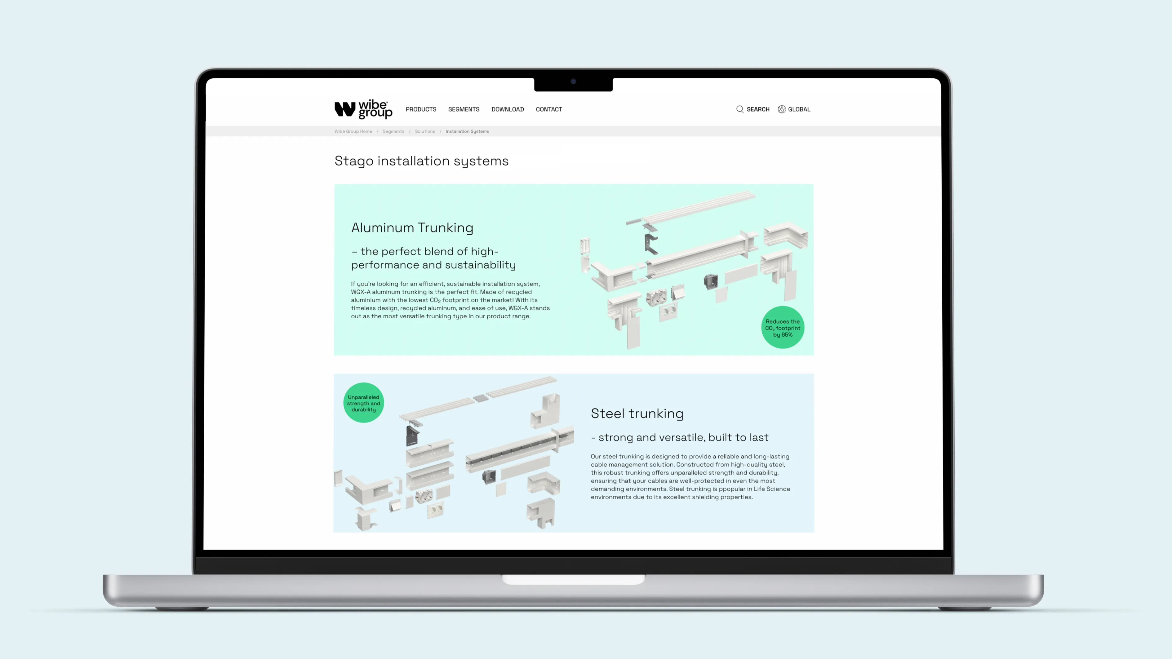
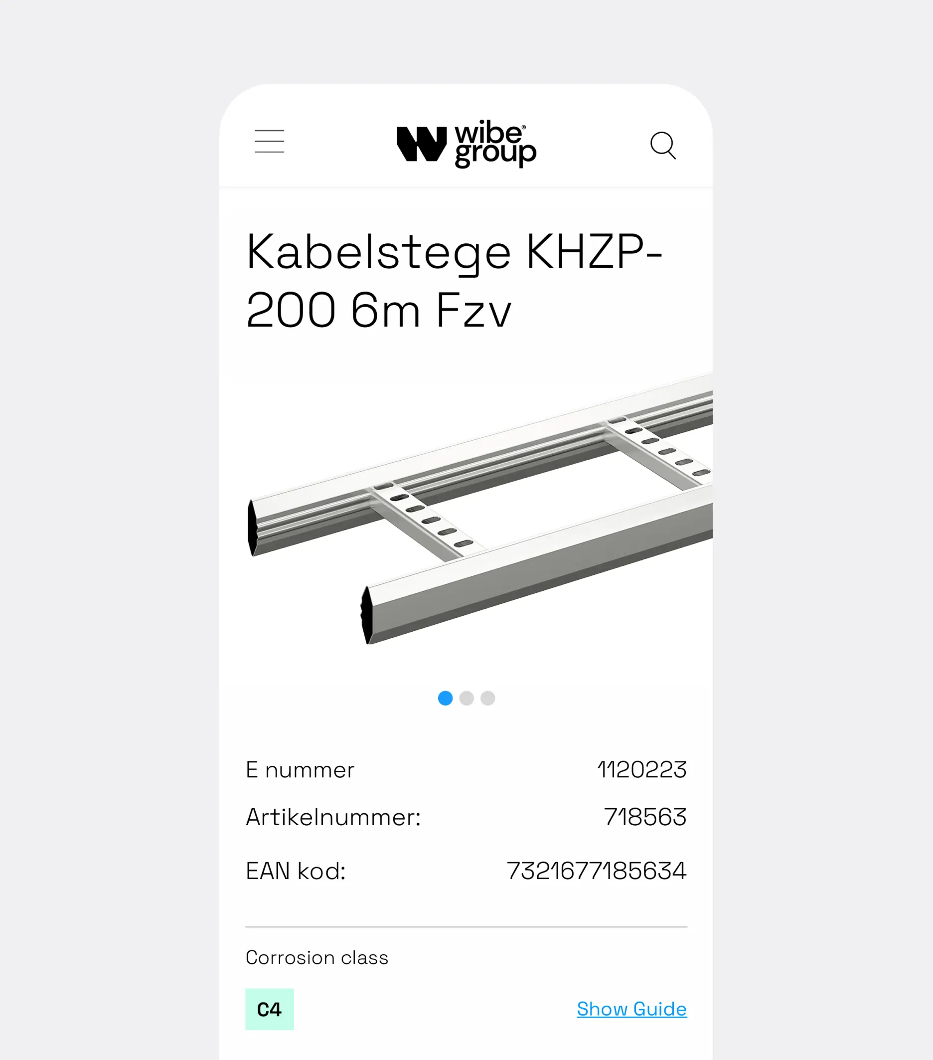
In a category traditionally focused on rational presentations of products and services, Wibe stands out with a contemporary and emotional identity. This identity successfully conveys both engineering prowess and intelligence, as well as a human touch characterized by consistently positive energy. Tailored for a digital world.
